Frank Gehry, Guggenheim Bilbao
by DR. MATTHEW A. POSTAL[1]

Gehry’s Guggenheim
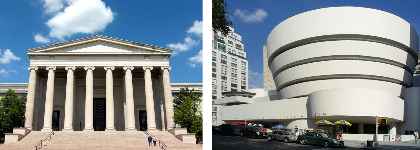
Prior to the mid-20th century, art museums in Europe and the United States were mostly designed in variants of the neo-classical style. From the Louvre in Paris to the National Gallery of Art in Washington, D.C. (below left), large and small cultural institutions commissioned stately stone structures, distinguished by pedimented fronts, long colonnades, and lofty rotundas. Axial and processional, exhibition galleries were traditionally arranged in rows, with understated decorative treatments that complement the artworks.
What is a pediment, colonnade, and rotunda

The 1959 Solomon R. Guggenheim Museum (originally the Museum of Non-Objective Art), with its spiraling concrete ramps, was one of the first museums to challenge this tradition. By the 1980s it had outgrown its Frank Lloyd Wright-designed Fifth Avenue home in New York (above right) and Thomas Krens, the museum’s director, began developing plans to expand the museum’s reach though the establishment of satellite branches funded by foreign governments.

Among these projects, the 1997 branch in Bilbao, Spain, has been the most highly regarded. Not only did it provide the Guggenheim with a large exhibition venue for 20th century and contemporary art but it shifted the direction of museum design. At this point in his prolific career, Frank Gehry had a number of cultural institutions to his credit and was developing an international reputation for producing consistently innovative work.

The Guggenheim Bilbao was also part of an ambitious urban renewal program conceived by the Basque regional government. An aging port and industrial center, the city had entered a period of significant economic decline during the 1980s. Various well-known architects were invited to design new structures, including Santiago Calatrava from Spain and Norman Foster from England. Though initial discussions focused on converting an existing industrial structure into an art museum, Krens convinced local officials to provide a more central and flexible location, a site on the banks of the Nerviron River.

Comparisons to the Guggenheim Museum in New York would be inevitable. Krens urged Gehry to “make it better than Wright” and the Bilbao museum recalls the earlier building in various subtle ways. From the absence of historical references to the focus on a central rotunda or atrium—albeit in Bilbao on a much larger scale—both architects produced unrestrained modern spaces of great architectural force and energy.

A personal aesthetic
Gehry, who started his career in the 1960s, developed a personal aesthetic gradually, discovering exhilarating ways to shatter and re-assemble architectural forms. As most architects do, he began with the structure’s most basic program. After determining the size and shape of the interiors, he melded the forms together, arranging them into a lively sculptural whole.
Though his earlier work, sometimes categorized as Deconstructivism, featured everyday building materials like chain link, corrugated metal and plywood, by the late 1980s Gehry had refined his vision, using more costly surfaces to produce unexpectedly sensuous designs. Aided by sophisticated computer software, his most daring projects evoke aspects of the Italian Baroque style. Like the drapery folds that animate some pieces of 17th century figurative sculpture, Gehry’s more striking works juxtapose elements that bend, ripple and unfurl.
Most photographs depict the Guggenheim Bilbao from across the river. Although this view is arguably the most dramatic and satisfying, the main entrance is on the opposite side of the building, at the foot of a narrow residential street, the Iparraguirre Kalea (above). Arriving visitors cross over concealed railroad tracks and descend through a broad stepped limestone plaza passing from a slender notch into a soaring 165-foot atrium. A complex and somewhat chaotic interior, this twisting glass-and-steel volume combines irregularly-shaped limestone and plaster walls, glazed elevator shafts, and vertigo-inducing catwalks.


The central atrium (left) serves as a circulation hub and orientation gallery, providing access to approximately 20 galleries on three levels. While the sequence of “classic” galleries are predictably rectangular, other exhibition spaces have surprising shapes, with angled or curving walls and occasional balconies. Particularly memorable is the so-called “boat gallery.” Though Gehry compares the shape to a fish (a reoccurring motif in his work), this enormous column-free space (above) extends more than 400 feet along the river-front promenade and beneath the adjoining bridge. Ideal for large works of sculpture, this vast space contains an installation by Richard Serra.
Additional resources:
Richard Copans and Julien Donada, Architectures : Le Musée Guggenheim de Bilbao, Melbourne: EnhanceTV, 2009 (video)
- Dr. Matthew A. Postal, "Frank Gehry, Guggenheim Bilbao," in Smarthistory, November 21, 2015, accessed February 21, 2023, https://smarthistory.org/frank-gehry-guggenheim-bilbao/. ↵

