CHAPTER 4: DATA MEASUREMENT
4-4: Interpreting Graphs and Charts
 Interpreting Graphs and Charts
Graphs and charts are used to give a visual representation of data. They condense large amounts of information into easy-to-understand formats that clearly and effectively communicate important points.
Reading a graph or chart means that we can look at the chart or graph and understand what it is trying to tell us. It involves picking out data points of interest and gives a quick synopsis of what the graph is about. Interpreting a graph or chart involves digging a little deeper. This may include completing calculations to determine an average or a sum or difference of data values.
Explore 1 – Interpreting a bar graph
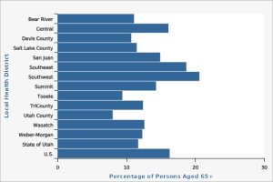
The horizontal bar graph shows the percentage of people aged 65 or older in each Local Health District of Utah in 2020.[1]
- Estimate the percentage of people who are 65 years old or older in the United States?
Solution: The U.S. bar is at the very bottom of the chart. The bar stretches to somewhere between 16% and 18%. So around 17% of the US population is aged 65 or older.
- Which areas have more percentage of people who are 65 years old or older than the percentage in the United States?
Solution: Drawing a vertical line from the end of the US bar, the bars representing the Southeast and Southwest Health Districts are longer than the U.S. bar.
- Which area has the lowest percentage of people who are 65 years old or older?
Solution: The lowest percentage is represented by the shortest bar: Utah County Health District.
- What is the mode of the data and what does it tell us?
Solution: The mode is represented by the longest bar. The mode is the Southwest Health District. This tells us that the Southwest Health District has the greatest percentage of people 65 or older in Utah.
- What other information would you need to know to be able to calculate a mean from this data?
Solution: Each district has a different population, so to determine a weighted mean we would need to know the population of each district.
- This bar graph looks almost like a histogram with a tiny amount of space between the bars. Should a histogram be used to represent this data or is a bar graph more appropriate. Explain your answer.
Solution: A bar graph is appropriate since the data is qualitative: nominal and the categories can be rearranged in any order.
Explore 2 – Interpreting a bar graph
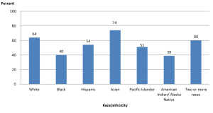
The bar graph shows the graduation rates by race/ethnicity within 6 years from first institution attended for first-time, full-time bachelor’s degree-seeking students at 4-year postsecondary institutions, where the cohort entry year is 2010.[2]
- What is the difference (in percentage) between the highest and lowest graduation rates?
Solution: The highest graduation rate is 74% and the lowest graduation rate is 39%. So the difference is 74% – 39% = 35%.
- A student claims that to find the mean graduation rate of all the students, we can add the seven percentages of bars and then divide the sum by 7. Do you agree? Explain your reasoning.
Solution: Disagree. Each percentage has a different weight (number of graduates), so to calculate the mean, we will have to multiply each percentage by its weight. That is, we need to use a weighted mean.
- A student claims that there were more Asians who graduated within 6 years compared to the other ethnic groups. Do you agree? Explain your reasoning.
Solution: Disagree. The number of people in each ethnic group is different. Even though the group Asians has the highest graduation rate of 74%, this does not mean that the number of Asians is larger than the number of people in any other ethnic group. We are not told how many graduates are in each ethnic group.
Sometimes two line graphs are combined onto a single graph to highlight what is happening with the data or to tell a story. They may or may not use the same vertical scale. It is important to recognize the scale for each line graph. This is often done using color coding.
Explore 3 – Reading and Interpreting a line graph
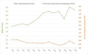
The line graph shows the number of visitors (the green line) and the number of full-time equivalent employees (FTE, the orange line) of Zion National Park from 2010 to 2022. FTE means the total full-time employees and part-time employees that add up to full-time employees (e.g., four part-time employees who work 10 hours each per week add up to make one full-time employee who works 40 hours per week).[3]
- Describe the trend of the upper, green line.
Solution: The trend is a basic idea of what the graph is doing. The upper, green line is basically going up as it moves from left to right. So, the number of visitors increased almost every year from 2010 to 2022.
- Describe the trend of the lower, orange line.
Solution: The lower, orange line is basically decreasing as it moves from left to right. The number of FTE decreased almost every year from 2010 to 2022.
- What was the increase in visits from 2010 to 2022?
Solution: The number of visitors is represented by the green line whose scale is on the left vertical axis. In 2010, the number of visitors was about 2.7 million and in 2022 it was about 4.7 million. The difference is 4.7 million – 2.7 million = 2 million. So, the number of visitors increased by about 2 million people.
- What was the decrease in FTE from 2010 to 2022?
Solution: FTE is represented by the orange line whose scale is on the right vertical axis. The FTE in 2010 was about 181 and in 2022 is about 162. The difference is 162 – 181 = –19. So, FTE decreased by 19 full-time equivalent employees.
- The upper (green) and lower (orange) lines get further apart as the graphs move from 2010 to 2022. What does this tell us?
Solution: As the upper (green) line increases the lower (orange) line decreases telling us that although the number of visitors increased, the number of full-time equivalent employees decreased.
Explore 4 – Interpreting line graphs
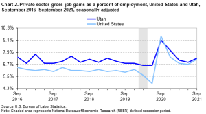
The two graphs show the growth (Chart 2) and loss (Chart 3) of non-government-controlled businesses from 2016 to 2021 in terms of the number of jobs offered (gross job gains) and the number of jobs lost (gross job losses). Gross job gains are the sum of increases in employment due to expansions at existing establishments and the addition of new jobs at opening establishments. Gross job losses are the result of contractions in employment at existing establishments and the loss of jobs at closing establishments.[4]
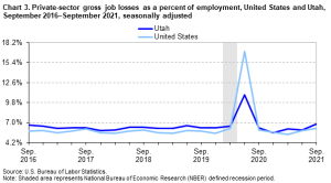
- What does the top graph (Chart 2) tell us about Utah’s job growth rate compared to the job growth rate of the U.S.?
Solution: Overall, the dark blue line representing Utah’s job growth rate lies above the light blue line representing the job growth rate of the US. This means that overall Utah has a higher job growth rate than the U.S.
- What does the bottom graph (Chart 3) tell us about Utah’s job loss rate compared to the job loss rate of the U.S.?
Solution: Overall, the dark blue line representing Utah’s job loss rate lies above the light blue line representing the job loss rate of the US. This means that Utah’s job loss rate is slightly higher than that of the U.S. overall.
- It has been said that Utah’s business growth rate is near the top of all states in the US. Is the statement true, according to the two line graphs? Explain your reasoning.
Solution: It is not true. First, the two graphs do not contain the information that Utah is near the top of all states in the U.S. Second, although Utah has higher gross job gains (about 1%), Utah also has higher gross job losses (about 1%) compared to the average of the United States.
- A student claims that Utah’s business growth from 2016 to 2019 was a lot better than the average growth of the United States because the distance between the two lines (dark and light blue) is quite large. Do you agree? Explain your reasoning.
Solution: Although it seems the two lines are not close, the difference actually hovers around 1%. Therefore, it is more important to read the scale marks to find the numerical difference instead of depending on how far the two lines are away from each other.
- What does the grey vertical rectangle represent on the graphs?
Solution: The grey vertical rectangle shows the time period that was defined as a recession period.
- What was the highest job loss rate for the U.S. and for Utah? How does it relate to the recession period?
Solution: The peak on Chart 3 shows the highest value around 17% for the U.S. and 11% for Utah. This was right after the defined recession period ended.
Explore 5 – Interpreting a pie chart
The pie chart shows the percentage distribution of the Food and Drug Administration’s (FDA) Budget to different programs for the fiscal year 2021. The total budget amount was $6.1 billion.[5]
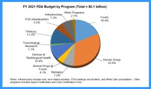
- What is the sum of the percentages on the pie chart?
Solution: Adding all the percentages, it is 101%. The percentages on a pie chart must sum to 100%, so this difference must be due to rounding the percentages shown on the chart.
- Which program received the most money? How much did it receive?
Solution: Human Drugs has the largest slice and received 33% of the funding: 33% of $6.1 billion = 0.33($6.1 billion) = $2.013 billion.
- Which program received the least money? How much did it receive?
Solution: The smallest slice represents Toxicological Research that received 1.1% of the funding: 1.1% of $6.1 billion = 0.011($6.1 billion) = $0.0671 billion = $67.1 million
- How much money was designated for Foods?
Solution: Foods was allocated 18.4% of the budget: 18.4% of $6.1 billion = 0.184($6.1 billion) = $1.1224 billion
- How much money was designated for Tobacco?
Solution: Tobacco was allocated 11.3% of the budget: 11.3% of $6.1 billion = 0.113($6.1 billion) = $0.6893 billion = $689.3 million
- How much more money did human drugs receive than Foods?
Solution: Human Drugs received 33% of the budget, while Foods received 18.4%. That’s a difference of 33% – 18.4% = 11.6% and 11.6% of $6.1 billion = 0.116($6.1 billion) = $0.7076 billion = $707.6 million
- A student claims that 1/3 of the money was designated for Human Drugs. Is the student’s claim correct? Explain your reasoning.
Solution: 33% = 0.33, while 1/3 = 0.33333…, so since these are very close and the percentages on the pie chart are rounded, the student is correct.
Explore 6 – Interpreting pie charts
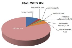
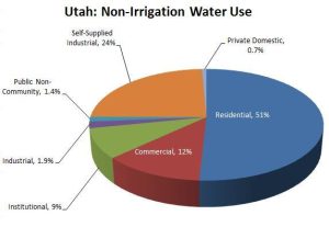
The two pie charts show the water use percentages of different categories in Utah. The first (top) pie chart shows all categories of water use in Utah. The second (bottom) pie chart shows all categories of non-irrigation water use.[6]
 |
 |
- What percentage of Utah water is used for non-irrigation?
Solution: Irrigation uses 81% of Utah’s water leaving 100% – 81% = 19% for non-irrigation use.
- What percentage of non-irrigation water is used for non-residential purposes?
Solution: Residential uses 51% of Utah’s non-irrigation water leaving 100% – 51% = 49% for non-residential purposes.
- True or False (Justify your answer): The residential water use is about 1/2 of the non-irrigation water use in the second pie chart. Therefore, the percentage of residential water use should be about half of the non-irrigation water use in the first pie chart.
Solution: True. The blue slice representing Residential use of non-Irrigation water on the second chart is 51%, which is very close to 1/2 = 50%. Also, the percentage of non-irrigation water use is 19% according to the first pie chart. Since residential water use is half of the non-irrigation water use according to the second pie chart, half of 19% is 9.5% , which is close to 10%, which matches the residential water use percentage in the first pie chart.
- If Utah were to cut its water use, which sector should be mandated to cut its water use? Explain your reasoning.
Solution: 81% of all water goes towards irrigation. That is the first sector that should be cut. 51% of the non-irrigation water is used by residential customers. That could also be cut to save water.
Explore 7 – Interpreting a histogram
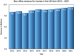 The histogram shows the box office revenue for movies in the US from 2012 – 2021 in billions of dollars.
- Which year had the lowest box office revenue?
Solution: The lowest revenue is shown by the shortest bar, which is $9.7 billion in 2014.
- Which year had a box office revenue of $10.9 billion
Solution: We look for the bar that has 10.9 written near the top: 2019
- What is the mode of the revenues?
Solution: We have to look at the revenues and decide which revenue occurs most often: 10.7 occurs in 2016 and in 2018, so the mode is $10.7 billion
- What is the median revenue?
Solution: The median is the middle value so we order the revenues from lowest to highest: 9.7; 10; 10.2; 10.4; 10.6; 10.7; 10.7; 10.9; 11.1; 11.3 SInce there are 10 values, the median will be halfway between the 5th and 6th data values: (10.6 + 10.7)/2 = 10.65 The median revenue is $10.65 billion.
- Is a histogram the appropriate graph to illustrate this data? Explain your reasoning.
Solution: Each bar represents the sum of all box office revenues across the US per year so is a calculated amount (continuous) that has been rounded to a tenth of a billion dollars. Year represents time, which is continuous. So a line graph would be an appropriate graph.

- A student claims that each bar in a bar graph is a data point, where the value associated with a bar is the value of the data point. Do you agree? Explain your reasoning.
Show/Hide Answer
The student’s claim is NOT correct. Each bar is the summary of a number of data points. The value associated with each bar tells us how many (or what percentage) are in that category. For example, in Explore 1, the data points that make up the bar labeled Utah County are the people who live in Utah County who are 65 or older.
Practice Exercises
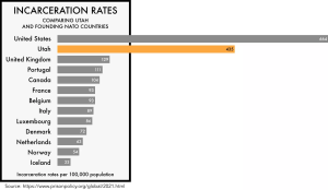 What does this bar graph show?
 - Why does the box around most of the countries exclude Utah and the United States?
- Why is Utah shown in orange?
- Which country has the lowest incarceration rate?
- How many times higher is the US incarceration rate compared to the Utah rate?
- How many times higher is the US incarceration rate compared to the Canadian rate?
- What is the median rate of incarceration for NATO countries?
Show/Hide Answer
- The incarceration rates of Utah and NATO countries per 100,000 population.
- Utah and the U.S. are outliers.
- To highlight and bring attention to it.
- Iceland
- 1.53 or 153%
- 6.38 or 638%
- 91 per 100,000
 In this section, we will take what we have learned and apply the concepts to new situations.
Perspectives
1. The bar graph shows the estimated number of vehicles taken out of production due to microchip shortages as of May 2021.[7]
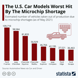
a) Which model was hit the hardest by the microchip shortage?
b) How many vehicles did Ford take out of production?
c) How many vehicles did Chevrolet take out of production?
d) How many more Ford vehicles have been taken out of production than Jeep vehicles?
e) What percent of the worst-hit models were made by Ford?
f) What percent of the worst-hit models were made by Chevrolet?
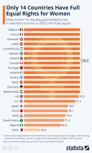
2. The bar chart shows 20 countries and the index score out of 100 of equal rights for women guaranteed by law in 2021.[8]
a) How many countries have full equal rights for women?
b) There are 194 countries in the world. What percent of these countries have full equal rights for women?
c) How many index points off is the US from having equal rights for women?
d) Explain why a bar chart is an appropriate way to display this data.
 What does the U.S .still have to do to ensure equal rights for women?
3. The bar graph shows the rise and fall of CD album sales in the US since 1983 in millions.[9]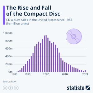
a) What is the mode of the data and when did it occur?
b) During which time periods did CD sales break 600 million?
c) About how many more CDs were sold in 2000 than in 1990?
d) Calculate the percent decline in sales from 2000 to 2020.
4. The line graph shows women’s median hourly earnings in the US as a percentage of men’s median hourly earnings.[10]
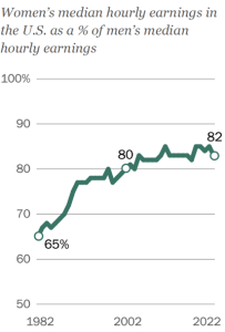
a) What is the difference in percent of median earnings from 2002 to 2022?
b) Calculate the percentage increase in percent of median earnings from 2002 to 2022.
c) What is the difference in percent of median earnings from 1982 to 2022?
d) Calculate the percentage increase in percent of median earnings from 1982 to 2022.
5. The line graph shows the percent of employed men and women in the US aged 25 or older with a bachelor’s degree or higher. level of education.[11]
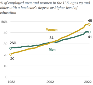
a) Calculate the increase in the percent of women aged 25 and older who hold at least a bachelor’s degree from 1982 to 2022.
b) Calculate the percent change in the percent of women aged 25 and older who hold at least a bachelor’s degree from 1982 to 2022.
c) Calculate the increase in the percent of men aged 25 and older who hold at least a bachelor’s degree from 1982 to 2022.
d) Calculate the percent change in the percent of men aged 25 and older who hold at least a bachelor’s degree from 1982 to 2022.
e) Compare the answers to parts a) and b) with parts b) and d).
f) The graph shows that the lines representing men and women cross over. What does this tell us?
Show/Hide Answer
- a) Ford F-Series b) 230,460 c) 138,762 d) 89,681 e) 45.2% f) 27.2%
- a) 14 b) 7.2% c) 8.7 d) It is qualitative: nominal data where the bars can be interchanged. e) Answers vary but wage gap and (p)maternity leave are two of the largest issues.
- a) 2000 b) 1994 – 2006 c) About 620 million d) About 94%
- a) 2% b) 3.1% c) 17% d) 26.2%
- a) 28% b) 140% c) 15% d) 57.7% e) The percentage of employed women with bachelor’s degrees or higher increased more than the percentage of men with bachelor’s degrees or higher since 28% > 15%. Employed women’s rate of change in the educational attainment of a bachelor’s degree or higher was considerably higher than that of employed men since 140% > 57.7% f) This is the point where employed women equaled employed men at 31% in percentage of educational attainment of a bachelor’s degree or higher, sometime around 2004.
 In this section, we will use what we have learned so far to practice skill problems.
Skill Exercises
- Calculate 34% of $4.5 million.
- Calculate 127% of $7.3 billion.
- Calculate 56% of 900.
- Calculate 245% of 95.
- Calculate the difference between 3408 and 2965.
- Calculate the difference between 85,409 and 96,036.
- Calculate the percent difference moving from 65 to 92.
- Calculate the percent difference moving from 74 to 38.
- Calculate the percentage increase from 7862 and 9408.
- Calculate the percentage decrease from 56,932 to 38,054.
Show/Hide Answer
- $1.53 million
- $9.271 billion
- 504
- 232.75
- 443
- –10,627
- 41.5%
- –48.6%
- 19.7% increase
- 33.2% decrease
- https://ibis.health.utah.gov/ibisph-view/indicator/complete_profile/AgeDistPop.html ↵
- https://nces.ed.gov/blogs/nces/2019/06/20/default ↵
- https://www.nps.gov/zion/learn/management/park-visitation-statistics.htm ↵
- https://www.bls.gov/regions/mountain-plains/news-release/businessemploymentdynamics_utah.htm ↵
- https://www.fda.gov/about-fda/fda-basics/fact-sheet-fda-glance ↵
- https://legacy.westernenergyalliance.org/knowledge-center/water/western-water-study/utah ↵
- https://www.statista.com/chart/24969/vehicles-taken-out-of-production-due-to-microchip-shortages/ ↵
- https://openknowledge.worldbank.org/server/api/core/bitstreams/105265e8-311a-4b39-a71b-e455a86dd0ba/content ↵
- https://www.statista.com/chart/12950/cd-sales-in-the-us/ ↵
- https://www.pewresearch.org/social-trends/2023/03/01/the-enduring-grip-of-the-gender-pay-gap/ ↵
- https://www.pewresearch.org/social-trends/2023/03/01/the-enduring-grip-of-the-gender-pay-gap/ ↵
