CHAPTER 4: DATA MEASUREMENT
4-3: Types of Data and Appropriate Representations
Introduction
Graphs and charts can be effective visual tools because they present information quickly and easily. Graphs and charts condense large amounts of information into easy-to-understand formats that clearly and effectively communicate important points. Graphs are commonly used by print and electronic media as they quickly convey information in a small space. Statistics are often presented visually as they can effectively facilitate understanding of the data. Different types of graphs and charts are used to represent different types of data.
 Types of Data
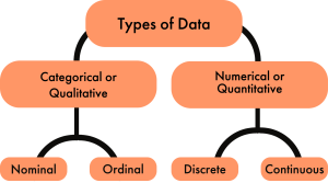
There are four types of data used in statistics: nominal data, ordinal data, discrete data, and continuous data. Nominal and ordinal data fall under the umbrella of categorical data, while discrete data and continuous data fall under the umbrella of numerical data.
Qualitative Data
Categorical or qualitative data labels data into categories. Categorical data is defined in terms of natural language specifications. For example, name, sex, country of origin, are categories that represent qualitative data. There are two subcategories of qualitative data, nominal data and ordinal data.
Nominal Data
Nominal data is the simplest data type. It classifies data purely by labeling or naming values. The labeled categories have no order, and are mutually exclusive (no overlap). Nominal data cannot be ordered and measured. For example, sex, home town, country of origin, favorite candy bar, etc. cannot be ordered. There is no category that has greater value than another category. Please note that  These numbers may make you think the data has order,
  . Nominal data are examined using a method that groups the data into categories, and then the frequency or the percentage of the data in each category can be calculated. Nominal data is visually represented using a pie chart.
Ordinal Data
When the categories have a natural order, the categories are said to be ordinal. It can be ordered and measured. For example education level (H.S. diploma; 1 year certificate; 2 year degree; 4 year degree; masters degree; doctorate degree), satisfaction rating (extremely dislike; dislike; neutral; like; extremely like), etc. are categories that have a natural order to them. Ordinal data are commonly used for collecting demographic information (age, sex, race, etc.). This is particularly prevalent in marketing and insurance sectors, but it is also used by governments (e.g. the census), and is commonly used when conducting customer satisfaction surveys. Ordinal data is commonly represented using a bar graph.
Quantitative Data
Numerical or quantitative data involves numbers and there is always order to those numbers. Quantitative data gives information about the measure of a specific thing.  For example, the distances between marks on a weight scale are equal. However, data points from a typical 5-point rating scale (e.g., 1-5) are not quantitative data, even though they are numbers. This is because the lengths (or strengths) between the adjacent points are NOT the same.
Quantitative data has two subcategories, discrete data and continuous data.
Discrete Data
The data is discrete when the numbers do not touch each other on a real number line (e.g., 0, 1, 2, 3, 4…). Discrete data is whole numerical values typically shown as counts and contains only a finite number of possible values. For example, the number of visits to the doctor, the number of students in a class, etc. Discrete data is typically represented by a histogram.
Continuous Data
The data is continuous when it has an infinite number of possible values that can be selected within certain limits. (i.e., the numbers run into each other on a real number line). Continuous data is data that can be calculated. It has an infinite number of possible values that can be selected within certain limits. Examples of continuous data are temperature, time, height, etc. Continuous data is typically represented by a line graph.
Explore 1 – Types of data
Classify the data into qualitative or quantitative, then into a subcategory of nominal, ordinal, discrete or continuous.
- weight
Solution
Weight is a number that is measured and has order. It can also take on any number. So, weight is quantitative: continuous.
- egg size (small, medium, large, extra large)
Solution
Egg size is typically small, medium, large, or extra large that has a natural order. So, egg size is qualitative: ordinal.
- number of miles driven to work
Solution
Number of miles is a number that is measured and has order. It can also take on any number. So, number of miles is : quantitative: continuous.
- body temperature
Solution
Body temperature is a number that is measured and has order. It can also take on any number. So, temperature is quantitative: continuous.
- basketball team jersey number
Solution
Jersey numbers have no order and are numbers that are not measured. So, jersey number is qualitative: nominal.
- U.S. shoe size
Solution
Shoe size is a number. It is calculated based on a formula that includes the measure of your foot length. However, it has only whole or half numbers (e.g., 8 or 9.5). Shoe size has a natural order but has a finite number of options (e.g., half or whole numbers). So, shoe size is quantitative: discrete.
- military rank
Solution
Military rank is not numerical but is categorical with a natural order. So, military rank is qualitative: ordinal.
- university GPA
Solution
University GPA is a weighted average that is calculated, so it is quantitative: continuous.
Practice Exercises
Classify the data into qualitative or quantitative, then into a subcategory of nominal, ordinal, discrete or continuous.
- year of birth
- levels of fluency (language)
- height of players on a team
- zip code
- blood type
- dose of medicine
- political party
- course letter grades
Show/Hide Answer
- Quantitative: discrete
- Qualitative: ordinal
- Quantitative: continuous
- Qualitative: nominal
- Qualitative: nominal
- Quantitative: continuous
- Qualitative: nominal
- Qualitative: ordinal
Types of Graphs and Charts
The type of graph or chart used to visualize data is determined by the type of data being represented. A pie chart or bar chart is typically used for nominal data and a bar chart for ordinal data. For quantitative data, we typically use a histogram for discrete data and a line graph for continuous data.
A pie chart is a circular graphic which is divided into slices to illustrate numerical proportion. Pie charts are widely used in the business world and the mass media. The size of each slice is determined by the percentage represented by a category compared to the whole (i.e., the entire dataset). The percentage in each category adds to 100% or the whole.
Explore 2 – Pie Charts
The pie chart shows the distribution of the Food and Drug Administration’s Budget of different programs for the fiscal year 2021. The total budget was $6.1 billion. [1]
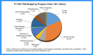
- How many categories are shown in the pie chart?
Solution
If we count the number of slices, there are 10 categories shown.
- What do the percentages represent?
Solution
The percentages show the percent of the $6.1 billion FDA budget that was spent on each category.
- Why is it vital to show the total budget on the chart?
Solution
Without the total budget we would be unable to calculate the amount spent on each category.
- Is there a limit to the number of categories that can be shown on a pie chart?
Solution
Yes. If the slices are too small to see, another method of representing the data should be used. Ideally, a pie chart should show no more than 5 or 6 categories.
- What does the largest slice represent?
Solution
The percentage of the total budget spent on human drugs.
- What does the smallest slice represent?
Solution
The percentage of the total budget spent on toxicological research.
- How could this pie chart be improved?
Solution
The slices could be ordered around the circle by size, and the 3-D look could be eliminated to avoid the distorted perspective and to make the graph clearer.
- Is this an appropriate use of a pie chart?
Solution
The chart is showing a comparison of all categories the budget went towards so it is appropriate.
Bar graphs are used to represent categorical data. Each category is represented as a bar either vertically or horizontally. A bar is the measured value or percentage of a category and there is equal space between each pair of consecutive bars. Bar graphs have the advantage of being easy to read and offer direct comparison of categories.
Explore 3 – Bar Graphs
Graduation rates within 6 years from the first institution attended for first-time, full-time bachelor’s degree-seeking students at 4-year postsecondary institutions, by race/ethnicity: Cohort entry year 2010
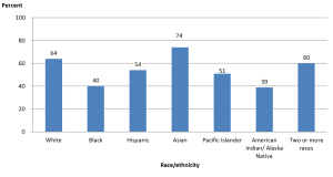
- How many categories are represented in the bar graph and what do they represent?
Solution
There are 7 categories representing the race/ethnicity of the students.
- What do the numbers above each bar represent and why may they be necessary?
Solution
The rounded percent of the category. They are necessary because it is very difficult to tell from the vertical scale the height of each bar.
- What does the tallest bar represent?
Solution
The percent of students who graduated within six years from their first institution within 6 years who were Asian.
- What does the shortest bar represent?
Solution
The percent of students who graduated within six years from their first institution within 6 years who were American Indian or Alaska Native.
- Is this an appropriate use of a bar graph?
Solution
Yes. The data is qualitative: nominal; there is no order within the categories.
Histograms are used to represent quantitative data that is discrete. A histogram divides up the range of possible values in a data set into classes or intervals. For each class, a rectangle is constructed with a base length equal to the range of values in that specific class and a length equal to the number of observations falling into that class. A histogram has an appearance similar to a vertical bar chart, but there are no gaps between the bars. The bars are ordered along the axis from the smallest to the largest possible value. Consequently, the bars cannot be reordered. Histograms are often used to illustrate the major features of the distribution of the data in a convenient form. They are also useful when dealing with large data sets (greater than 100 observations). They can help detect any unusual observations (outliers) or any gaps in the data.
Histograms may look similar to bar charts but they are really completely different. Histograms plot quantitative data with ranges of the data grouped into classes or intervals while bar charts plot categorical data. Histograms are used to show distributions while bar charts are used to compare categories. Bars can be reordered in bar charts but not in histograms. The bars of bar charts have the same width. The widths of the bars in a histogram need not be the same as long as the total area of all bars is one hundred percent if percentages are used or the total count, if counts are used. Therefore, values in bar graphs are given by the length of the bar while values in histograms are given by areas.
Explore 4 – Histograms
Reading data from a table can be less than enlightening and certainly doesn’t inspire much interest. Graphing the same data in a histogram gives a graphical representation where certain features are automatically highlighted.
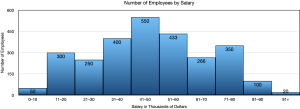
- What do you notice about the bars of this histogram compared to the bars of a bar graph?
Solution
The bars touch in a histogram but not in a bar chart. This is because the data is ordered along the axis.
- What do the numbers above the bars represent?
Solution
The number of employees whose salary lands in each class.
- State a feature of the graph that is very obvious to you.
Solution
Answers may vary. Very few employees make less than $10,000 or more than $91,000. $41,000 – $50,000 is the most common salary.
Line graphs are used when the data is quantitative and continuous. The axis acts as a real number line where every possible value is located. Line graphs are typically used to show how data values change over time.
Explore 5 – Line Graphs
Here is an example of a line graph.
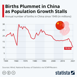
- What does this line graph represent?
Solution: The number of annual births in China from 1949 to 2021.
- What do the numbers on the vertical axis represent?
Solution: The number of births in millions.
- What do the numbers on the horizontal axis represent?
Solution: The year.
- Is this an appropriate use of a line graph?
Solution: Yes. The time scale in years is continuous and a line graph is appropriate for continuous data.
- Does a line graph highlight anything that a histogram may not?
Solution: Yes. The trend in data over time. In this graph the trend of annual births is decreasing.
 What happened around 1960 for the birth rate to fall so suddenly then pick up so rapidly?
Infographics are often used by media outlets who are trying to tell a specific (often biased) story. They often combine charts or graphs with narrative and statistics.
Explore 6 – Infographics
 What type of graph is this infographic based upon?
Solution: Since it is circular and based on percentages in each category, it is based on a pie chart.
- How many categories are represented?
Solution: There are three categories.
- What story is the infographic trying to tell?
Solution: About one third of Americans believe in aliens.
- How was the data gathered?
Solution: A survey of 1522 U.S. adults.
- What does the largest blue area on the chart represent?
Solution: The percentage of those surveyed that believe that all sightings can be explained by human activity or natural phenomena.
- What does the smallest grey area on the chart represent?
Solution: The percentage of those surveyed that have no opinion on UFO sightings.
Example
- Robert is involved in a group project for a class. The group has collected data to show the amount of time spent performing different tasks on a cell phone. The categories include making calls, Internet, text, music, videos, social media, email, games, and photos. What type of graph or chart should be used to display the average time spent per day on any of these tasks? Explain your reasoning.
- A marketing firm wants to show what fraction of the overall market uses a particular Internet browser. What type of graph or chart should be used to display this information? Explain your reasoning.
Show/Hide Answer
- The data is categorical so a bar graph should be used.
- The data is categorical. If there are not too many categories (browser used) then a pie chart would work since fraction of the market is used. Alternatively, a bar chart could be used showing the fraction or percent as the height of each bar.

- Name three (3) differences between a bar graph and a histogram.
Show/Hide Answer
- A bar graph is used for qualitative data while a histogram is used for quantitative data.
- In a bar graph the categories can be reordered. In a histogram the categories cannot be reordered.
- In a bar graph the bars do not touch. In a histogram the bars touch.
Practice Exercises
- A teacher wants to show their class the results of a midterm exam, without exposing any student names. What type of graph or chart should be used to display the scores earned on the midterm? Explain your reasoning.
- A pizza company wants to display a graphic of the five favorite pizzas of their customers on the company website. What type of graph or chart should be used to display this information? Explain your reasoning.
- Maria is keeping track of her daughter’s height by measuring her height on her birthday each year and recording it in a spreadsheet. What type of graph or chart should be used to display this information? Explain your reasoning
Show/Hide Answer
- Midterm scores may be quantitative as either raw scores or percentages, in which case they should show a histogram showing the number of students scoring in a given score (or percentage) interval. If the midterm results are letter grades, the data is qualitative but ordered. In this case, a pie chart could be used to show the percent of students with each letter grade, but it would be very busy. A better option would be a bar graph showing the number of students at each letter grade.
- An infographic. This is categorical data so a (pizza) pie chart would be a good option or a bar chart.
- A line graph since the data is collected over time and time is continuous.
 In this section, we will take what we have learned and apply the concepts to new situations.
Perspectives
- Mike has collected data for a school project from a survey that asked, “What is your favorite pizza?”. He surveyed 200 people and discovered that there were only 9 pizzas that were on the favorites list. In his report, he plans to show his data in a (pizza) pie chart. Is this the correct chart to use for his purpose? Explain your reasoning.
- Sarah is keeping track of the value of her car every year. She started when she first bought the car new and looks up its value every year. She figures that when the car’s value drops to $5000, it is time for an upgrade. What type of graph or chart should be used to display this information? Explain your reasoning.
- The Earth’s atmosphere is made up of 77% Nitrogen, 21% Oxygen, and 2% other gases. What type of graph or chart should be used to display this data? Explain your reasoning.
Show/Hide Answer
- A pie chart could be used but with 9 categories there may be too many slices for the chart to be clear. A bar graph may be better due to the number of categories.
- A line graph since time is continuous and she will be able to see the trend in car value over time.
- The data is qualitative: nominal and has percentages that add to 100% so a pie chart would work well with only 3 categories. Alternatively, a bar chart would work.
 In this section, we will use what we have learned so far to practice skill problems.
Skills Exercises
Classify the data into qualitative or quantitative, then into a subcategory of nominal, ordinal, discrete or continuous.
- year of birth
- weight
- phone number
- course letter grades
Show/Hide Answer
- Quantitative: discrete
- Quantitative: continuous
- Qualitative: nominal
- Qualitative: ordinal
able to be put into categories
data that can be given labels and put into categories
qualitative data that can be put into labelled categories that have no order and no overlap
having nothing in common; no overlap
the number of times a data value has been recorded
a number or ratio expressed as a fraction of 100
a circular graphic which is divided into slices representing the number or percentage in each category
qualitative data that has a natural order
a graph where each category is represented by a vertical or horizontal bar that measures a frequency or percentage of the whole
expressed using a number or numbers
data that involves numerical values with order
data that is measured using whole numbers with only a finite number of possibilities
a graph similar in appearance to a vertical bar graph with gaps between the bars, ordered bars, with a bse length equal to the range of values in a specific class
unlimited
data that has an infinite number of possible values that can be selected within certain limits
use arithmetic and the order of operations
a graph used for continuous data that uses an axis as a real number line where every possible value is located
a graph where each category is represented by a vertical or horizontal bar that measures a frequency or percentage of the whole
a graphic showing a combination of graphs, charts, and statistics
