15 Visual Communication
Nathan J. Rodriguez, Ph.D.
First, a Story…
Imagine it’s the 1920s, and you’re a store clerk who sells watches.
Actually, scratch that. Before we get too far in this anecdote, do a quick Google Images search for “watches” and see if you notice any similarities in the search results.
Of course, there are plenty of visual considerations with watches that give them a certain look and feel—the materials used, the color, the way the numbers are rendered all go into the overall aesthetic. But there’s something else: Look at the time.
Chances are, it’s set to within a minute or two of 10:09. And, chances are that the second hand is set to within a few seconds of :35. Timex shows 10:09:36, while Rolex will always use 10:10:31. Seiko used 10:10:30 before 1964 and has used 10:08:42 since then.[1] Apple—in an effort to be “slightly ahead” of its time—opted for 10:09:30.[2]
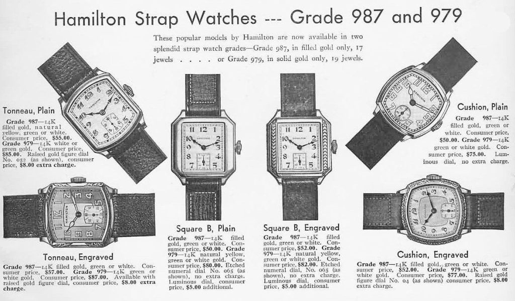
Before we get into why watch manufacturers choose to display that time, let’s go back to the origin story for a minute. As the story goes, the store clerk at the Hamilton Watch Company noticed that when he set the watches to somewhere around 10 after 10, they sold better. So Hamilton set all of its watches for that time, and other watch-makers followed suit. That advertising practice is now a century old, and an example of purposive design that often goes unnoticed.
To my knowledge, there has never been an actual study regarding the psychology of 10:09. (If you come across any formal studies, let me know!) A common explanation is that the watchmaker’s logo is typically below the 12, and having the hour- and minute-hands at 10 and 2 provides a prominent visual frame for the logo. That positioning also conveys a sense of movement and balance, and some have even posited that the hour- and minute-hands create a smiley-face in this position.[3] Another idea is that the cardinal orientation of straight lines and sharp angles are easier for our eyes to process than curves, a tendency that’s “built into the biology of our eyes.”[4]
The Takeaway
Professionals sweat the most minute details, while amateurs overlook them.
Approach visual communication intentionally, and you’re more likely to succeed. There should be a purpose behind including and placing all imagery and text. If your first impression is good, and you can explain the rationale behind the visual choices, you’re in great shape.
Phrasing and framing go a long way toward selling your idea to an audience, but effective visual communication lets the audience feel the same “aha” moment of discovery as you did. When the phrasing, framing, and visual communication of an idea align for a particular public, you’ve effectively grabbed their attention.
Introduction
Visual communication is a vast field, and entire courses, majors, and careers are devoted to its practice. This chapter is therefore just a glimpse at a much broader and more detailed topic.
The point isn’t to transform you into a graphic designer, but rather to ensure a basic understanding of how color, typeface, and visuals influence perceptions of products, services, and organizations.
Even if you might not consider yourself a graphic designer, organizations continue to expect new hires to be able to do a bit of everything. If you understand a handful of general concepts regarding design, you’ll be better able to express what you like or don’t like about a visual concept, using terminology that enhances the credibility of your argument.
What We’ll Cover:
Why it Matters
Sight is the most important sense that consumers use when evaluating brands and their purchasing options. Our visual cortex processes visuals 60,000 times faster than words, and the credibility of a brand or organization is often judged by whether we find their visual identity attractive.[5]
Visual design covers everything from the product’s packaging to the appearance of the office or storefront—even the employees who interact with the public[6]—to the logo, website, fonts, images, symbols, colors and overall layout of marketing materials.[7] Publics tend to align with brands and organizations that provide a better experience at every visual touch point.
The first step on our visual communication, or VisComm, journey is Color Theory, which is essential to understanding what a particular color can convey to a particular audience, and also how different colors interact with one another.
Color Wheel
Ask any local kindergartener, and you’ll learn the primary colors are yellow, red, and blue. They are the colors we can’t make
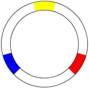
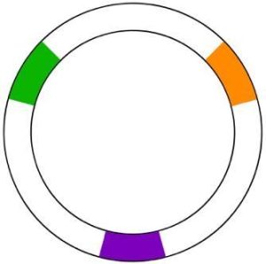
Secondary colors are a mix of those primary colors. So yellow and red make orange; red and blue make purple; and blue and yellow give us green.
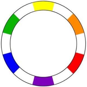 We’re halfway there. The remaining empty spots on our wheel are the colors produced by mixing a primary and a secondary color, known as a tertiary color.
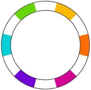
Tertiary colors are yellow-orange, red-orange, red-purple, purple-blue, blue-green, and green-yellow. Those colors are usually referred to by more specific names like chartreuse, cyan, and indigo.
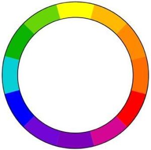
So, here’s our full color wheel with the 12 basic colors: Three primary, three secondary, and six tertiary.
The color wheel is useful for understanding colors and selecting combinations that work well together. Designers refer to the purposive selection of colors as a color palette.
Colors are also grouped into temperatures: warm and cool.
Blue is the only primary color in the cool spectrum, which means other colors are created by combining blue with a warm color (yellow for green and red for purple). Greens therefore take on some of the attributes of yellow, while purple takes on some of the attributes of red. And while green and purple are technically cool colors, there are warmer and cooler greens and purples.
Cool colors are calming, relaxing, and reserved. They remind us of night, water, and nature. Use cool colors in your designs to convey a sense of calm or professionalism.
Because of the way our eyes process colors, cool colors will naturally recede into the background. They work best as a larger background color.
Warm colors will naturally come forward for the same reason. They work best in text or as an accent color. Warm colors are all truly warm, since both red and yellow are primary colors, and orange falls in the middle. The colors remind us of fall, fire, sunrises and sunsets, and convey friendliness, happiness, and coziness. And if those colors happen to remind you of fast-food restaurants, that’s because red and yellow combinations are perceived as eye-catching, exciting, and connoting speediness. Use warm colors in your designs to convey a sense of enthusiasm, energy, and passion.
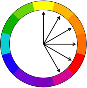
One way to select a color combination is by using complementary colors.
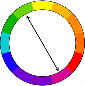
Complementary colors are on opposite ends of the color wheel, which means they’ll have the highest contrast. This is yellow-green (chartreuse) and red-purple (magenta).
You’ll typically want to use one color as the majority color and accent with its complement. A little goes a long way, so use the complement sparingly to draw attention to something important. If you aren’t careful, the design can become overwhelming and difficult to look at, since the eye won’t know where to focus.
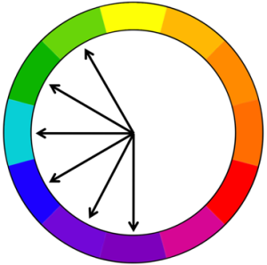
Another way to select a color palette is by picking analogous colors.
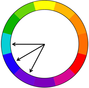
Analogous colors are the colors next to one another on the color wheel. Analogous colors create a harmonious palette because they all share a single color. Here, blue-green, blue, and blue-purple all share a blue base.
Because everything blends together nicely, analogous colors lend a calmer design. The challenge is to find a way to make the most important information stand out since the color contrast is lower than it is for complementary colors.
The Psychology of Color
Color has different meanings in different situations. One unresolved question is whether human reactions to colors are instinctual or if those reactions stem from learning by association.[8]
Natalie Kalmus was the color director for Technicolor Motion Pictures, and a true legend in the movie industry—seriously, check out her IMDB page. In the 1930s, she produced a color chart, as well as Color Consciousness, in which she discusses how the “psychology of color…can subtly convey dramatic moods and impressions to the audience.”[9] While she originally produced this work for Hollywood, many of her observations continue to influence designers in all walks of life nearly a century later.
Colors can convey different ideas across cultures and nations, and can have different meanings based on demographic factors.[10] At the same time, the following list of colors and descriptors is widely accepted as a “default” interpretation for audiences in the United States.
Red is associated with passion, danger, love, and anger. It’s linked with fire and violence, increasing blood pressure and heart rates, and creating a sense of urgency. It can be a powerful accent color, but can become overwhelming if it’s used too much in design. Red can be very versatile, with brighter reds being more energetic and darker shades being more powerful and elegant. You’ll see this color in automobile and food advertising as well as clearance sales.
Orange is a vibrant and energetic color that conveys energy, happiness, and vitality. Muted orange colors can remind us of the earth, fall, and changing seasons. It can represent change and movement in general. Orange can be playful, but also a bit aggressive and can help create a call to action. It commands our attention in design without being as overpowering as red, and is often seen as more friendly and inviting.
Yellow is the first color our eyes process. It’s the brightest and most energizing of the warm colors, and is associated with happiness and sunshine. It’s optimistic and youthful. It can also be associated with caution, cowardice, and deceit. In design, bright yellows lend a sense of cheerfulness. Softer yellows are commonly used as a gender-neutral color for babies and young children. Lighter yellows lend a calmer feeling of happiness than bright yellows. Dark yellows and gold-hued yellows can look antique and be used in designs where a sense of permanence is desired.
Green is the easiest color for the eyes to process. It can represent new beginnings and growth, as well as nature and abundance. It can also be associated with envy or lack of experience. It has the same calming attributes as blue, but also incorporates some of the energy of yellow. Stores use it to help customers relax. In design, it can have a balancing and harmonizing effect. It’s appropriate for designs related to wealth, stability, renewal, and nature. Brighter greens are energizing and vibrant, olive greens are representative of the natural world, and dark greens are the most stable and representative of affluence.
Blue connotes a sense of calm and responsibility, but can also signify sadness. It’s often associated with loyalty, trust, and sincerity, and is frequently used by banks and businesses. In design, the exact shade of blue will have a tremendous impact on how it is perceived. Lighter blues are refreshing and friendly, while darker blues are strong and reliable. The color blue is associated with peace and often has religious and spiritual connotations. Dark blues are excellent for corporate sites or designs where strength and reliability are important.
Purple is associated with royalty, because historically it was the most labor-intensive color to produce, as it was originally made with snails. Legend has it that Hercules’s dog discovered the pigment—a story too good to fact-check! Today, purple is also associated with creativity and imagination. It soothes and calms, and is often seen in beauty or anti-aging products. Dark purple lends a sense of wealth and luxury, while lighter purples are softer and can be associated with spring and romance.
Black is the strongest of the neutral colors. Neutral colors often serve as the backdrop in design and are commonly combined with brighter accent colors. The meanings and impressions of neutral colors are more affected by the colors surrounding them than warm and cool colors. Black is used in edgy or elegant designs and can be conservative, modern, traditional, or unconventional. It can convey mystery, sophistication—or evil—and is often used to market luxury products.
White is a neutral color that works well with almost any other color. It’s associated with purity, cleanliness, and virtue. It’s popular in weddings and the health care industry. In design, it’s considered a neutral backdrop that allows other colors to have a larger voice. It can help convey simplicity and is popular in minimalist designs. It’s also the best background for reading black text.
Components of Visual Communication
The more you get into design, the more ideas you come across—ranging from line, shape, value, color, texture and type to alignment, contrast, balance, proximity, repetition, unity, form and format—just to name a few. There’s a free video, “The Fundamental Elements of Design,” that provides a brand-centric overview of basic design terminology in less than 3 minutes.
Robin Williams, author of the classic Non-Designer’s Design Book, contends four principles of design influence every design project: proximity, alignment, repetition and contrast. Understanding these concepts and knowing how to adjust them can transform an “okay” design into something visually stunning.
Proximity means that items that are related to one another should be grouped together closely. This helps the viewer process the information by providing structure and reducing visual clutter. It’s important to note that the concept does not mean that everything should be bunched up, but certain elements should be both logically connected and visually connected. The Nielsen Norman Group published a nice overview of Proximity with several examples.
Alignment means that every element should be placed with precision. Every element should have a visual connection with other elements. There is a natural tendency to center elements, which works in some cases, but also may be too boring. Meanwhile, a strong left or right alignment, paired with proximity, could substantially improve the feel of the design. For more on Alignment, here’s an overview with examples.
Repetition means repeating different design elements throughout by font, shape, color, line thickness, and concept, to name a few. Repetition unifies the design and creates a sense of cohesion. Look at a website, a pamphlet, or even this text, and you’ll see visual elements repeated. The Interaction Design Foundation put together a nice primer on Repetition, and the related concepts of pattern and rhythm.
Contrast is perhaps the most important concept, as it draws the viewer into the design. The idea is that if elements do not belong together, you should make them different. Contrast can help direct the viewer to a particular place, and it should help organize information as well. As discussed in this overview, you can create Contrast through color, size, shape, and typography.
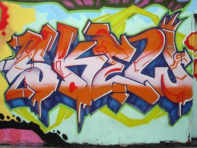
Image used with written permission of the band’s management.
Typography
When we’re so focused on the message itself, it can be easy to forget about the visual experience that accompanies the message.
Typography is the art and science behind arranging type to appeal to an audience. The type itself should be seen as “an art form of shapes, curves, circles, and lines” that connect with the brand personality and the target audience.[11] In short, it is “word art.”[12]
Typeface and Font are terms often used interchangeably in informal conversation, but they are different: A typeface, such as Times New Roman or Helvetica, is a collection of related fonts, like bold and italics.
The most basic classification for type styles is Serif and Sans Serif. Serif styles feature decorative “feet” or “tails” on individual letters.[13] Sans is the French word for “without,” and sans serif styles feature straight lines without feet or tails on individual letters.
Common serif fonts include Times New Roman, Baskerville, and—my personal favorite—Georgia. Serif fonts harken back to a pre-industrial time when calligraphy was more common. For that reason, it’s viewed as traditional, authoritative, and reputable. It can also convey a sense of delicate refinement. For practical purposes, serif fonts are often used for a larger body of text as it’s believed to be easier for the viewer to visually process, due to the more pronounced differences between individual letters. The serifs also lead the eye more easily from one letter to the next, which enhances the flow for the reader.
Common sans serif fonts include Arial, Calibri, and—perhaps the only typeface to have its own documentary—Helvetica. Sans serif fonts represented such a break from the norm that they were referred to as “grotesque” when they first appeared in the 1920s, and that nickname has persisted. In the mid-20th century, new sans serif typefaces like Helvetica were called “neo-Grotesque,” but quickly became popular as they were seen as a cutting-edge alternative, offering a clean, neutral, and approachable look. For practical purposes, sans serif type styles are often used when space for text is limited. Common applications are billboards and visual presentations, as well as apps and websites that someone typically interacts with on a smaller, lower-resolution screen.
For our purposes, it’s not essential to memorize every term used by designers, but the most common descriptors for individual letters include the baseline, median, X-height, ascender, and descender.
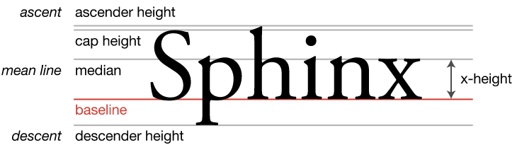
The baseline is the bottom line on which most letters are placed. The median is the ceiling for most lower-case letters, and the space between the baseline and median is referred to as the x-height because it’s equal to the height of a lowercase “x.” The greater the x-height, the more legible it becomes. Ascender refers to parts that rise above the median, and descender refers to parts that fall below the Baseline.[14]
Weight refers to how thin or thick individual characters are, and kerning refers to the space between letters. Kerning can wind up being important: Take a 2-minute break and search for “bad kerning examples.”
Readability and legibility are also often used synonymously in informal conversation, but they are different. Readability refers to the ease of reading the entire text, while legibility is a “zoomed in” version of that concept, used to describe how easy or difficult it is to distinguish individual characters from one another.
Experts Talk Back:
Three Questions with Dr. Ren-Whei Harn, graphic designer in the greater Kansas City area.
Q: You’ve rebranded and crafted visual identities for a lot of different clients. And I’m sure that each situation is a little different—if not a lot different—but can you describe the process of working with those clients to come up with the rebranding? How much of it is their vision? How much is your vision? How much is a shared vision, and what’s that give-and-take like?
My recent clients in the last five years have been pharmaceutical companies, and that’s a whole different beast. But in a broad sense, on a more typical design project—it could be for a book or for a tattoo or for a brand: We’ll have a kick-off where they share their ideas; what they’re wanting to do with it, their usual target audience, primary audience, secondary audience, and the look and feel that they’re thinking of.
And then from there what we usually do is assemble mood boards with at least three very solid concepts—three different visual directions, and then present that to the client and see what they respond to. Because this is the point where, there’s three different paths here: Which path do we take? Or do we need to combine some things and then come up with Option 4?
So then from there, you start distilling from these mood boards colors, typography, the font, and things like that.
Q: You mentioned in the last few years that you’ve done a lot of work with pharmaceutical companies. From the outside looking in, it seems like that may be a space that’s less about whimsy and cutting-edge creativity and instead places value on the design and images that reinforce ideas like reliability and safety or credibility and things like that. First, I don’t know if that’s a fair characterization. Is it helpful to have those parameters or does that make your job more challenging?
It’s always good to have a framework to help guide your work.
I really don’t like it when clients are like, “Well, I’m open to anything.”
I’m like, “Well, no you aren’t. You will not be.” (Laughs).
So, in working with pharmaceutical companies, we do have our framework. There are ways to be creative. We try to push in different ways because the market is so crowded for certain drugs that you really want to differentiate. So, you don’t want to be too clinical.
There’s two different ways with pharmaceuticals, and it depends on the audience. So, if you’re marketing it to consumers, you need to know “Am I marketing this to 20-year-olds or am I marketing this to 40-year-olds?” because that’s going to have a very different look and feel.
Whereas our other side is you’re marketing to health care professionals, and usually that isn’t very sexy because health care professionals just want to see the information they want to see, because they’ve seen so much of this. So, look and feel and trying to make it exciting isn’t a priority with them; It’s actually just visual hierarchy of information—trying to discern what information they’re going to look for, highlighting the keywords they’re going to look for, and just making sure that if they’re going to a site that they’ll find something really quick and then move on with their day.
Q: What advice would you have for students who will graduate in the next few years and enter the field of public relations and strategic communication, maybe with a design emphasis?
They won’t be designers. The important thing is for them to know how to communicate with designers.
If something’s not working, to be able to communicate instead of just “Well, I don’t like it.” Well, what’s not working? Is it the low contrast? Is it the framing? Is it the crop of the image? Is it the scale? Is it the visual hierarchy?
Because being able to identify visual hierarchy is a huge thing: What does your eye see first? Being able to be really in tune with what your eye sees first, and being able to describe that.
Q: Piggybacking off that, I understand there are concepts such as proximity, alignment, repetition, and contrast—what other terminology or concepts do you think are most important for students to be able to communicate what they’re thinking or feeling about something to a designer?
Those general principles are good.
I’m trying to think about our clients’ push back. It oftentimes probably boils down to the visual hierarchy: Just prominence of things—whether the headline and the image are competing.
If you want a more splashy image, you’re going to detract from the headline. You can’t have both. Every person sees things in a process. There’s going to be 1, 2, 3, 4.
And then there’s some bad designers out there that don’t really abide by it, and that’s where you really see design fall apart. But if you pay attention to visual hierarchy, then everything else falls in line. So, if you’re saying, “Well, in these two sets of copy, my eyes are bouncing between them.” Do we need to pull them apart? Do we need to make one bigger, or do we need to set one on a darker background to make it pop more?
So, if you can figure out that process of vision and reading, everything else will work itself out. That’s my theory. (Laughs).
Best Practices for Photos/Instagram Ideas
For new products, it’s best to go with a picture of the product or someone using it.
To call attention to company culture and employees, humanize the brand. Give the viewer a “backstage pass” and provide images of behind-the-scenes activities. People want to see who works there and who is actually on social media. Don’t use traditional headshots, make it fun and relaxed—not someone sitting at a desk.
For trending topics and events, you need to stay up-to-date about what matters to your followers. Post pictures of the news, fun facts, and trending events and topics.
Finally, photo contests are a fun way to engage users. People submit their own images in exchange for recognition from a brand they like: It’s a win-win.[15]
Best Practices for Videos
Some of the more basic ideas for videos include unboxing a product, demonstrating a product, producing how-to or educational videos, and interviewing people.
For these videos, show—don’t sell.
A quality video is crafted with purpose. You need to know your audience and the platform on which you’ll reach them. (Again, it all comes down to understanding purpose, audience and method.) Sketching out ideas on a storyboard is a good first step.
Pay attention to the style and tone, including the tone of the message, the dialogue, production quality, video quality, and audio quality.
Does the script do enough, or is it trying to do too much? Either of those will bore the audience.
Consider the lighting, the angles and shots you want, and how those will be edited. Finally, how will you share and spread this particular video?[16]
This is just a brief checklist of some of the considerations that go into producing a successful video.
One example of great use of visual design was a classic Public Service Announcement by Metro Trains in Melbourne that encouraged people to be safe around trains—perhaps you’re one of the nearly 300 million views it’s accumulated over the past decade:
Best Practices for Websites
Aim for a simple design, with clear content that’s easy for users to navigate. Home pages that are poorly organized or too content-heavy tend to prevent first-time website users from sticking around.
A simple design means limiting the number of images, the number of words and the amount of information. Unnecessary words and graphics are confusing. Negative space allows a reader to view the entire page, and pay closer attention to what’s there.
All imagery should be proportioned and complement the other elements.
For clear writing, focus on sentence length, and prioritize word choice and brevity. Paragraphs should be short, no more than a few sentences. The writing should be concise and precise, similar to a magazine ad.
The user experience of the website should be as frictionless as possible. This means considering the overall site navigation, as the user should be able to find what they need quickly and easily. The menu tabs need to be arranged in a purposive way that’s helpful and logical. The idea is to make the process feel effortless.[17]
Summary: Putting it All Together
Examples of great visual communication are all around us, as are examples of ineffective visual communication. You may notice that some brands have strategically built a visual identity around a deep metaphor, as was discussed in Chapter 7.
The hope, after finishing this chapter, is that you’re better able to identify and articulate potential issues in the way a client presents themselves to their publics, and are also able to evaluate your own creative contributions with a more critical eye.
Sometimes it’s not what you say, but how you say it. And it’s not the image, but how you convey it.
Whether you’re crafting an advertisement, a post on social media, a video, a website—or any other form of communication—the elements of color theory, and the design principles of proximity, alignment, repetition, contrast, and typography can make or break the effectiveness of that messaging.
Media Attributions
- Hamilton Watch Company ad is licensed under a Public Domain license
- Primary colors
- Secondary colors
- Primary and secondary colors
- Tertiary colors
- Full color wheel
- Cool colors
- Warm colors
- Complementary colors
- Analogous colors
- Eggy logo © Eggy is licensed under a All Rights Reserved license
- Baseline, median, X-height, ascender and descender © Max Naylor is licensed under a Public Domain license
- Readability and legibility © sagesolar is licensed under a CC BY (Attribution) license
- https://museum.seiko.co.jp/en/knowledge/trivia01/ ↵
- Seward, Zachary M., Quartz, 9/10/14. https://qz.com/262524/late-to-watches-apple-watch-set-a-minute-early ↵
- https://www.bbc.com/news/newsbeat-31816570 ↵
- Leach, p. 73. ↵
- Luttrell, p. 127, 129 ↵
- Perloff in Miller, pp. 67-68. ↵
- Miller, pp. 67-68 ↵
- Popa, Popescu, Berehouiu & Berehoiu, 2013. ↵
- Kalmus, 1935, p. 142. ↵
- Popa et al, 2013 ↵
- Blakeman, 2018, p. 83. ↵
- Dylan Todd, quoted in Adobe.com/creativecloud/design/discover/serif-vs-sans-serif.html Accessed 6/21/22 ↵
- Rather than “feet” and “tails,” you may think of them as “hats” and “shoes.” Thanks to Dr. Nicola Corbin for this delightful observation. ↵
- Ed Wasserman, 6/9/16. https://webdesign.tutsplus.com/articles/a-comprehensive-guide-to-typography-basics--cms-26644 ↵
- These ideas are from Luttrell, pp. 131-2, lightly paraphrased here. ↵
- These suggestions primarily come from Luttrell, pp. 133-136. ↵
- These suggestions all come from Juska, pp. 33-4. ↵
