8 Planning Ahead
Forecasting Basics
Evan Barlow
Alex sat nervously at her new desk, anxiously glancing at the clock. It was her first day as Chief Operations Officer at Crumb and Get It, a small but growing company that makes and sells high-end baked goods. While it was great that Crumb and Get It was growing, customers’ primary complaint was the sporadic availability of their favorite baked goods.
"Alex!" shouted a gruff voice. It was Jim Fuller, the CEO. "Great to have you here! First project: We’re having serious issues with stockouts. Our marketing research shows that customers have a strong response to online reviews. Unfortunately, the customers most likely to write an online review are the ones that come into the stores and see a lot of products missing. You're responsible for forecasting product demand and making sure our customers are satisfied and want to come back. Get to it."
Alex gulped. Forecasting? She barely remembered it from school, and she remembered thinking artificial-intelligence-driven software would do everything for her. While in school, she never would have forecasted that her own forecasting ability could make the difference between success and failure in any job, let alone her career.
Even though it was her first day as COO, she was already looking to the future. Jim Fuller was going to be retiring in a few years, leaving an opening in the CEO position. If Alex couldn’t get their forecasts performing well enough to improve their business, she would never be considered as a serious candidate for CEO. Come to think of it, if Alex couldn’t do what was needed to maintain positive reviews, she wasn’t sure Crumb and Get It would survive. How pathetic would it be if she could only keep her position for a few months? She would never be given another chance as an executive.
Frantic, Alex went online and asked her favorite AI chatbot to help her learn the forecasting tools necessary to help her succeed.
Chapter Learning Objectives
- Understand how forecasting promotes successful business outcomes
- Be able to generate forecasts based on data visualizations
- Be able to generate forecasts using simple quantitative methods
- Be introduced to more advanced forecasting methods including Excel's ETS methods
Introduction to Forecasting
“Forecasting,” the AI chatbot said, “is about estimating likelihoods of future events. The simplest forecasts show the most likely future event, while more advanced forecasts show estimates of the likelihoods of all possible future outcomes.”
Alex’s familiarity with forecasting really started and ended with weather forecasts. But she doubted she would be able to apply anything about weather forecasting to demand forecasting. Then again, thinking about possible parallels couldn’t hurt.
Visualization-Based Forecasting
Alex realized that with weather forecasts, we can look all around and get a pretty accurate forecast for the next several hours. With a sense of the direction of the wind, we don’t even need to necessarily look all around – just in the direction the wind is coming from.
“Are there any methods I can use for forecasting product demand that are based on visualizations?” Alex asked the chatbot.
“Absolutely!” replied the chatbot. “Plotting historical product demand data (like the plot I’ve generated and shown below) can be used to get an idea of the expected demand and the anticipated uncertainty in demand.”
“Using the chart, try to come up with your best guess for tomorrow's demand. Also try to estimate the smallest demand range so that you’d be 90% confident that the actual value of tomorrow’s demand will fall in the range. This activity captures the essence of graphical forecasting.”
Using the Prediction Interval
Alex realized the importance of one of the things the chatbot mentioned: “anticipated uncertainty in demand” and found similarity again with weather forecasts. When looking at the weather forecast, tomorrow’s high and overnight low always just show a single number instead of showing the likelihood of each possible high (or low) temperature. However, when talking about precipitation, it was the “chance of precipitation” instead of the expected number of inches of precipitation (although this information is also available if you look hard enough). She realized that a “false negative” (where the weather forecast predicts rain but there is none) is very different than a “false positive” (where the weather forecast predicts no rain but it does rain) in terms of costs. This led to the realization that there is also a massive asymmetry in the consequences of prediction error for “inches of rain:” it matters a great deal for the actual precipitation to be over the forecast by 1 inch, but we shrug it off when the actual precipitation is under the forecast by 1 inch. It’s a similar asymmetry with demand forecasting. Carrying extra inventory is bad, but having a stockout is typically much worse. If Alex were to supply the wrong amount, it’s much better to supply too much than too little. But there are also limits to over-supplying: they can’t afford to have too much in inventory. This must be where the prediction interval enters into the planning process: at some point, the extra expected cost of another unit of inventory will balance the extra expected cost of a stockout. Going forward, she’d keep this in mind.
The Pros and Cons of Graphical Forecasting
She decided to turn back to the chatbot to continue learning about forecasting based on data visualizations.
“I have to warn you,” continued the chatbot, “that while forecasting based on the appearance of charts is a relatively simple and intuitive approach, it opens the door to errors based only on the way the chart looks rather than the historical data itself. Take a look at the different charts in the image slider below. The same historical data is graphed in multiple different ways. Since it’s the same data, all of the graphs should lead to the same forecast. Would you generate the same forecasts for all of the different graphs?”
Integrating Domain Expertise
“It can also help to understand the specifics of the forecast. Products often follow a similar pattern in demand, called the Product Lifecycle. Products typically go through different phases: Introduction, Growth, Maturity, and Decline. Many companies exert effort to extend the Maturity phase of the product lifecycle and delay the Decline phase. Here is some more information and a visualization about the different phases of the product lifecycle.
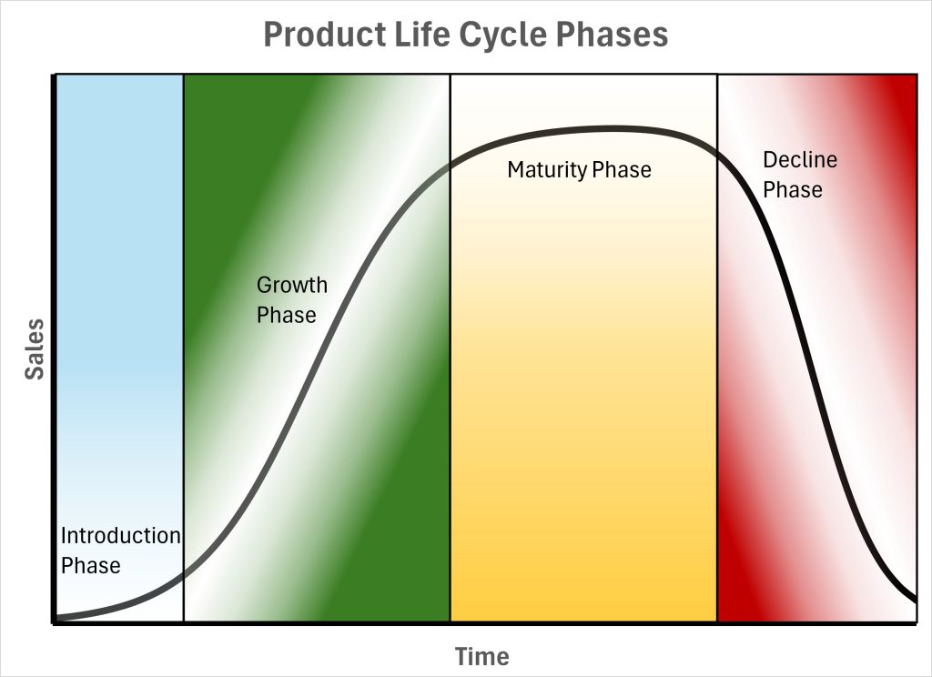
Phases of the Product Life Cycle
Introduction
This is the phase where a product is launched into the market. During this stage, the focus is on generating awareness and interest among potential customers. Marketing efforts are typically high, and sales growth is slow as the product is new and customers are just beginning to learn about it. Companies often incur higher costs during this phase due to promotional activities and initial production expenses. There is often a lot of risk associated with this phase of the product lifecycle since returns from marketing expenses may not be realized. Furthermore, sales are typically too low to take advantage of increased efficiencies that often come with aspects of larger businesses.
Growth
In the growth phase, the product starts to gain traction in the market. Sales begin to increase rapidly as more customers become aware of the product and start purchasing it. The company may expand its distribution channels and improve the product based on customer feedback. Marketing efforts continue, but they may shift towards differentiating the product from competitors. Profits start to rise as economies of scale are achieved.
Maturity
The maturity phase is characterized by sales levelling off as the product reaches widespread acceptance. The market becomes saturated, and competition intensifies. Companies focus on maintaining market share and optimizing profitability. This may involve making incremental improvements to the product, adjusting pricing strategies, and enhancing customer service. Marketing efforts may be geared towards reminding customers of the product's benefits and encouraging repeat purchases.
Decline
Eventually, the product enters the decline phase, where sales begin to fall due to changes in customer preferences, obsolescence, or increased competition. Companies must decide whether to discontinue the product, sell it off, or try to rejuvenate it through innovation or repositioning. Managing reduced demand and planning exit strategies are crucial during this phase to minimize losses.”
Uncertainty and Variability in Life Cycle Curves
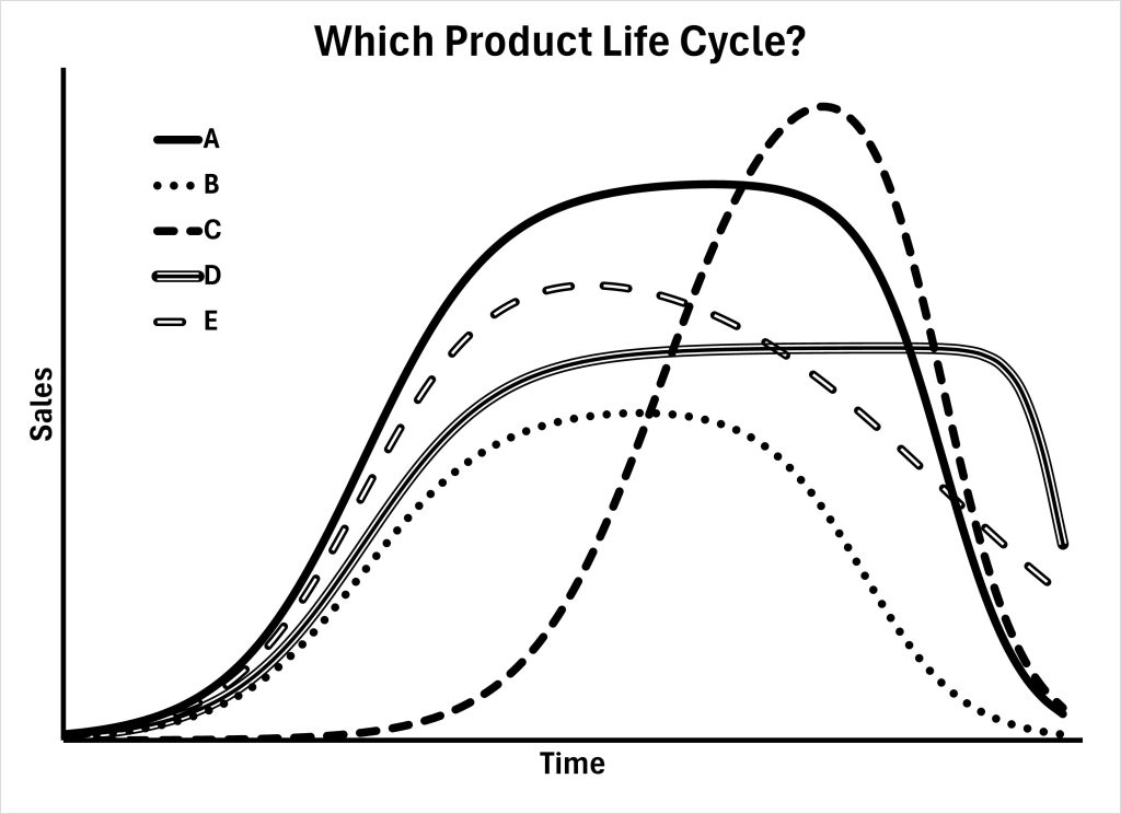
Alex appreciated the perspective of integrating domain knowledge into the forecasting process, but something bothered her. She asked the chatbot, "Does every product exhibit a similar Life Cycle Curve?"
The chatbot replied, "No, absolutely not. The benefit of examining other Product Life Cycle curves is that we can get an idea of general long-term patterns in demand. Let me illustrate a bit more. Below is a chart that shows multiple different hypothetical product life cycle curves. Before a product launch, it is very difficult to tell which curve will be more representative. And even after a product grows to a certain level of demand, it's very difficult to tell which curve will be more representative in the future of the product's life cycle. In other words, the information present in any prior or current phase does not tell you much about future demand."
Quantitatively Simple: Simple Moving Average
The AI chatbot continued, "Integrating domain knowledge can help with both graphical and quantitative forecasting. Quantitative methods for forecasting are typically much less prone to bias from the forecaster. Let’s move on to quantitative methods for forecasting. One of the simplest and most widely used methods for quantitative forecasting is the simple moving average. This method involves averaging a set number of past observations to predict future values. For example, if you want to forecast sales for the next day, you might average the sales figures from the past three days."
“Now, Alex,” continued her chatbot, “I'm assuming you're familiar with the concept of an average. If you need a refresher, try to find some online tutorial articles or videos. Next I’ll explain how the word “moving” fits into simple moving average forecasting."
"Imagine you’re on a flight across an ocean. While the plane is moving, the view through the window is changing with every second that passes – something new enters the view and something old exits the view. This is the idea behind a moving window in forecasting. Forecasting the upcoming landscape from the window of an airplane is like using the most recent sales data to forecast the next day's sales. On a flight across the ocean, the view does change dramatically, changing the forecast dramatically. At the beginning of the flight, the view through the window shows nothing but land with an occasional river or lake. At this point, you would expect the next items that enter the view through the window to be similar to the view you currently see: more land. At some later point, you look out the window and see nothing but ocean. Would you expect the next item to enter your view to be more similar to the current ocean view or the view of land from when the plane first took off? The view is likely to continue to be ocean. The main assumption behind a moving window for forecasting is that the most recent view through the window captures everything we need to know to generate a forecast of the future.”
Alex thought about flying across the ocean. It made sense to her that her view was changing on an airplane, but she wasn’t completely sure how this transferred to forecasting product demand. She asked her chatbot, “Generate some content to help me understand how a moving window is applied to forecasting product demand.”
“Sure thing, Alex!” came the response. “The animation below captures the idea of a moving window in forecasting product demand. The plot in the animation has windows of six days of data, four days, and two days.”
“So, Alex, the simple moving average forecasting method uses a moving window to forecast the future, and any information in the window is averaged to generate the forecast. Any information older than what appears in the window is ignored. Below is the animation from above but with a simple average of the data inside each window being used as the forecast for the next time period."
Alex began to feel more confident as she learned about forecasting. She asked, “What are the advantages and disadvantages of the simple moving average forecasting method?”
She read intently as her chatbot explained the advantages of the simple moving average method. “The simple moving average forecasting method is easy to understand and implement, making it a great starting point. It smooths out short-term fluctuations so that businesses don’t over-react to random variation in demand. Furthermore, if product demand changes meaningfully, the simple moving average forecast eventually catches up."
The chatbot also pointed out the shortcomings of this method. "While the simple moving average is useful, it has its limitations. It doesn't account for seasonal variations or increasing (or decreasing) trends, which can be critical for seasonal products or for products in the Growth and Decline phases of the Product Life Cycle. Additionally, the simple moving average forecasting method gives equal weight to a specified number of past observations, which might not be ideal if more recent data is more relevant."
Alex nodded, absorbing the information. She decided to apply the simple moving average method to forecast the demand for one of their most popular products, Classic Chocolate Chip. By averaging the sales data from the past three weeks, she was able to create a basic forecast of daily demand. Although it wasn't perfect, it gave her a starting point for quantitative forecasting.
Forecasting Further into the Future
Alex realized that a lot of the decisions facing the business have to be made weekly or even monthly. That meant she needed forecasts for the next week of demand and the next month of demand. Alex asked her chatbot, "How can I use the quantitative forecasting methods that generate daily sales forecasts to generate a forecast of the demand for the next week or month?"
The chatbot replied, "Just assume that tomorrow's forecast turns out to be perfectly correct and then use tomorrow's forecast as the data for the forecast for the day after tomorrow. Then use both tomorrow's forecast and the forecast for the day after tomorrow as data to help generate the forecast for sales three days from now. Continue this until you have a forecast as far into the future as necessary. Then add up all of the necessary daily forecasts to get the forecast for either the week, month, quarter, or even year. I should warn you that a daily forecast that uses data from the most recent few weeks is probably not going to be very accurate for predicting sales for the next year. The animation below shows this use of historical data along with some forecasts to extend the forecast even further into the future."
Assessing Performance of a Forecast
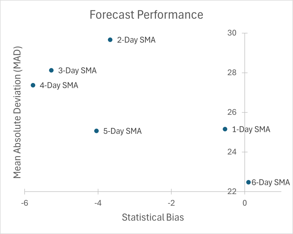
Alex appreciated what she had learned about the simple moving average. But her chatbot had shown her a simple moving average with a 2-day, 4-day, and 6-day window. Her chatbot had told her that a fewer number of days in the window made the forecast more responsive to change but possibly over-responsive to random variation that does not represent legitimate change. But how would she even know if one window size is better or worse than another? She asked her chatbot, "How do I get a number that tells me how many days I should include in my simple moving average window? For that matter, how do I get a number describing how well any forecasting method performs? How can I compare one forecasting method to another one? How would I know which forecasting method is better?"
The chatbot replied, "Excellent questions. When you're making forecasts, you should understand both statistical bias and the uncertainty or random variability. If forecasts are consistently too high or too low, the forecasts suffer from statistical bias. If one forecast method gives larger bias, it is less preferred. Furthermore, if the differences between a model's forecasts and the actual observations are more chaotic, then that model's forecasts are less preferred. To understand how good your forecasting method is, you need easy-to-understand measures that capture these two features of forecasting performance. Two key concepts to help you evaluate your forecast accuracy are called statistical bias and the mean absolute deviation (or MAD).
The error in a forecast is the difference between the expected value of the forecast and the actual observation. For example, suppose a model forecasts that 200 units will be sold but only 180 units end up being sold. The error would be 20 units. On the other hand, if a model forecasts that 200 units will be sold but 215 units end up being sold, then the error would be -15 (negative 15) units. The mathematical equation for the error is:
[latex]error_i =Actual_i - Forecast_i = A_i - F_i[/latex].
In this equation, [latex]A_i[/latex] represents the actual value that was observed, and [latex]F_i[/latex] represents the value of the forecast.
Statistical bias is simply the negative average of the errors. A positive bias means that the forecast is consistently over-estimating, and a negative bias means that the forecast is consistently under-estimating. The equation for calculating the statistical bias of a forecasting method is:
[latex]bias = -Average(errors)[/latex].
While bias (or error) tells you about the direction of forecast errors, it doesn't say much about how large or significant those errors are. That's where the mean absolute deviation (MAD) comes in. The MAD gives you a sense of the typical magnitude of the errors, regardless of whether they're above or below the actual values. To calculate MAD, follow these steps: first, you find each forecasting error, then take the absolute value of each error (make each error positive). Finally, you average all of the absolute values of errors. If you're interested, the mathematical equation for calculating the MAD is below:
[latex]MAD=Average(Absolute Value(errors))[/latex].
Together, statistical bias and MAD give a pretty clear picture of forecasting performance: bias reveals whether forecasts are regularly too high or too low, while MAD shows how far off forecasts typically are. Forecasting methods that give lower values for both statistical bias and MAD are almost always preferred."
This was a lot for Alex to process. Nobody had told her during the interviews for COO that she would need to calculate forecasting errors! She turned back to her computer screen and told her chatbot, "Walk me through the process of using the statistical bias and MAD to find the best window for the simple moving average forecasting method."
"Sure thing, Alex," replied the chatbot. "Let's walk through the calculations for the data we looked at before. Since this is just an illustration, we'll see which window size is better, the 2-day or the 6-day window. The first step is to calculate the simple moving average forecast for each window size. The second step is to calculate the error for each forecast. The third step is to calculate the average of the error -- this is the statistical bias. This can easily be done with the AVERAGE formula in Excel. Next, we calculate the MAD, the average of the absolute value of the errors. Unfortunately, there's no Excel formula for the MAD; but we can use the ABS function to calculate the absolute value of each error and then average the absolute values of the errors using the AVERAGE function. So the Excel formula to calculate the MAD looks something like this: AVERAGE(ABS(Errors)). For the last step, we plot the statistical bias and the MAD for each window size to find out which is best.
Step 1: Calculate the forecast for each moving window size.
To calculate the forecast for each day, average the most recent sales data with the appropriate forecast window. The table below shows an example formula that would be used for each forecast window to generate the forecast for that cell. In the cells below the example formula, the results are shown.
| A | B | C | D | |
|---|---|---|---|---|
| 1 | FORECASTS | Forecast Windows | ||
| 2 | Day of Week | Observed Sales | 2-Day SMA Forecast | 6-Day SMA Forecast |
| 3 | Sunday | 161 | ||
| 4 | Monday | 112 | ||
| 5 | Tuesday | 123 | =AVERAGE(B3:B4) | |
| 6 | Wednesday | 142 | 117.5 | |
| 7 | Thursday | 166 | 132.5 | |
| 8 | Friday | 182 | 154 | |
| 9 | Saturday | 202 | 174 | =AVERAGE(B3:B8) |
| 10 | Sunday | 125 | 192 | 154.5 |
| 11 | Monday | 124 | 163.5 | 156.67 |
| 12 | Tuesday | 156 | 124.5 | 156.83 |
| 13 | Wednesday | 170 | 140 | 159.17 |
| 14 | Thursday | 150 | 163 | 159.83 |
| 15 | Friday | 137 | 160 | 154.5 |
| 16 | Saturday | 168 | 143.5 | 143.67 |
Step 2: Calculate the error for each forecast.
To calculate the error for each forecast, the forecast value for each day for each moving window size is subtracted from the actual observed sales for the day.
| A | B | C | D | |
|---|---|---|---|---|
| 21 | ERRORS | Forecast Windows | ||
| 22 | Day of Week | 2-Day SMA Forecast | 6-Day SMA Forecast | |
| 23 | Sunday | |||
| 24 | Monday | |||
| 25 | Tuesday | =B5-C5 | ||
| 26 | Wednesday | 24.5 | ||
| 27 | Thursday | 33.5 | ||
| 28 | Friday | 28 | ||
| 29 | Saturday | 28 | =B9-D9 | |
| 30 | Sunday | -67 | -29.5 | |
| 31 | Monday | -39.5 | -32.67 | |
| 32 | Tuesday | 31.5 | -0.83 | |
| 33 | Wednesday | 30 | 10.83 | |
| 34 | Thursday | -13 | -9.83 | |
| 35 | Friday | -23 | -17.5 | |
| 36 | Saturday | 24.5 | 24.33 | |
Step 3: Calculate the statistical bias for each moving window size.
To calculate the average statistical bias for each moving window size for the simple moving average forecast method, the columns in the above table are averaged and made negative. The table below shows the formulas for calculating the average statistical bias for each forecast window in one row with the results of the calculations in the row below.
| A | B | C | D | |
|---|---|---|---|---|
| 41 | BIASES | Forecast Windows | ||
| 42 | 2-Day SMA Forecast | 6-Day SMA Forecast | ||
| 43 | Formulas | =-AVERAGE(C25:C36) | =-AVERAGE(D29:D36) | |
| 44 | Results | -3.667 | 0.104 | |
Step 4: Calculate the MAD for each moving window size.
In the calculations shown here, we use the function combination mentioned above: AVERAGE(ABS(errors)).
| A | B | C | D | |
|---|---|---|---|---|
| 51 | MAD | Forecast Windows | ||
| 52 | 2-Day SMA Forecast | 6-Day SMA Forecast | ||
| 53 | Formulas | MAD | =AVERAGE(ABS(C25:C36)) | =AVERAGE(ABS(D29:D36)) |
| 54 | Results | 29.67 | 22.48 | |
Step 5: Plot the MAD and the statistical bias for each window size to see which one is best.
The scatter plot below shows the performance of the moving window sizes based on each window's average statistical bias and mean absolute deviation (MAD). To be a bit more complete, I've completed the statistical bias and MAD calculations for moving windows between 1-Day and 6-Day and have plotted all of them in the scatter plot below. According to the analysis, the 6-Day Simple Moving Average forecast gives the lowest average statistical bias (i.e., the average statistical bias is closest to zero) and the lowest MAD. Out of the six moving average forecast window sizes, a 6-day window is best."
"Okay," Alex thought. "I can do this." But she knew she was out of time -- she needed to get the orders for ingredients processed and she needed to make sure all of the stores were ready to handle the supplied quantities. She got the data for the last several months and completed the simple moving average calculations for all of the cookie varieties at all of the stores. She even looked at the visualizations of sales to estimate the 90% prediction interval. Because the margins on the cookies are so favorable, she decided to make sure enough cookies were supplied to cover the upper limit of the 90% prediction interval plus a little bit extra.
Next Steps: Beyond Simple
It was a good thing she had ordered extra ingredients -- she had forgotten that sales had been growing. This made sense with the statistical bias she had found in her analysis: the forecast was almost always under-estimating demand. She turned back to her AI chatbot and asked, "What improvements do I need to make in my forecasting to account for growth in sales?"
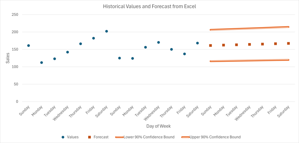
The AI responded, "When sales are increasing over time, a simple moving average forecast typically under-estimates demand. The simple moving average forecasting method is best-suited to data that are relatively consistent over time. You should look at the built-in forecasting functionality in Excel using the "Forecast Sheet" if you're using a Windows PC or the FORECAST.ETS functions if you're on a Mac. These use a technique called "exponential smoothing" that makes several improvements over the simple moving average. First of all, the exponential smoothing methods place consider more recent data to be more relevant than older data; but they never completely stop using older data either. Secondly, the exponential smoothing methods in Excel are actually triply-exponentially smoothed; so they allow for something like a "moving average," a "moving trend," and "moving seasonality." The functionality in Excel can even automatically give you an estimate of the prediction interval. As an example, check out the visualization below."
This was music to Alex's ears. While one side of her wished she could have just started with the Excel functionality, another side reminded her that working through the simple moving average methods has prepared her to better understand how to use the tools in Excel, how to interpret the output from Excel, and how to make decisions based on Excel's ETS forecasts.
Alex was pleased with the progress she had made with forecasting. Her changes had resulted in immediate and significant improvement in customer satisfaction and profits. With these improvements, they might be able to start growing even faster. She definitely needed to learn the more advanced methods and get them ready to be deployed in practice as soon as possible. Motivated by her success in her new role as COO, she turned back to her computer to keep learning about how to make better decisions with better forecasts.
Media Attributions
- Example Product Life Cycle © Evan Barlow is licensed under a CC BY-NC-ND (Attribution NonCommercial NoDerivatives) license
- Life Cycle Uncertainty © Evan Barlow is licensed under a CC BY-NC-ND (Attribution NonCommercial NoDerivatives) license
- MAD-and-Bias-Scatter-Plot © Evan Barlow is licensed under a CC BY-NC-ND (Attribution NonCommercial NoDerivatives) license
- Excel ETS Forecast © Evan Barlow is licensed under a CC BY-NC-ND (Attribution NonCommercial NoDerivatives) license
