7 Good Business Decisions Start With Data
Introduction to Data Visualization and Storytelling
Ben Neve
Learning Objectives
- Understand the limitations of a set of data
- Use Microsoft Excel to filter, organize, and visualize data
- Select relevant visualizations for qualitative and quantitative data
- Present and discuss data clearly and concisely
- Evaluate a complex situation using the C.A.R. method (Context, Analysis, Recommendation)
Starting with Data
Imagine starting a shaved ice business, beginning with only the resources you have now. Your first reaction would likely be to start looking for data. Consider the following sequence of questions:
- How much shaved ice can a person generate by scraping a robust soup spoon across the surface of a frozen chunk of ice?
- How long will it take, using the inexpensive spoon method, to get enough for a single serving of shaved ice?
- How much will it cost to purchase an actual shaved ice machine?
- How much money do you have?
- How much will it cost to rent a shaved ice machine?
- Where can you get flavors?
- Which flavors are customers most interested in?
- How much should you charge for each cup of shaved ice?
- Where would be a good place to set up your shaved ice stand?
- How many customers should you expect to serve each week?
- Can you justify the work required to make the business successful?
A potential shaved ice business owner would probably ask ALL of these questions, and more, because the information is critical to developing their business plan. Imagine the huge number of questions asked across a complex global supply chain, every day!
Because of these kinds of important questions and more, decision makers can’t ignore the need for data. With higher quality data, coupled with the appropriate analyses, managers are more likely to make great decisions. This is especially true across supply chains, where the complexity and changing nature of different industries make data all the more valuable.
So, we need to understand some basic characteristics of data, how to analyze data, and then how to interpret and take action based on what we learn.
Assuming we have good data, the most prolific tool for analyzing data today is spreadsheets, and the most common and capable spreadsheet software is Microsoft Excel (we can rock-paper-scissors any disagreements about this at a later time). This text will rely on Excel for data analysis and other calculations, though much of what is covered in this introductory chapter can be performed in other spreadsheet software, or by using generative AI tools such as Perplexity, Gemini, Grok, ChatGPT, Copilot, Claude, Deep Seek, etc. (assuming you know what to ask in your prompts!!).
Tools for Processing Data and Analysis
For this introductory text, we are going to limit our introduction of data analysis to the following key tools, techniques, and skills:
- Understanding basic data types
- Summarizing and describing data
- Data filtering and sorting
- Pivot tables
- Categorical data visualization
- Numerical data visualization
- Storytelling with data and the C.A.R. method
This text assumes a basic understanding of Excel navigation. For interested readers, Appendix 1 at the end of this chapter includes an overview of what students should already be familiar with, as well as some basic shortcuts and techniques that are useful for laptop users.
The rest of this chapter will go through the tools, techniques, and skills required for the remainder of this book, beginning with an introduction to data types.
Understanding Basic Data Types
Data comes in many forms: numbers, words, pictures, sounds, videos, and really anything that can be observed and recorded. Supply chain managers use all kinds of data to understand how everything is operating, but we are going to primarily focus on two basic types of data: numerical and categorical.
Numerical data is quantitative data that was generated by some kind of measurement. Weight, dollars, temperature, speed, and volume are just a few examples. Technically, the numerical data type can be broken down further, into interval data or ratio data. For our purposes, we want to focus on the fact that numerical data is measured quantitative data.
Categorical data, on the other hand, is generally qualitative in nature. Gender, location names, categories, and even scaled rankings can be considered categorical. Similar to Numerical data, Categorical data is often broken down into subcategories. Ordinal categorical data has a specific order like restaurant ratings or classifications of business sizes, and Nominal categorical data has no implied order, such as marital status or gender.
A Food Manufacturer’s Need for Data
Remember the cultural significance of peanut butter and honey sandwiches from the first chapter? In this chapter, we are going to look at a company named “Shef B. Foods”, to help us learn and apply the basics of working with data.
Shef B. Foods, as EVERYONE knows, is famous for their Peanut Butter and Honey sandwiches.
Recently, Shef B. Foods gathered some data to try and improve their sandwiches even further.
Below, we list what they specifically wanted to know, and why:
- Which is the best brand of bread? (Dunford Bakery or Grandma Sycamore’s)
- … for highest customer ratings? (quality)
- … for productivity/speed of sandwich construction? (labor cost)
- What’s the preferred peanut butter brand? (Adams, Peter Pan, Jif, Skippy, or Smucker’s)
- … for highest customer ratings? (quality)
- … for productivity/speed of sandwich construction? (labor cost)
- What is the preferred type of peanut butter? (Creamy or Chunky)
- … for highest customer ratings? (quality)
- … for productivity/speed of sandwich construction? (labor cost)
- Which Chef has the best technique? (Ben, Francois, Shane, Hugo, or Evan)
- … for highest customer ratings? (quality)
- … for productivity/speed of sandwich construction? (labor cost)
- … for least amount of ingredients used? (raw material cost)
- What sandwich temperatures are more preferred? (measured in degrees Fahrenheit)
- … for highest customer ratings? (quality)
To get the data, Shef B. Foods conducted a randomized study, where they watched their 5 best Chefs make about 50 PB&H sandwiches using different kinds of ingredients and methods, as mentioned above. They recorded the ingredients (brands, volumes, weights), the sandwich temperatures, and the assembly times, as well as which Chef made each sandwich.
Then, a group of loyal, experienced customers tried each of the experimental sandwiches and rated the flavor on a scale from 1 to 5. A score of 1 meant that the sandwiches were much worse than normal, and a 5 meant the sandwiches were much better than normal. A score of 3 meant that the customers rated the sandwich as being the same flavor/quality as a normal Shef B. Foods PB&H sandwich.
That data is located here: Clean Sandwich Data
In the table below, we have defined some of the Shef B. Foods by the data type, how the data was collected, and why it was collected.
TABLE 4-1
|
Measurement |
Example Data |
Data Type |
How collected |
Why collected |
|---|---|---|---|---|
|
Volume of peanut butter |
16.7 grams |
Numerical (Ratio) |
Weigh on kitchen scale |
Monitor consistency of ingredients in each sandwich |
|
Brand of peanut butter |
Jif |
Categorical (Nominal) |
Read each jar label during use |
Test customer preferences for different brands |
|
Sandwich assembly time |
106.78 seconds |
Numerical (Ratio) |
Stopwatch used to time each Chef’s sandwich assembly time |
See which Chef uses the fastest sandwich assembly method |
|
Customer flavor ratings |
Much worse (1) |
Categorical (Ordinal) |
Customers record flavor ratings on feedback cards |
Monitor the quality of the sandwich in comparison to the normally produced sandwich |
|
Sandwich Temperature |
77.3° F 91.5° F 71.0° F |
Numerical (Interval) |
Food thermometer reading in center of sandwich |
Find the ideal sandwich temperature for optimal taste |
The type of data you have determines the kind of charts you can make, the kind of analysis you can do, and the kind of statistical techniques you can apply. The data type also affects how data is collected.
The most important aspect of data is its purpose. Collecting data just to have data is potentially wasted effort, which is why in the table we included the column “Why Collected”. There may be several reasons to collect certain information, but there should be intentional reasoning behind spending time and money to gather data.
Raw Data
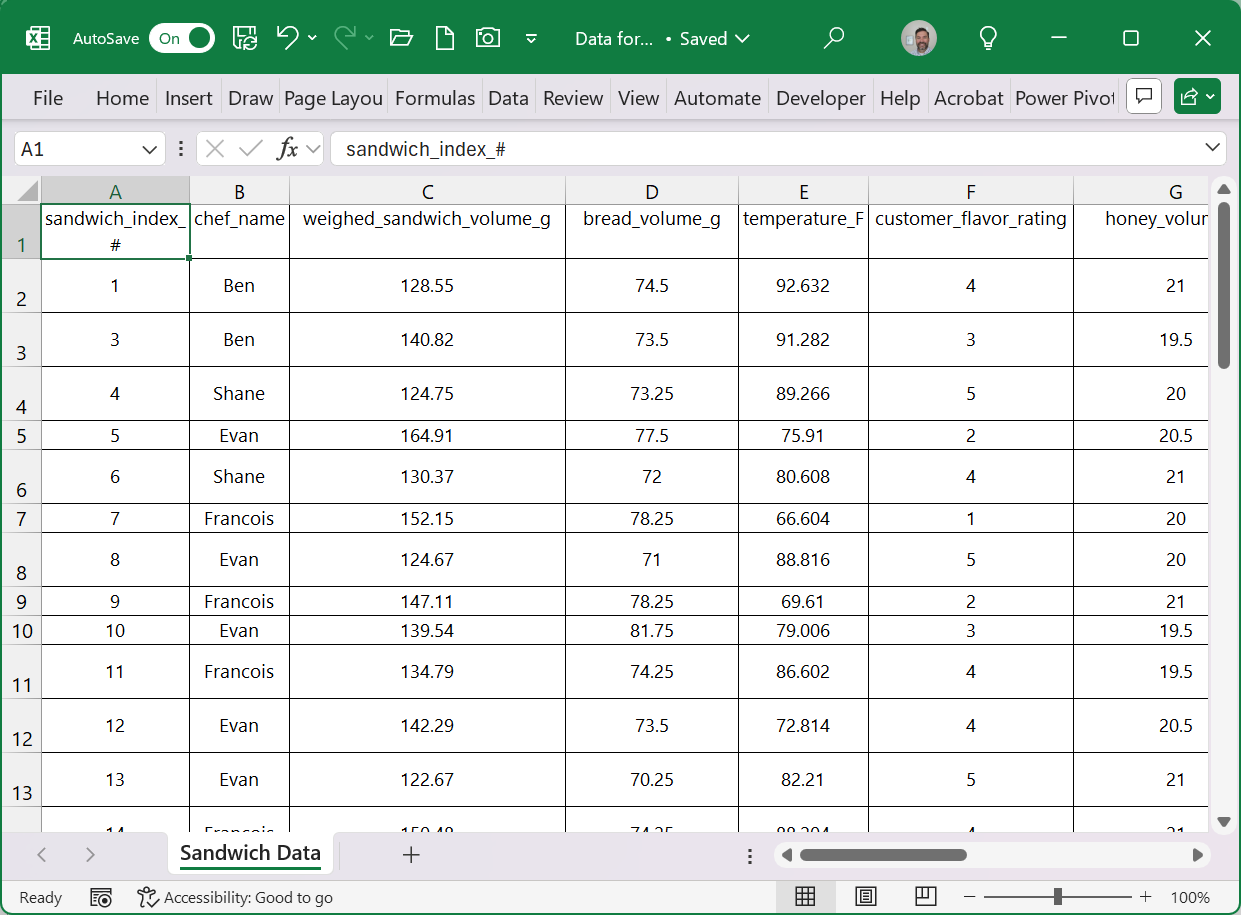
Raw data, like the data provided in the Shef B. Foods dataset, is generally organized with each row representing the entity being measured. For Shef B. Foods, each sandwich that was made gets its own row of data, because sandwiches are the “entities” being measured.
The columns, on the other hand, represent the characteristics that we want to know about each “entity”. The columns in the Shef B. Foods file each provide different measured characteristics for each sandwich. For example, the “chef_name” column records the name of the Chef who made the sandwich on each row, while the “temperature_F” column shows the measured temperature of each sandwich, in Fahrenheit, just before being served to customers. More scientific terms for the “characteristics” being measured include variables, or factors – we may use these terms interchangeably.
While mostly for organizational purposes, the columns can also include index variables, so that each entity can have a unique “label”. In the example dataset, the first column includes a “sandwich_index_#”, that gives a unique assigned identification number to each sandwich entity.
Raw data comes in various sizes, from a single entity/variable, to millions and millions of entities and variables. Our example data set for Shef B. Foods is only 49 rows and 13 columns if you include the row of column/variable names, but some raw datasets are thousands, millions, or even billions of rows and/or columns. Excel, as a software, “only” has room for 1,048,576 rows and 16,6384 columns, but it is not recommended to use Excel for larger datasets.
Finally, there is no rule that says we can’t swap the columns and rows (so that entities are in columns, rows represent variables). The problem-solver, analyst, manager, or whoever is analyzing the data set, needs to know how the data is organized before beginning their work.
Data Storytelling
When data is used for decision-making, it is rarely used in its raw, row-by-column-by-tedious-row format.
Instead, we summarize the data with statistical calculations, or we create charts and graphs, to more efficiently and effectively describe it. We suggest that any data can be summarized and described in five key areas, regardless of whether it is numerical or categorical, or whether it is shown in charts or in calculated statistics.
Meta Data
The most basic way to describe data is to answer ‘how much’ and ‘where it came from’. Other similar terms used are ‘totals’, ‘sum’, ‘amount’, ‘source’ or ‘size’. We refer to this most basic result summary as the quantity of data or the meta data. We can explain the source of the data (meta), the size or quantity of data (meta), the names of important categories or variables (categorical), the type of data we have (meta), and we can sum important numbers like sales figures or shipping costs (numerical). These basic information areas and calculations give us an idea of the quantity of the data we have for each category or condition and where the data came from.
Typical Data
We use terms like ‘average’, ‘most likely’, ‘median’, or ‘expected value’ to describe typical data for a specific data set, or for group within a data set. For example, to portray a typical salary for fresh college graduates from your major, university brochures will promise an average salary or median salary.
Rare Data
On the other end of the spectrum, terms like ‘outlier’, ‘extreme point’, ‘special case’, or ‘one-off’ are used to describe rare data within a data set. Often, these rare results are due to unexpected outcomes that are not typical, and possibly too extreme to be included when considering the full data set. Imagine an NFL recruit graduating with a degree in Supply Chain, whose starting annual salary is $12 Million per year. The NFL salary would be considered an outlier when compared with the other Supply Chain graduates’ salaries the same year, and should probably not be included in the calculations for average salaries.
Variability of Data
When describing the data as a whole, we may use terms like ‘dispersion’, ‘range’, or ‘spread’, or we may describe the data as ‘dense vs. sparse’, or ‘consistent vs. inconsistent’ to describe the variability of data. Going back to the salary example for college graduates, marketing campaigns may include an average salary $70k for Supply Chain Majors, but also provide a typical range of $60k – $90k. This added information provides a bit more understanding of what to expect as a college graduate going into the field of Supply Chain Management.
Shape of Data
Lastly, when terms like ‘cluster’, ‘skew’, ‘spike’, or ‘uniform’ are used, we are trying to describe the shape of data. The best way to understand the shape of results is by using a graph or diagram. However, as the graph or diagram is described in words, the ‘shape’ terms are used to describe what is shown. We could add to the salary brochure by describing the starting Supply Chain salary data as being clustered around $80k, with a few rare salaries skewed towards the lower end of the $60k – $90k range.
Applying Data Storytelling to Different Data Types
Different data types need to be summarized using different methods. For example, numerical data can be used to calculate averages, whereas an average cannot be computed for most categorical data. Instead, categorical data can be summarized using proportions or percentages. The table below summarizes the different measurements that can be used for each data type.
TABLE 4-2: Data Storytelling Summaries by Data Type
|
Data Summary Area |
Numerical Data Type |
Categorical Data Type |
|---|---|---|
|
Meta Data |
Summation of the data (where warranted), Count of the number of total data points, and a brief description of the data source |
Count of the results in each category, count of the number of total data points, count/names of the categories, and a brief description of the data source |
|
Typical Data |
Average (the data added together, then divided by the number of data points) Median (the middle of the data after it’s sorted smallest to largest – 50% above and 50% below) (Look at the graph) |
Proportions are computed for each category (the category count is divided by the total count across categories) The larger proportion categories represent more ‘typical’ data (Look at the graph) |
|
Rare Data |
Outliers – points that seem extreme on either end of the data (officially from statistics: a data point that is more than 1.5 * IQR beyond the first or third quartiles, OR a data point with a z-score less than -3 or more than +3) (Look at the graph) |
Categories with very small proportions in relation to other category proportions (compare the proportions) (Look at the graph) |
|
Variability of Data |
Standard Deviation (basic measure of variability for numerical data) Variance (the square of the standard deviation) Range (maximum value – minimum value) (Look at the graph) |
Compare the category proportions, and if they are roughly similar then there is low variability. If they are extremely different, then variability is high. (Look at the graph) |
|
Shape of Data |
Quartiles and Interquartile Range (i.e. from a box-and-whisker plot) Skewness (balance vs. imbalance) and Kurtosis (“pointy” vs. “rounded”) (Look at the graph) |
This is more for ‘ordinal’ categorical data. If the data is clustered on one end or the other, and/or if the data is very light towards one end or the other. (Look at the graph) |
Data Storytelling Basics
A simple way to ‘tell the story’ about the data, is to compute or graph the data summaries as described in the able above, and then describe each summary area briefly. This allows us to quickly understand what the data looks like for a particular variable (or characteristic) of the entities that are being measured. In the table below, we summarize two of the variables from the Shef B. Foods dataset mentioned earlier – one is numerical and the other is categorical.
TABLE 4-3
|
Data Summary Area |
Sandwich Assembly Times (numerical) |
Peanut Butter Brand (categorical) |
|---|---|---|
|
Meta Data |
Shef B. Foods was looking for ways to improve their peanut butter and honey sandwiches, and so they gathered data on 48 experimental sandwiches. To understand the speed at which the sandwiches were made, assembly times were recorded in seconds. |
Shef B. Foods was looking for ways to improve their peanut butter and honey sandwiches, and so they gathered data on 48 experimental sandwiches. To see whether the brand of peanut butter used affects customer ratings, they had their Chefs use 5 different brands of peanut butter: Adams, Jif, Peter Pan, Skippy, and Smucker’s. |
|
Typical Data |
Average Sandwich Assembly Time = 78.1 seconds Median Sandwich Assembly Time = 78.4 seconds |
The top two brands used in the study were Jif and Skippy, representing almost 46% of the sandwiches made, evenly splitting the percentage with 11 sandwiches each. |
|
Rare Data |
Looking just at the assembly times overall, there were no outliers, or “rare” assembly times in this data set. |
The two brands least used, also equally, were Smucker’s and Adams, at roughly 17% each. Despite them being the smallest categories, they should not be considered rare as both brands were still well-represented. |
|
Variability of Data |
Standard Deviation of sandwich assembly time was 22.7 seconds. |
The Peanut Butter Brands did not vary much, with the top two categories at 23% each, and the bottom to brands at 17% each – a span of only 6%. |
|
Shape of Data |
Data was more clustered around the lower end, between 42.56 and 65.43 seconds for sandwich assembly time, with the data spread more evenly on the upper end. |
Because there was not much variation, the shape of this data is fairly even. However, if Shef B. Foods wanted a more complete study of the impact of peanut butter brands, it would be better to have the brands equally represented in their experimental data. |
EXAMPLE 1 – Real Estate Data
Another example of data storytelling is shown in the table below, where we are looking at both a numerical and a categorical example based on a different data. The Real Estate dataset can be found in this spreadsheet: Real Estate Data
TABLE 4-4: More Examples of Data Storytelling
|
Data Summary Area |
Prices of Single-Family Homes in a US City (Numerical) |
Construction Style of Homes in a US City (Categorical) |
|---|---|---|
|
Meta Data |
Data was collected from 30 homes sold in a US City during the summer of 2018. Data includes home amenities, size, number of rooms, construction style, and school district. |
Data was collected from 30 homes sold in a US City during the summer of 2018. Data includes home amenities, size, number of rooms, construction style, and school district. There are 5 different styles of construction, namely: Cape Cod, Ranch, Tudor, Colonial, and Modern. |
|
Typical Data |
Average Fair Market Value (price) = $474,910 Median Fair Market Value (price) = $431,200 |
The most common type of construction style is the Cape Cod style, representing about 27% of the data. The next most common styles were Ranch and Tudor styles, each representing another 20% of the homes in the data. |
|
Rare Data |
One of the homes was priced at $889,000 – more than $100K more than the next highest home price. This is likely due to some unique characteristic of that particular home. The lowest price home was $310,200, with the next lowest only being $8K higher – showing that the low price is not rare in this market. |
The least common housing styles were Colonial and Modern styles, but should not be considered rare, as they each represent about 17% of the homes in the data. |
|
Variability of Data |
Standard Deviation of home prices was $144,313. |
No one style could be considered rare or overwhelmingly represented, suggesting a near even variability of construction styles to choose from in this market. The range of percentages from largest category to smallest category was 26.7%-16.7%. |
|
Shape of Data |
Data was clustered around the lower prices, with home prices much more spread out in the higher price ranges. (The bottom 50% of home prices fell between $310K and $430k, but the top 50% of home prices ranged between $430k and $889k). |
The construction style data is relatively flat, aside from the Cap Cod style which was more represented than the other four styles. No two categories can be combined to represent most (>50%) of the data, whereas the top THREE categories make up 2/3 or 66.7% of the data. |
Even without seeing the data described above, these simple summaries tell a story about the data that is insightful. However, because this was a single sample of only 30 homes from only 3 different school districts, we have to be careful how this data is used – real estate data can be vastly different only a few miles away. We talk more about the limitations of data further down.
Organizing, Summarizing, and Visualizing Data
In order to have the information necessary to fill in the table above (or really, to tell the story within the data), we’ll need to look beyond the raw data and do at least some basic analysis. Performing even a basic analysis will let us do more than just tell the story – it will enable our organization to make better decisions and solve problems.
So, to get to the story being told by the data, we have three crucial steps:
- Organizing the data (which sometimes involves “cleaning”)
- Summarizing the data (which involves basic statistics calculations and tabulating results)
- Visualizing the data (which involves charts and graphs)
Organizing Data
After collecting data, even expensive data, many organizations find that their efforts stall or fail because the data is messy or flawed. Working with messy and unorganized data can be tedious and lead to errors during analysis. Furthermore, there may be need for quick, simple calculations or insights that do not require a full analysis. Why go to the trouble of a full analysis if you just need a couple sales figures?
Sorting Data
Sorting data provides an easy way to see the maximums, minimums, and extreme data points that might be of interest. When sorting by date, the data can be scanned for trends, cycles, or other time-based phenomena. We can also established rankings or priorities by sorting the data based on a key metric or performance target.
Filtering Data
Excel provides the user with a versatile filtering mechanism, for both text and numerical data. With a set of data that includes dates, suppliers, production times, quality ratings, or costs, filtering allows users to drill down into the when, where, and in which group specific issues are occurring. Of course, in a spreadsheet format the users still have to scroll through the rows and columns of data and try to pick out the important information.
Excel offers several tools for quickly cleaning and organizing data so that it can be quickly scanned and also used more effectively for full analysis. See Example in Appendix 2 to see how filtering and sorting can be used to quickly discover data issues, resolve the issues, scan for interesting findings, and prepare for a complete analysis.
The reader is encouraged to follow along with the Example in Appendix #2 at the end of the chapter to see Excel’s sorting and filtering capabilities at work on a messy data set from Shef B. Foods.
Summarizing Data
Summarizing data is bulk what occurs in an introductory Statistics class. In this text, we will rely solely on Excel’s capabilities, with a focus on simple interpretations of the calculations. Students are directed to their university’s or college’s statistics classes for a full treatment of these measures and their explanations.
We want to focus on two areas of summarizing data: Descriptive Statistics and Tabular Summaries (Sometimes called “crosstabs”).
Descriptive Statistics
In Table 4-2 above, we list a number of descriptive statistics that Excel can easily compute using formulas or an Excel Add-in. Note the differences between the numerical and the categorical data types.
For numerical data, we need to be able to find the Mean, Median, Standard Deviation, and Range. Excel will do all the work for us using built-in formulas, the Excel “Data Analysis Tools” Add-in, or using Pivot Tables.
-
-
- Excel formulas for basic numerical descriptive statistics:
- For computing the average: “=AVERAGE(#ref#)”
- For computing the median: “=MEDIAN(#ref#)”
- For computing the sample standard deviation: “=STDEV.S(#ref#)”
- For computing the range: “=Max(#ref#)-MIN(#ref#)
- Excel formulas for basic numerical descriptive statistics:
-
On the other side, categorical data summaries rely heavily on counting the data and calculating proportions (or percentages) in relation to the larger group. Excel has many tools to make this easier for us, but we can also use some simple calculations to get proportions and counts of categorical values.
-
-
- Excel formulas for basic categorical descriptive statistics:
- For counting a specific category: “=COUNTIF(#ref#, #category name in quotes or a cell reference for that category”)”
- For counting a list of categorical labels: “COUNTA(#ref#)-COUNT(#ref#)”
- For computing the proportion: “=(#ref# for specific category count) / (#ref# for count of all categorical labels)”
- Excel formulas for basic categorical descriptive statistics:
-
Despite the seemingly cumbersome nature of Excel’s built-in formulas, familiarity with them will provide students with a skill that ensures long-term efficient use of spreadsheets. However, much of what can be calculated with formulas can also be done using Tabular Summaries, and may even be more efficient.
Tabular Summaries
Far more powerful than simply filtering and sorting, pivot tables can be used to explore cross-sections of our data – with descriptive statistics and summary calculations built into tabular summaries. One of the best things about pivot tables in Excel is how fast they can be used to uncover valuable insights from the data.
Cleaned Excel Data File: Clean Sandwich Data
Data Opened in Excel:
The data above shows raw data, already cleaned, and ready for analysis. The pivot table tool creates a “sandbox” environment for exploring cross sections and calculations from our data set. Anything we do in our pivot table will leave the original data untouched.
Pivot Table Sandbox Environment:
We can use Pivot Tables to glean valuable information from the Shef B. Foods data set regarding sandwich assembly, customer ratings, and sandwich maker (chef) performance.
Numerical Summaries with Pivot Tables
Suppose in our Shef B. Foods data set, we wanted to get numerical statistics summaries for the Kitchen Assembly Time column (measures how fast the Chefs assemble each sandwich). Using pivot tables, and only a few clicks of the mouse, we can get the Minimum, Average, Maximum, and Standard Deviation. The table below shows what this summary looks like:
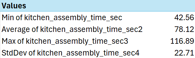
Unfortunately, the current numerical calculations available in pivot table do not include Median or Range. There is, however, an even more advanced Pivot Table tool in Excel called Power Pivot, and it allows for more customization of the type of calculations it will perform.
Categorical Summaries with Pivot Tables
For categorical summaries, we really only need to count the number of each category and compute proportions in relation to the column variables. Pivot tables make summarizing categories easy, with only three clicks of the mouse. The table below shows a summary of the Peanut Butter Brands used in the Shef B. Foods data:
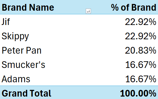
We can easily see how the categories differ by comparing the proportions in the right column. We can make quick summaries for each categorical variable, but perhaps we’d like to drill down even further!
Combined Categorical and Numerical Summaries with Pivot Tables
Where pivot tables especially shine is when specific results are needed for each category or grouping of data. The practice data file “Clean Sandwich Data” has categories for chef name, peanut butter type, customer ratings (which could be considered categorical or numerical), peanut butter brand, and bread brand. We include a few pivot table results below to show results from our preliminary analysis of the practice data.
Pivot Table #1 (below) shows the calculated statistics for sandwich assembly times, by Chef. This table took only 13 clicks of the mouse. It was done so quickly, that it took longer to change the names of the columns! (disclaimer: We do NOT receive royalties from the Pivot Table “company” for our endorsement of its capabilities).
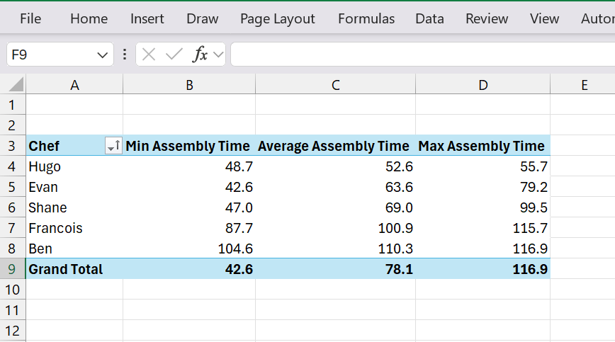
Pivot Table #2 (below) shows the same chart, but broken down by type of peanut butter used. To create this table, we made a quick copy (“Ctrl+C”) of the original table above, pasted it below it on the same worksheet (“Ctrl+V”). Then, we used the Pivot Table sandbox (aka “Pivot Table Field List”) to swap the Chef column for the Peanut Butter Type Column, and changed the column name. SUPER FAST. We can see that pivot tables are like creamy peanut butter: fast (it clearly took less time to assemble creamy peanut butter and honey sandwiches than chunky).
|
Peanut Butter Type |
Min Assembly Time |
Average Assembly Time |
Max Assembly Time |
|---|---|---|---|
|
Chunky |
79.23 |
101.8684211 |
116.89 |
|
Creamy |
42.56 |
62.56551724 |
87.65 |
|
Grand Total |
42.6 |
78.1 |
116.9 |
Pivot Table #3 (below) shows the average temperature of the sandwich for each level of customer rating. It seems like the warmer the sandwich, the higher the customer rating.
|
Customer Rating |
Average Sandwich Temperature °F |
|---|---|
|
1 |
65.9 |
|
2 |
71.0 |
|
3 |
79.5 |
|
4 |
85.2 |
|
5 |
85.5 |
|
Grand Total |
79.6 |
You should see if you can discover anything else interesting in this data after following the example at the end of this chapter. Do the different Chefs earn higher customer ratings? Does the brand of bread make any difference to the customers? Even though the data is largely fictitious, you can get some good practice using pivot tables in Excel.
Visualizing Data
Categorical data and numerical data can be visualized in charts and graphs, but, despite a similar appearance, the two data types require completely different graphs. Recall from the earlier section on Summarizing and Describing Data.
We have five primary areas to describe: quantity or size of the data, what’s typical, what’s rare, the variation, and shape of the data. The charts and graphs introduced below are meant to help portray each of those five areas for each data type.
Categorical Data Visualizations:
For categorical data, we generally count data in each category, compute proportions, create tables and graphs, and then interpret the graphs based on each of those five areas to describe what the data shows. There is more we could do with categorical data, such as word clouds, cluster analysis, and more, but more advanced categorical visualization is beyond the scope of this textbook.
Here, we focus our attention on bar charts, column charts, line charts, and pie charts, as these are most commonly used to portray categorical data. Using the practice data, we generated a number of categorical visualization below:
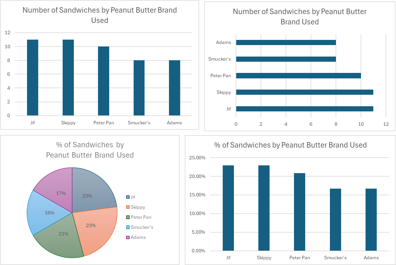
From top left, and moving clockwise, the first chart is called a “Column Chart” in Excel, and shows the counts in each category. The column chart seems very basic, yet it is completely effective. We could easily replace the bars with a line (call it a “Line Chart”) and get the same idea of what is happening with the data.
The top right chart is called a “Bar Chart” in Excel, and shows the same information as the column chart, but turned on its side to display the counts horizontally.
The bottom right chart is another column chart, but the vertical (y) axis is showing the proportion of each category. It is literally the exact same chart as the top left, but the axis is showing percentages instead of counts. Which one do you like better?
Finally, the bottom left chart shows a pie chart, which shows the same information again, but you might have to look closer to figure out the details. It is a hopeful possibility that, someday, a famous scientist will finally decide that pie charts are worthless and they will be removed from the insert chart options in Excel – but for now, pie charts still exist.
Overall, these categorical charts should be used to describe the data, not just take up space on a page.
Looking at these charts, we can describe the data as follows:
-
- Meta Data: There are about fifty sandwiches represented in the data, the data was collected to understand how customers feel about different ingredients and specific Chefs.
- Typical Values: Jif and Skippy Brands are most represented (11 each), with Peter Pan close behind (10).
- Rare Values: Smucker’s and Adams are the least represented brands, but they are not rare.
- Variation of Data: The five brands are fairly evenly represented, with 8-11 sandwiches made with each brand of peanut butter.
- Shape of Data: The graphs show a cluster (only a slight imbalance in this case) of data around Jif and Skippy, but not drastically different than the other categories.
Numerical Data Visualizations:
Numerical data allows for a much wider variety of visualization options, and when coupled with categorical data provide a plethora of opportunities to improve our understanding of the data.
We will explore visualizations of three types:
-
- Single-variable visualizations (where only one column is being visualized)
- Multi-variable visualizations (where more than one column is being visualized)
- Category-specific numerical visualizations (where visualizations of type (1) or (2) are created, but within specific categories).
Single-variable numerical visualizations
For a single-variable visualization, we want to understand all the numbers in a single column of data. In the Shef B. Foods practice data, we will look at the data from the “kitchen_assembly_time_sec” column, which shows how much time it took to assemble each sandwich in the data set.
Common single-variable charts include histograms (which look like column charts), and box-and-whisker plots (which look like a rectangular box split in two with whiskers protruding from both ends).
Below we have included both types of single-variable numerical data charts, but first the focus is on histograms:
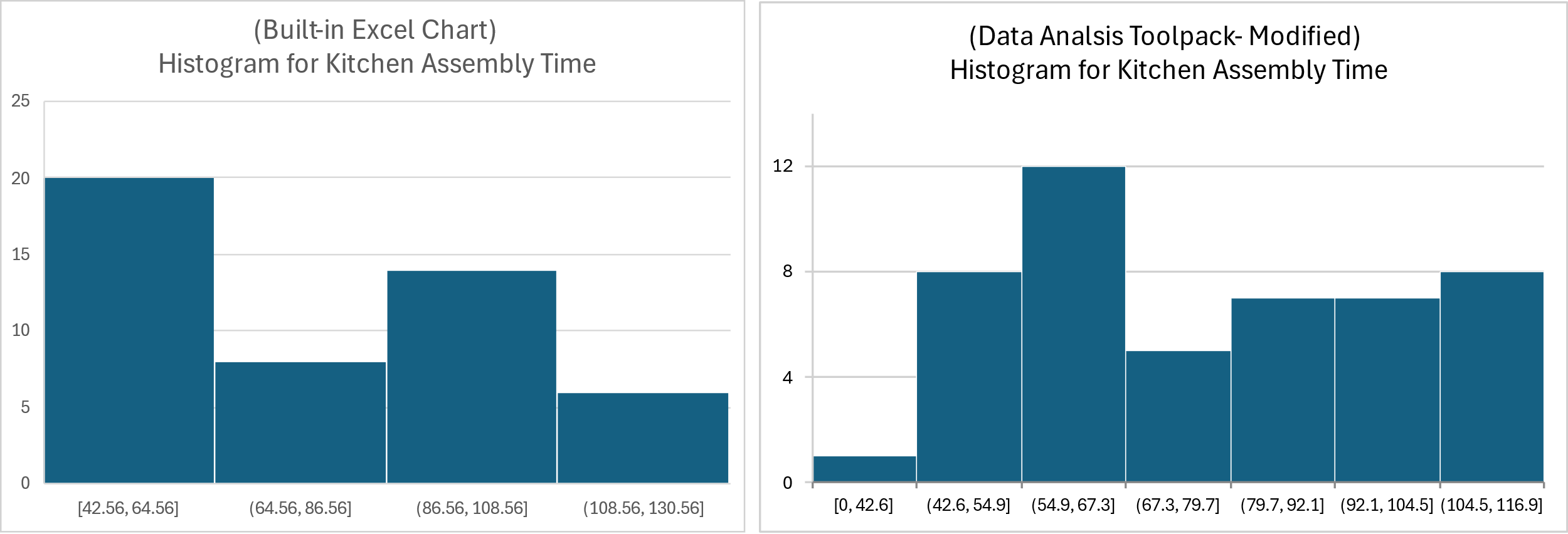
Because there are multiple ways to create histograms in Excel, we are showing the resulting charts from two separate methods. This illustrates the challenge of interpreting histograms for numerical data, which as you can see here, can appear to show two different sets of data despite being generated by the same data column.
To interpret these histograms, start by looking at the number ranges along the x-axis (bottom of the chart). On the left-hand chart each number range (referred to as the ‘bin’) includes about 22 seconds (i.e. 64.56 to 86.56 seconds in the second bar), whereas the right-hand chart ranges are approximately12.4 seconds wide (i.e. 42.6 to 54.9 seconds in the second bar).
The histogram y-axis shows the number of sandwiches with assembly times within the time ranges shown at the bottom of each bar. There are roughly 7 sandwiches included in the second bar on the left-hand chart, and about 8 in the second bar of the right-hand histogram chart.
Since the standard time range used is different for each chart, the count of sandwich times within those ranges are also different, leading to widely different histogram shapes for the same set of data.
For this reason, the box-and-whisker plot might be a better tool to visualize the data for a single variable. It quickly shows us the minimum, maximum, and median values, and can even display individual points. This makes it much easier to assess typical values, rare values, as well as both the variability and the shape of the data.
The two plots below represent the same data set, with the left chart showing the built-in Excel output. The right chart shows the same box-and-whisker plot with edits, displaying each of the individual assembly time data points as small dots/circles, numbered labels for each quartile, including the minimum, maximum, and median values from the data.
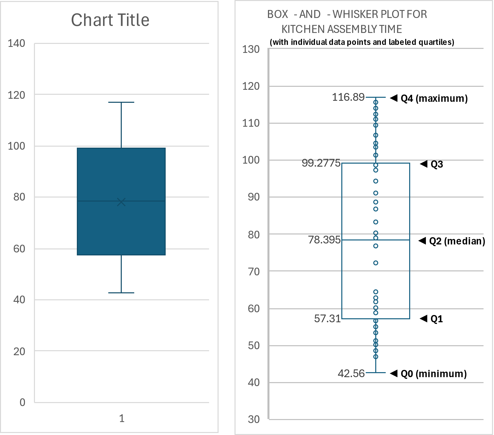
The above box-and-whisker plots allow for identification and assessment of most of the key characteristics of a data set. Below is an attempt to portray the basic ‘story’ of the sandwich assembly time data.
- Quantity: There are about 50 sandwiches represented (based on previous findings)
- Typical Data: The median sandwich assembly time is 78.395 seconds, so 50% of the sandwiches took longer to assemble, and 50% took less than 78.395 seconds to assemble.
- Rare Data: There doesn’t appear to be any rare data, but it is interesting that between about 65 seconds and 80 seconds there are only two data points. So, we can say it is rare to see a sandwich assembled in that time window.
- Variability of Data: Sandwiches in this data set took between about 42 seconds and 117 seconds to assemble. There is an interesting change in variation as the data points seem to cluster at the endpoints but are more spread out in the middle.
- Shape of Data: The data is sparse in the middle (between 65 and 80 especially) and much more densely arranged at the upper and lower ends. This is an example of a bimodal shape – where data seems to be clustered in two separate areas. There may be a good explanation for this phenomenon.
Quick Tip: Quartiles
The quartiles of a numerical data set represent boundaries that separate the data into four, 25% ‘chunks’ of data. The median, which is also called the 2nd quartile, is the dividing point where 50% of the data is above and 50% of the data is below that point.
Referring to the right-hand graph in figure above, you can see labels for all four quartiles, including “Quartile 0” which represents the minimum value.
Facts about quartiles:
- Quartiles must be calculated using sorted, numerical data.
- Quartile values sometimes, but will not always, coincide with actual data points (it depends on the number of data points in a data set).
- The number of data points between two quartiles equals 25% of the total number of datapoints in the data set.
- The Inter-Quartile Range (IQR) is calculated thus: IQR = Q3 – Q1.
- Outliers are often defined as data points that fall more than 1.5*IQR above the median, or more than 1.5*IQR below the median.
- There are two methods to compute quartiles by hand, and Excel is capable of performing both types of calculations.
Multi-variable numerical data visualizations
When two or more numerical variables (such as “kitchen assembly time” and “sandwich temperature” or “peanut butter volume”) are found within a data set, we often want to see if there is a relationship between them.
To visualize a relationship between two variables, we use a scatter plot – also called an “X,Y Scatter Plot”. It is critically important to carefully decide which variable is “X” and which variable is “Y”.
From the Shef B. Foods practice data, we might wonder if the assembly time in the kitchen affected the temperature of the sandwiches. It seems like a plausible hypothesis.
In defining which variable should be used for “X”, we can think of the “X” variable as the “influence”, “input”, “predictor”, or “independent” variable. In this example, we are wondering if the assembly time affects, or predicts, or influences, the sandwich temperature. So, assembly time will be our assigned “X” variable, and the numbers along the X-axis will represent assembly time.
In the case of the “Y” variable, the sandwich temperature, it will be represented on the Y-axis. The “Y” variable is often referred to as the “dependent”, “response, or “output” variable.
Finally, to set up the data for Excel to build a graph, the “X” variable column of data must be on the left side of the “Y” variable column, even if the columns are not side-by-side. Review the tutorial on building this graph for more guidance, if needed.
The graph is shown below:
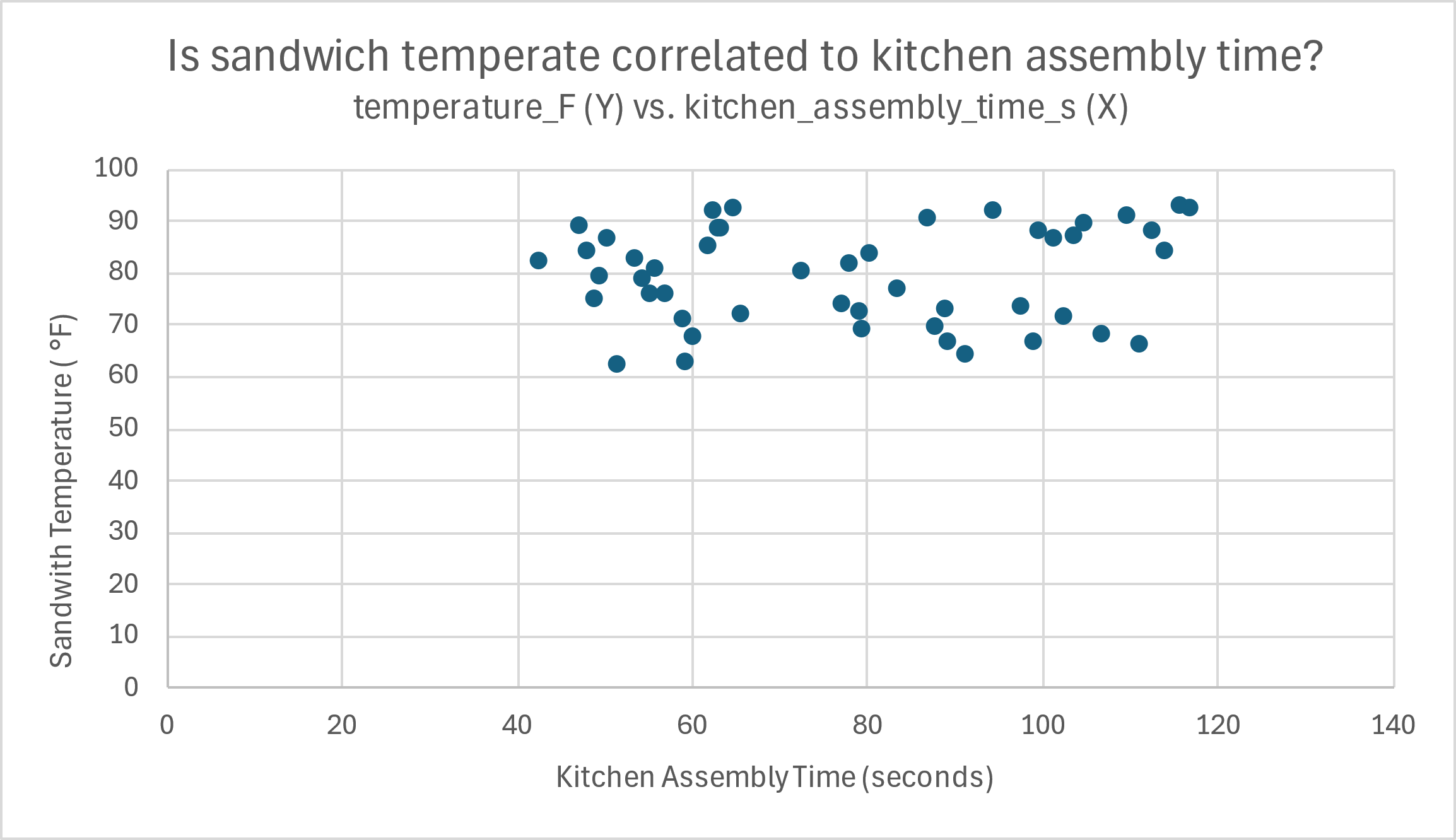
Telling the story of this data is a bit different than previous data, as there are two variables represented. It is helpful to ‘walk’ along the X-axis and see how the dots change in relation to the Y-axis. Remember, each dot represents a single sandwich, where the associated X-axis positioning represents that sandwich’s assembly time, and the associated Y-axis position of the same dot represents the single-sandwich’s temperature.
In this case, there isn’t much to say. For kitchen assembly times on the lower end (40-65 seconds, outlined in orange below), the temperature shows both high and low figures in relation to the Y-axis.
The same could be said for the other values for kitchen assembly time, though there are some minor differences. In the assembly times between 70-90 seconds (in blue), the temperatures aren’t as high, or as low, over all. Still, there is no clear pattern of increasing or decreasing temperatures based on assembly time.
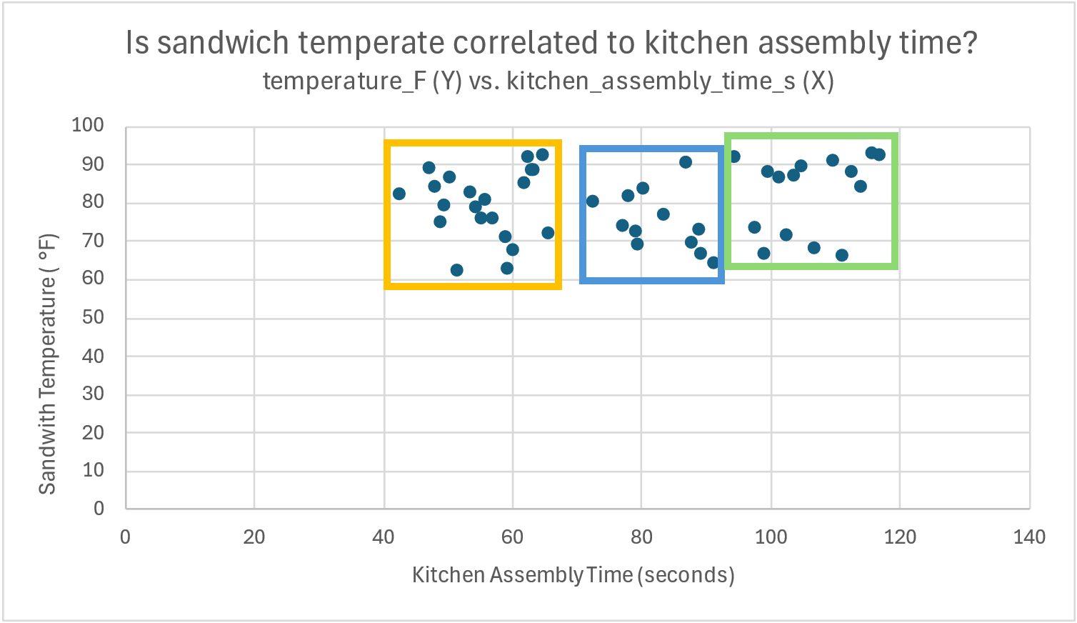
Finally, in the green highlight, where the temperature data seems to be missing along the 80 °F range on in the Y-axis, there are still both low and high temperatures, regardless of how much time the kitchen assembly took.
Overall, we would say that there doesn’t seem to be a relationship between assembly time and sandwich temperature.
If you’ve ever made a peanut butter sandwich, you know that the sticky, thick consistency of peanut butter makes it harder to assemble the sandwich. More peanut butter seems like it should affect assembly time, based on our own experience. In this case, we are wondering if peanut butter volume influences assembly time, so peanut butter volume should be used as the “X” variable, and assembly time should be used for the “Y”.
The next graph shows a clear relationship between the amount of peanut butter in grams (X) and the assembly time (Y).
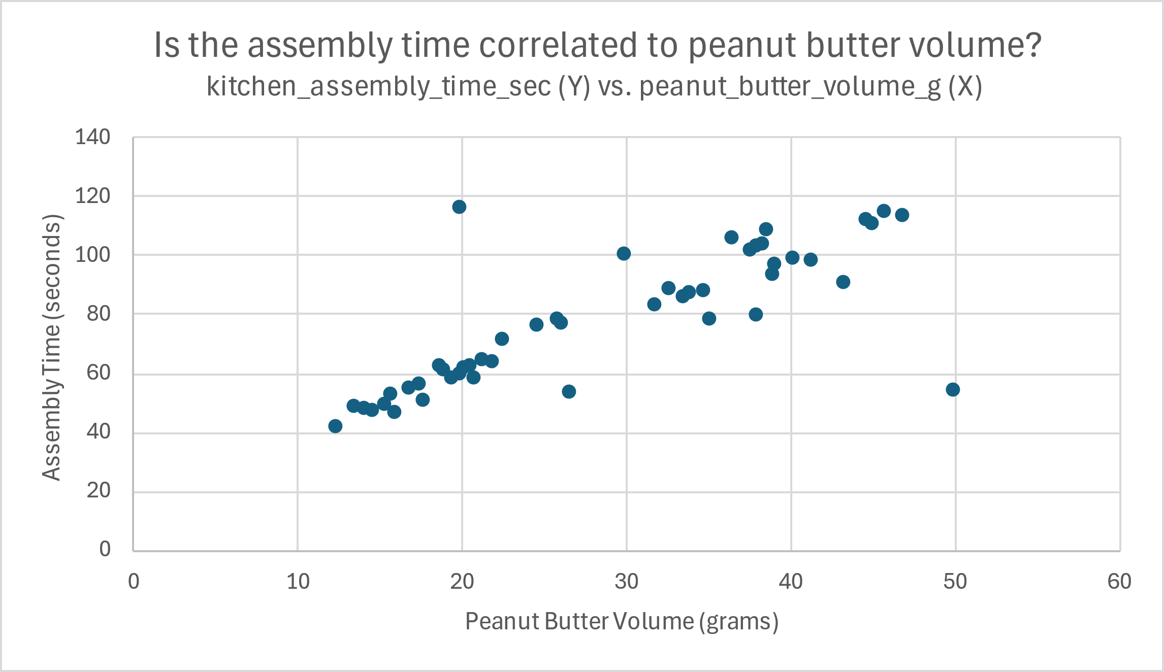
It is pretty simple to make out a rough pattern emerging in the data, as highlighted in the next image in a diagonal red oval. Clearly, as the points move along the X-axis values (increased peanut butter volume), the points move higher in the Y-axis direction (longer assembly time).
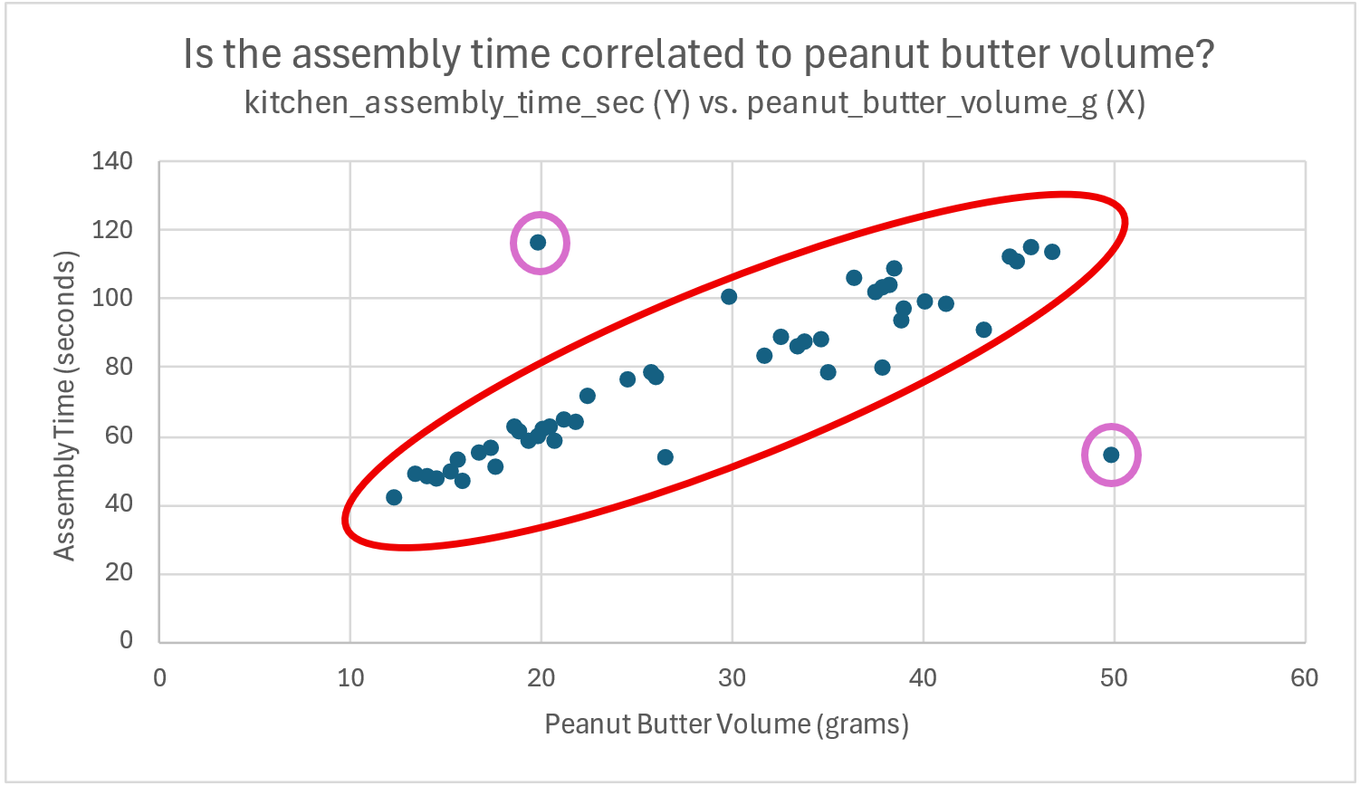
Two potential outliers are also highlighted in purple, as these two sandwiches had values that suggest a different relationship between the two variables.
The first potential outlier sandwich contained 20 grams of peanut butter but took almost twice the assembly time compared to other sandwiches with only 20 grams of peanut butter.
The second potential sandwich outlier had more peanut butter (at 50 grams) than any other sandwich in the data set, but had an assembly time of about 50 seconds – on par with sandwiches containing only about 1/4th the peanut butter.
Overall, we would say that peanut butter volume is highly correlated with assembly time, barring the two outliers highlighted above. As peanut butter volume increases, sandwich assembly times also tend to increase.
Working with three or more numerical variables
While scatter plots are great for looking at two numerical variables in graphical form, it gets a lot harder when you have more than two. Sometimes it is beneficial to look at three dimensions, or even more as the number of important variables increase.
With three variables, there is a bubble chart available in Excel where the dots of the scatterplot are replaced with circles sized according to the third variable of interest. However, these charts are difficult to interpret unless generated by a small data set.
Beyond this, it is more common to do pairwise, two-variable scatterplots, or take a purely statistical route with the technique of multiple regression – which is beyond the scope of this text.
Category-specific numerical visualizations
Looking at numerical visualizations from the perspective of categorical variables can be very insightful. For instance, we can view the previous scatter plot by peanut butter type (categorical variable).
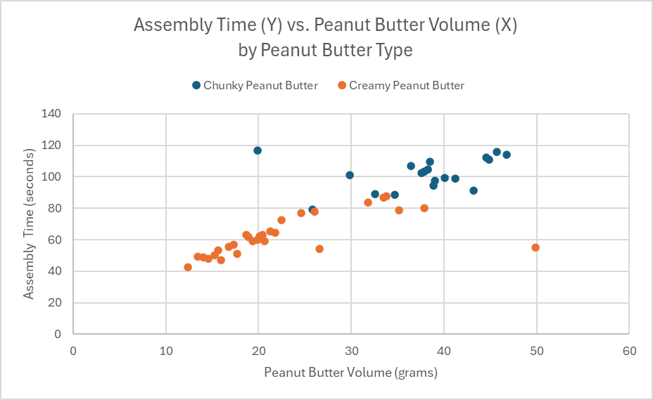
The color-coded data shows that not only were slower assembly times associated with more peanut butter, they were also associated with the chunky peanut butter type. Looking closer, you can see that none of the chunky peanut butter sandwiches were assembled in less than about 80 seconds, while the creamy peanut butter sandwich were normally assembled in less than 80 seconds, barring a few exceptions.
Excel also makes using box-and-whisker plots with categorical variables very simple. For example, we have plotted sandwich assembly time in a set of box-and-whisker plots, separated by peanut butter type.
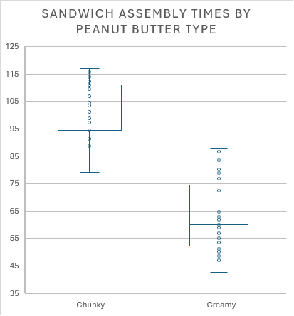
Similarly, this chart shows the huge difference in assembly times, based on the type of peanut butter used. Chunky peanut butter sandwiches generally took longer to complete.
Good Data Visualizations Require Creativity and Practice
While these visualizations and other approaches to telling the story of data might make sense for the example used in the text, data encountered in industry settings may not provide the same insights using the same techniques. Instead, analysts and other professionals will need to ensure that they are using the right analysis techniques for the right purposes. And it isn’t always clear which data is important, or how the data should be analyzed or presented.
To help with this process, we are going to deploy a foundational structure, called the C.A.R. Structure, or the C.A.R. Method, to guide you as you learn to address complex situations in the real world – regardless of your major or your career path.
The C.A.R. Method
Because analyzing data, calculating statistics, and creating graphs are such exciting activities, we need to be certain not to lose sight of the purpose of our supply chain: to generate value.
Looking beyond the adventures surrounding Excel and other analytical software, we want to remember to focus on the Context. The context includes our organization’s situation, its background, the questions we need answers to, and what we hope to gain from collecting and analyzing the relevant data.
Once we have the data, our Analysis should be purposeful, focused, and ensure that we have verifiable answers to the all-important questions. Just because we can perform a certain analysis, or create a certain kind of chart, doesn’t mean that it results in valuable insights.
The answers generated from our analyses should provide guidance as we develop Recommendations for a solution, a plan, or a pathway forward. All recommendations can be improved by considering the entire system or supply chain that might be impacted by our actions or reactions. We certainly don’t want to create more, or even larger, problems than we started with.
The C.A.R. structure (Context, Analysis, Recommendations) provides a simplified approach to addressing issues (simple or complex) within any organization or across its supply chain.
Now that we have an understanding of basic data analysis, visualization, and storytelling, we can see and apply the C.A.R. structure more effectively. The example below shows a fictitious example of the C.A.R. method at work in the real world.
EXAMPLE: Applying the CAR structure to a Peanut Butter and Honey Sandwich Business
Mini Case:
After a successful launch of its Peanut Butter and Honey food truck business, Shef B. Foods expanded its sandwich production by setting up a production facility in Dayton, OH at the end of 2024.
Over the first half of 2025, sales of sandwiches increased by more than 50%, but the costs also increased as shipping and storage fees skyrocketed. Based on rough numbers, it looked like they were not actually making a profit.
The executive team asked their managers to figure out what was going on, and to determine what, if anything, they could do to resolve the issues they might uncover.
Lynne Seadoyle, the logistics manager, claimed that warehouse space was hard to find near their sandwich production site. Her team of logisticians had arranged for a 3PL to position incoming materials and finished goods across the border in Indiana.
The 3PL also used a temperature control system in all their warehouse locations so that the sandwiches arrived to the customer, ready to eat. The logistics flow through the 3PL was a bit more expensive than they had originally planned, but it got the job done well.
Hunny Colmes, the marketing manager, reported that customers had been raving about excellent sandwich temperatures after the change in logistics policies. The demand was so high that Hunny’s sales team thought the sandwiches were underpriced for the service and quality the customers experienced.
On the other hand, because demand had risen so sharply, many customers were unable to order sandwiches at all, leading to frustration for many would-be sandwich eaters.
P. Knutte, the plant manager of the production facility, knew that they could produce a lot more sandwiches in a given day. However, he didn’t think they should produce sandwiches that lost the company money overall.
With Logistics, Marketing, and Production at odds over what to do, they turned to the data.
They focused on specific data about customer price preferences, logistics costs, and sandwich production capabilities, finding the information below to be very useful:
- From a marketing standpoint, the analysis of a new customer survey showed that sale prices could be increased by 30% without damaging customer loyalty.
- The production team uncovered a lot of waste in the sandwich-making process, and found ways that they could increase productivity. They would be using better ways to spread peanut butter and honey without damaging the perfectly fluffy bread. This change would lower production costs by 20%.
- Last of all, logistics manager Lynne found out that if they shipped full truck loads and opted for a slightly reduced sandwich temperature, they could reduce logistics costs by bypassing the 3PL entirely.
Based on the analysis and associated recommendations from each department, the changes were implemented. By August of 2025, the data showed that Shef B. Foods was on track for a banner year of profits and happy customers.
Breaking down CAR as it was demonstrated in the example:
In this brief, albeit fictional, example, you can see the CAR structure in play.
CONTEXT:
The executives and their management team focused their efforts on a specific Context: profitability for the business. They already knew about their own firm, who the stakeholders were, and what kind of timing was necessary. Once the logistics team realized that profitability was threatened by their 3PL solution, they looked for ways to reduce costs and still satisfy the customers while making a profit.
ANALYSIS:
The case reported that each team conducted specific Analysis related to the problem at hand: threatened profitability. People in logistics analyzed the costs of the 3PL, marketing analyzed the customer preferences about pricing and sandwich temperatures, and the plant manager analyzed operational capacities in light of weak profitability.
RECOMMENDATIONS:
After their thorough analysis, the team developed a set of Recommendations that included:
- Increase selling prices by 30%
- Improve the manufacturing process to decrease production costs by 20%
- Use full truck loads whenever possible to bypass the 3PL, with a concerted effort to ensure only minor impact on the product’s temperature.
We see from the example that the recommendations were implemented and the results were positive. (Easy to do when it’s a fictitious example!) As we go through the rest of this textbook, you will see other examples of the C.A.R. method at work, as it represents a foundational approach to solving complex, real-world problems.
Final word on the C.A.R. Method
Similar to the Example, students will have the opportunity to apply the C.A.R. method to supply chain situations throughout this textbook. To learn the C.A.R. method, students will first need to practice seeing the technique (or some variation) applied by someone else to a real-world situation. After recognizing the process, students will have opportunities to apply the technique to more open-ended situations, as in a business case study. In this text, our case studies have been targeted to first-time case analysts. More advanced case analysis techniques common to advanced business or supply chain courses will build on the foundation of the C.A.R. method in one form or another.
DISCUSSION AND EXCERCISES
Discussion Questions
- What kind of data do you use on a daily basis at home, school, or work? What type of data is it? How do you analyze the data? What decisions do you make based on the analysis?
- How does the desktop version of Microsoft Excel compare with the online version of Google Sheets.
- Have you tried data analysis with a Generate AI tool? If so, which tool was it and how did it go? If not, see if you can try one now, and we can discuss how it went.
- Which undergraduate university majors benefit from data analysis skills?
Essay/Reflection Questions
- Describe the role of storytelling in presenting data to stakeholders. What are the consequences of good storytelling vs. bad storytelling?
- After learning about and using the C.A.R. method for addressing complex issues, what practice(s), if anything, could be added to the C.A.R. method to improve it?
- Compare and contrast calculated data summaries (i.e. averages, proportions, standard deviations, etc.) with data visualizations. Which method for summarizing data do you prefer, and why?
Practice Exercises
A. Diamond Data – Complete the following exercises based on the “Diamond Data” Excel file, found here: Diamond Data.
A.1. Calculate basic summary data for the “Price($)” column, but only for diamonds certified by GIA.
-
-
- Include: Average, Median, Standard Deviation, Min, Max, Range
- Include brief statements for meta data, typical data, rare data, variability of data, and shape of data.
-
A.2. Calculate basic summary data for the “Clarity” column, but only for diamonds with the color “G”.
-
-
- Include: Names for each category, counts of each category, proportions (%) for each category
- You can use a PivotTable to efficiently generate your summary.
- Include brief statements for meta data, typical data, rare data, variability of data, and shape of data.
- Include: Names for each category, counts of each category, proportions (%) for each category
-
A.3. Create two different visualizations for the “Carat” column, but only for diamonds certified by “HRD”.
-
-
- Include: Histogram, Box-and-Whisker plot
- Include brief statements for meta data, typical data, rare data, variability of data, and shape of data.
-
A.4. Create a visualization that looks at the relationship between “Carat” to “Price($)”, but only for diamonds with “VVS1” clarity.
-
-
- Include: Scatter plot, with “Price($)” used as the Y-variable and represented on the Y-Axis.
- Include brief statements on what you think the visualization/chart shows.
-
A.5. Create a visualization showing the relationship between “Clarity” and “Certification Body”.
-
-
- Include the “Crosstab” table from the PivotTable tool in Excel.
- Use the PivotTable to create a color-coded column chart or bar chart.
- Include brief statements on what you think the visualization/chart shows.
-
B. Real Estate Data – Complete the following exercises based on the “Real Estate Data” Excel file, found here: Real Estate Data.
B.1. Summarize and Graph the “Fair Market Value($000)” data, based on which “School District” the homes are in.
-
-
- Include: Average, Median, Standard Deviation, Min, Max, and Range calculations for Fair Market Value summaries in each school district.
- Create Box-and-Whisker plot visualizations for Fair Market Values in each school district
- Include brief statements for meta data, typical data, rare data, variability of data, and shape of data.
- Compare and contrast the data for home prices across the school districts.
-
C. Shef B. Foods Data – Complete the following exercises based on the “Clean Sandwich Data” Excel file, found here: Clean Sandwich Data
C.1. Complete the analysis and recommendations for improving the Speed of Assembly AND Raw Material Costs.
-
-
- Include Charts, Graphs, and Calculations in your analysis that support your recommendations.
- Structure your approach using the C.A.R. Method, and include your written discussions with your file submission on Canvas.
-
Appendix 1 – Basic Excel Navigation
The best way to learn Excel is… however you find that you learn best.
There are countless videos online about navigating Excel, you can ask a friend or teacher, or you can try navigating it on your own through trial and error.
Regardless of how you learn it, here are the basics that you should know about navigating Excel:
BASIC FILE SYSTEM:
- Excel’s main file type is the Microsoft Excel Workbook, with the *.xlsx extension. Older versions of Excel use *.xls, and you might find additional file types that Excel can open, such as *.csv, *.xlsm, and others.
- You should save most files with the extension *.xlsx using the latest version of Excel available.
- If you are familiar with Google Sheets, these can be easily exported to the Excel workbook format.
- You need to know how to create a new workbook, save the workbook, find and re-open the workbook file you created, save the workbook as a new file name, and then able to find and rename all the Excel workbook files you interact with.
This list may seem overly simplistic, but if you can’t find your Excel files, you’ll lose your work.
WORKBOOK NAVIGATION:
- Recognize the “Ribbon” of tabs across the top part of the screen, each with unique tools and functions that will be useful going forward.
- Recognize the worksheets found along the tabs at the bottom of the screen, learn how to add them, rename them, hide them, unhide them, move them, color them, copy them, and delete them.
- Recognize and practice working with the structure of the worksheet system common across most spreadsheet software.
- Rows are numbered along the left side of the screen (running from 1 to 1,048,576), while columns are lettered across the top of the screen (running from “A” to “XFD” – which is 16,384 columns).
- Rows and columns can be changed in width and height with simple mouse manipulation at the edges of the worksheet area.
- When you cut/copy and then paste or insert rows or a columns to a new location, the other rows and cells adjust, assigning the copied row or column an appropriate index to match with the surrounding rows and columns.
- Cells are referenced by their column and row. The upper-left-most cell is indexed by the “A1” reference, and the bottom-right-most cell is indexed by “XFD1048576”.
- Like rows and columns, you can cut/copy cells and then paste or insert cells, with the column and row indexing adjusting accordingly.
- You need to be comfortable with moving rows, columns, and cells around the worksheet area.
- No matter how long you’ve worked with Excel, the “Undo” button or, similarly, the “Ctrl+Z” keyboard shortcut allows you to reverse most mistakes while working in Excel. Feel free to mess everything up, undo your mistakes, and try again. This is a great way to get comfortable with navigating within the Excel environment.
- If you delete a worksheet in Excel, you cannot undo this easily, and the worksheets may be lost forever. However, if you save your work frequently or use the “Autosave” feature, you could roll back your file version to an earlier state before the worksheets existed. Simply go to the File menu, select “Info” and then click on Version History where you can see previous saved versions of the file that you can restore.
EXCEL FUNCTIONS:
The power of Excel lies in its wide range of built-in formulas and its ability to create dynamic, pre-defined calculations. You should be familiar with how Excel Functions work.
To create a Static Calculated Cell:
- Click on a single cell.
- Type the “=” key to begin your equation, and type something you want to compute.
- Conversely, you can also click in the Formula Bar above the worksheet to enter formulas.
Here are some examples you can try (don’t include the quotation marks).
-
- “=7^2” should show the number “49” after you press ‘Enter’ on the keyboard
- “=45+7-10” shows the number “42” after you press ‘Enter’
- “=(23*10)/5” shows the number “46”
To create a Dynamic Calculated Cell:
- We need to input some numbers first:
- In a cell of your choosing (“A1” if you like), type the number “10” and hit ‘Enter’ (it should remain a “10”)
- In a second cell of your choosing (“A2” if you like), type the number “2” and hit ‘Enter’
- Once you have set up your input Cells, it’s time to build the Dynamic Calculation.
- In a third cell (“A3” if you like), start an equation by typing “=”.
- Then, you can use the mouse to click on the cell with the “10”. Excel will add that Cell’s reference to your equation, so that your equation now looks like this: “=A1”.
- You can then type the “/” key and then click on the Cell with the “2” in it. Your equation should look like this: “=A1/A2”.
- Pressing ‘Enter’ will calculate the dynamic calculation in Cell ‘A3’. It should show the number “5”.
What makes the dynamic calculation so powerful is that you whenever you change the numbers in the input Cells, Excel will recalculate the Dynamic Calculation Cell based on the new numbers.
To create an equation using Built-in Formulas:
- Select a target cell, and then click on the Insert Function ‘fx’ button just above the worksheet next to the Formula Bar. You can also just start typing in the Cell with “=” and then type the name of the function. There are over 400 built-in Excel Functions to choose from.
Built-in Formula Example:
-
- Start by entering ten random numbers into ten different Cells. We are going to find the average of these numbers.
- In a separate Cell, type “=average(” or click the Cell and press the “fx” Insert Function button, and select the “AVERAGE” function and click “OK”.
- You will need to select the ten Cells with random numbers with your mouse, and then either type a “)” to end the formula in the Cell or click “OK” in the Insert Formula dialog box.
- Excel will calculate the average of any Cells in your selected range with valid numbers. Because this is dynamic, you can change the numbers in your input cells, and the “average” function will update accordingly.
There are a wide variety of useful built-in Excel functions, some of which we will use in this textbook. If you don’t like the selection of built-in functions, advanced users can create their own custom functions – but we will not cover this concept in this textbook. Students are encouraged to make a fresh stack of Peanut Butter and Honey Sandwiches and spend a weekend trying out as many Excel Functions as possible.
EXCEL FORMATTING:
Just like other Office programs, Excel can be formatted to improve clarity. It is a good practice to use formatting and an intuitive layout so that your Excel calculations can be easily understood by others in your organization. Your instructor may provide guidance on how best to communicate your Excel calculations for classwork. Some options for formatting are given below:
Cells can be modified individually, or as a range of Cells, with different background fills, fonts, borders, styles, and number formats. Excel even has a feature that allows for Conditional Formatting of Cells or Ranges of Cells. The Conditional Formatting feature will change Cells’ formats based on the values or states of the Cells’ contents or other conditions within your Excel Workbook.
Graphs can be modified a great deal, with changes to backgrounds, labels, styles, sizes, shapes, and titles, even down to the individual data point. It is essential that your graphs provide a clear picture of what the data shows.
Worksheet tabs can be color-coded.
Tables of data can be formatted in a number of ways that can help (or hinder) your navigation and clarity. There is a “Format as Table” drop down on the ‘Home’ Ribbon tab that opens this option.
EXCEL SHORTCUTS:
All Keyboard Shortcuts for Excel can be found on the Microsoft Website.
When using a laptop computer for Excel work can be tedious, especially without a computer mouse. The following shortcuts will help to better navigate Excel with or without a mouse.
- “Ctrl+[Arrow Key]” : Shifts cell target to end of data row/column
- “Shift+[Arrow Key]” : Expands/contracts Cell Range selection range by ONE Cell/Row/Column
- “Shift+Ctrl+[Arrow Key]” : Expands/contracts Cell Range selection to the end/beginning of Data in row/column
- Click and drag the bottom-right corner of any selected range to expand the Cell contents along the row or column direction.
- Double-clicking the bottom-right corner (Fill Handle) to expand fill of formula, number pattern, or date range to the bottom of the column.
Appendix 2 – Data cleanup and verification Example
DATA MINI CASE: Sandwich-making supply chain – Part 1
Consider a fictitious sandwich supply chain for a company named Shef B. Foods.
The company wants to know how to improve their peanut butter and honey sandwiches. Based on previous customer feedback, Shef B. Foods designers believe that temperature, ingredient volumes, peanut butter supplier, bread supplier, and peanut butter types all influence the customer experience. Some believe the specific sandwich maker (chef) might also influence how well the customers rate the product.
Based on these beliefs, Shef B. Foods leaders gathered data on 50 sandwiches produced during the summer of 2025, including how customers rated each sandwich.
Leaders at Shef B. Foods also want to figure out if there is a faster way to make peanut butter and honey sandwiches. Therefore, data was also collected on chef assembly time.
The raw data can be found in the attached spreadsheet: Raw Sandwich Data
Concept check:
- Looking at the data in each column of the spreadsheet, can you identify the data type?
- Can you identify the purpose behind collecting the specific data for each column?
Excel offers several tools for quickly cleaning and organizing data so that it can be used effectively.
To demonstrate these tools, we will use the data from Shef B. Foods as described in the mini case above. We suggest that you open the data file in Excel as you follow along with the textbook.
Our plan is apply the built-in filtering mechanism and practice 1) sorting data, 2) filtering data, and 3) cleaning data so we can use it for analysis.
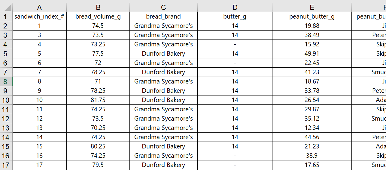
With the data file open, look carefully at the numbers and text in each of the columns. (Partial screenshot shown below)
Can you see any problems with the data? Anything missing? Any errors? Filtering and sorting the data can help spot many issues more efficiently.
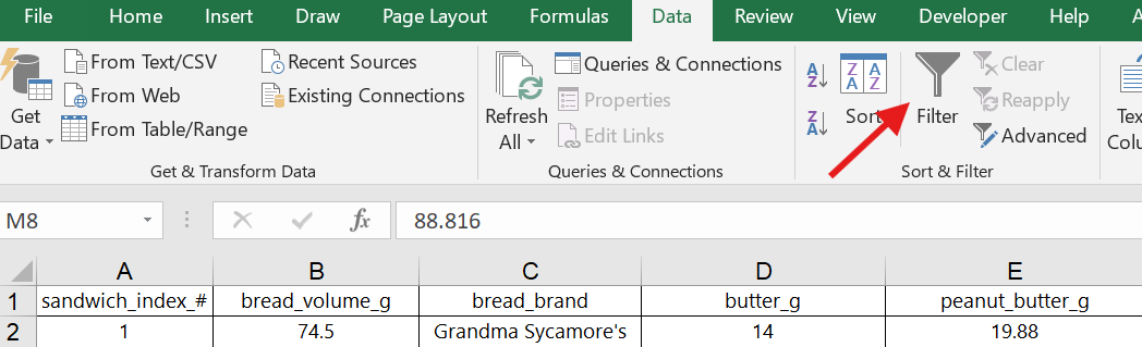
We are going to apply the filtering and sorting tool in Excel. Follow along by highlighting all the data in the spreadsheet and then clicking on the filter button (found on the Data ribbon tab or in the “Sort and Filter” dropdown on the Home ribbon tab).
Finding the filter button on the Data tab:
Finding the filter button on the Home tab:
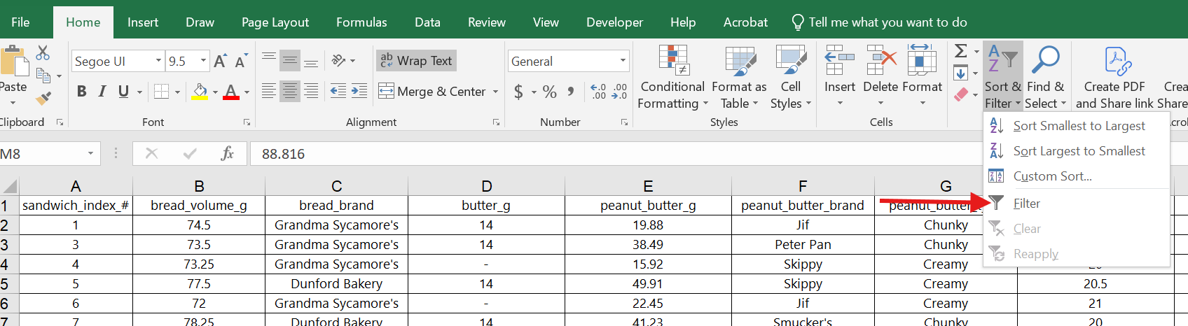
Once the filtering option had been selected, you should see a small dropdown arrow at the top of each column in your spreadsheet. (Shown below)
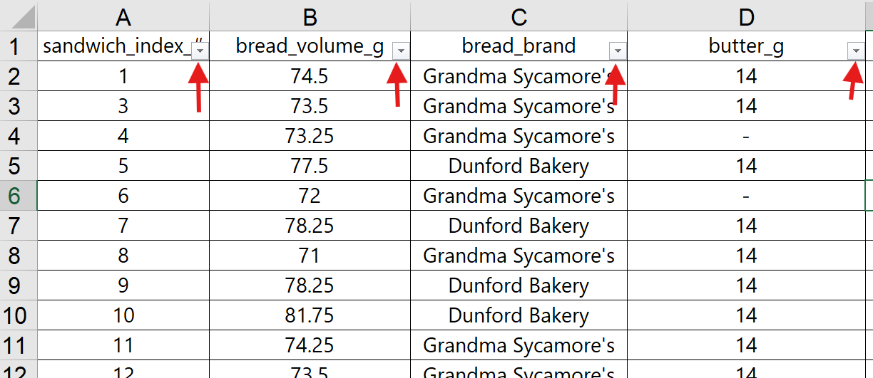
When the filtering tool is set up correctly, Excel applies all sorting and filtering changes to the entire data set.
Sorting the Shef B. Foods Data
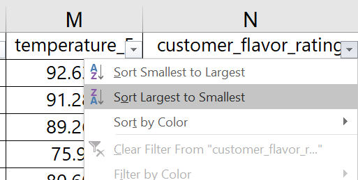
Observe how you can sort the data based on customer ratings in the last column, sorting from largest to smallest rating.
You can now see the data in order of highest customer rating to lowest customer rating. You might find it insightful to look at the rest of the data set sorted this way. Notice anything interesting?
You can undo a sort by pressing the Undo button or using the ‘Ctrl+z’ shortcut. You can also use the index column on the far left to sort the data in its original order. It is good practice to try sorting, unsorting, and resorting the data while you explore the data for the first time.
Filtering the Shef B. Foods Data
In the Chef column, we would like to click the filter/sort dropdown arrow and select only one Chef to view customer ratings for sandwiches made by that specific Chef. However, before we can do that, we find a problem with the data.
Because the filtering tool shows each unique text entry as an option to select for the filter, it makes it easy to spot data anomalies. As shown in the screenshot, the data for Chef names includes misspelled names, possibly more than might have been found by just scrolling through the raw data.
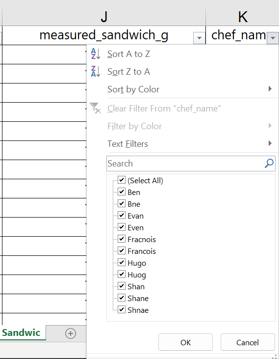
In a real-world setting, we would want to check whether these are in fact misspellings of the five Chef names, or oddly similar, additional Chef names. Assuming that we have verified the correct spellings, we can use the filtering tool to filter out all other data so we can easily find and update the spellings.
We start by selecting all the misspelled names so we can fix them in the spreadsheet, as shown below.
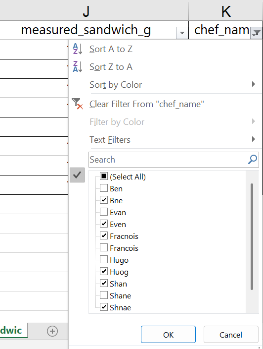
The Excel filter then shows only the rows with incorrect spellings, but the data we filtered out is still in the spreadsheet. The row labels on the left side of the worksheet are now shown in blue, indicating that the rows between these numbers have been hidden from view.
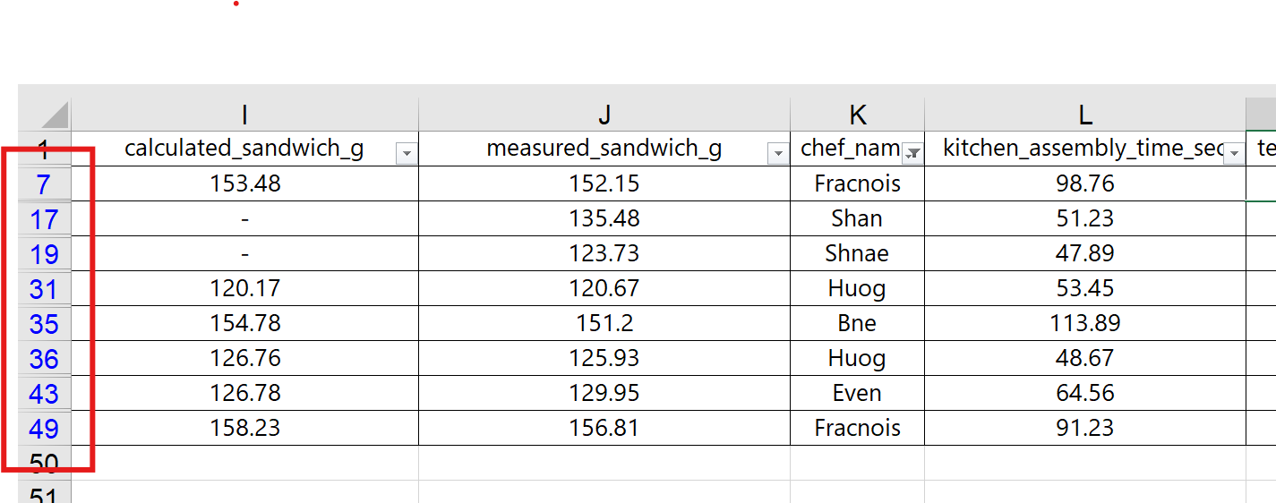
A common error in working with filters in Excel is to forget about the hidden rows and make changes across several rows at once using the “Expand Fill” mechanism. Be careful!
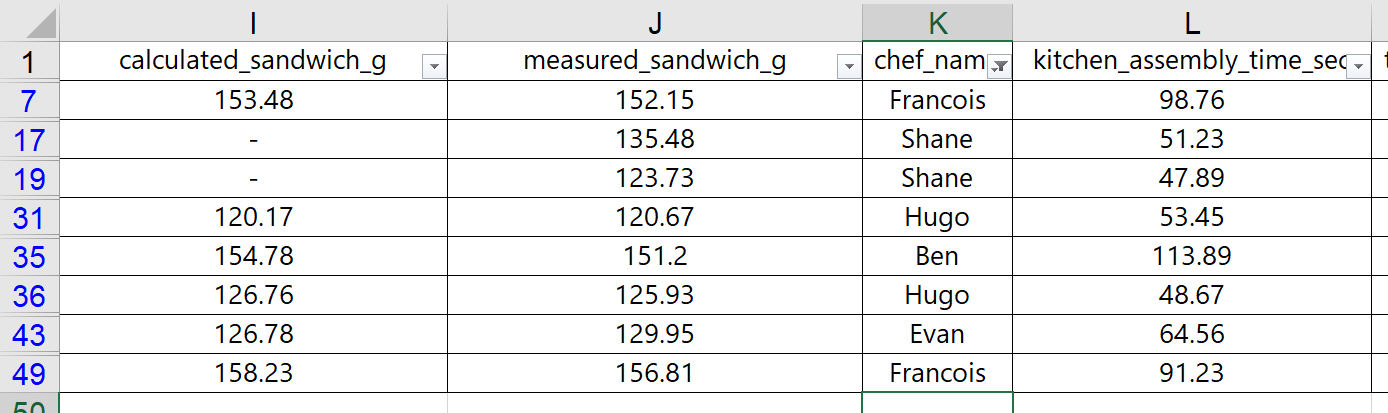
With the filter in place, we can easily update the misspelled names by typing the correct spelling. This will help us use the more advanced Pivot Table tool in the next section.
We updated the spreadsheet with the appropriate spelling for Chef names, and Excel updated the filtering options automatically. Screenshots are shown below.
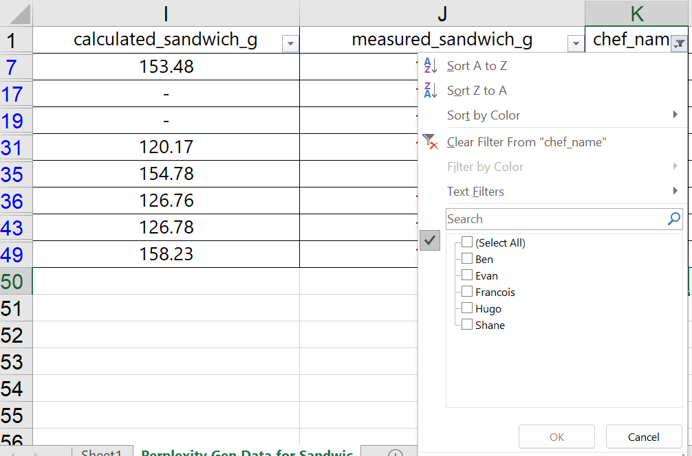
To undo the filter, simply choose the “(Select All)” option and click OK. Learning how filters work can help with reviewing the data set, rough analysis, and cleaning up messy data – as we did here with the Chef names.
With numerical filters, Excel provides additional options. Suppose that Shef B. Foods wants to only see customer ratings for sandwiches assembled in under 60 seconds. We can use the filter drop-down arrow on the “kitchen_assembly_time_sec” column and choose a number less than 60.
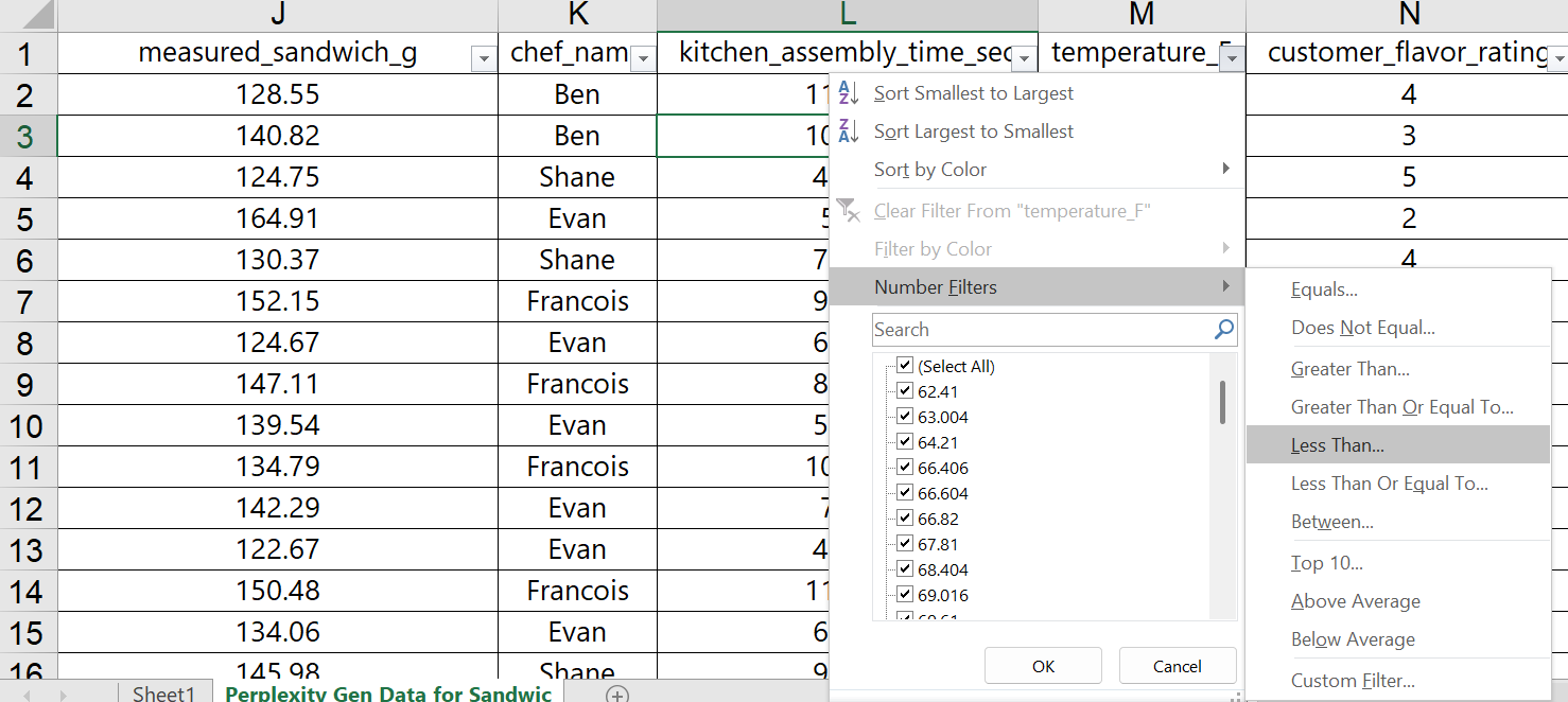
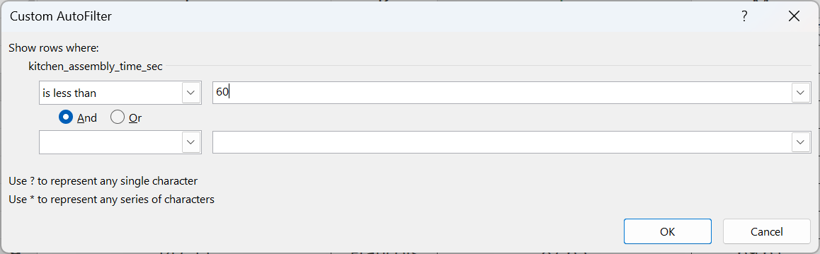
Once OK is selected, the worksheet is updated to only show the sandwiches with assembly times less than 60 seconds. Though it is not entirely clear, it looks like some Chefs are faster at assembly than others. Operationally, we might be able to learn the best way to assemble these sandwiches, and then train the other Chefs on the more efficient process.
As you’ve gone through this process, you have likely noticed some missing data, where only a dash, “-” is listed. You might have also noticed that some of the Chef names are misspelled. Looking even deeper, you might have additional questions, such as:
- Why is the butter measurement exactly 14 grams, and why are so many numbers missing?
- Why is there a difference between calculated sandwich grams and measured sandwich grams?
- Why doesn’t the data show the brand of Honey or the brand of Butter used?
Even though this data was engineered for this textbook example, it is very common to have similar and even worse problems with real-world data. If you are provided with data at work, you will likely need to verify that the data is accurate, you may need to understand how the data was collected, and you might have several questions you need answers to before you can even begin to analyze the data.
Appendix 3 – Putting it All Together (Suggested Class Activity)
In this final section, we want to walk through a full analysis of a complex, real-world situation that requires basic data analysis, structured after the C.A.R. method. We include a brief case and a set of related data. Students are encouraged to follow along with the data set found at this link: Exhibit A – Diamond Data
In-Class Mini Case Handout: Buying Diamonds for Maalek Jewelry’s Supply Chain
A New Job
Diana Hammond is a new procurement intern for Maalek Jewelry assigned to the medium-gem (MG) jewelry division, which supports all jewelry made with gemstones sized between 0.35 to 0.60 carats. During the orientation, the interns all learn that Maalek Jewelry is known for jewelry constructed with internally flawless (IF) diamonds in the Colorless (E,F) to Absolutely Colorless (D) ranges.
On the first week of her actual internship, Diana has been tasked with analyzing a sample inventory of a new potential supplier. The potential supplier’s inventory list for 308 sample diamonds is found in the “Exhibit A – Diamond Data” Excel spreadsheet file.
Based on the sample inventory list, Diana is supposed to figure out which certification catalog (GIA, IGI, or HRD) to request from the potential supplier. Her decision should be based on what she knows about Maalek Jewelry, and on which certification body is more likely to meet the needs of the company – at a price point that won’t “break the bank.”
Her boss, Maxine Verstartten, believed Diana would probably realize, on her own, that she could ignore the IGI certification group, since IGI mostly certified lab-grown diamonds for science or industrial laboratories. GIA-certified diamonds, on the other hand, were probably too expensive to really consider – “They’ve always been the best – but out of our price range.”
Despite this direction, Maxine plopped a stack of industry market reports on Diana’s desk and told her to go through the research process anyway – just for the sake of learning. Plus, the new supplier might carry a different selection than what they’ve seen before, so she should try to keep an open mind.
Diana took notes as she perused the reports, which can be found in Exhibits B and C.
While Diana was working through the diamond market materials, Maxine dropped in to remind her that the intern position is focused on sourcing diamonds sized at a half-carat or below. Specifically, if there are any half-carat diamonds available with great clarity and color, it might be a good idea to buy them from the supplier – if they’re available at a good price.
Coupled with her new understanding of the diamond market, Diana is ready to begin her approach to the task at hand – developing recommendations regarding the potential supplier for Maalek Jewelry’s purchasing department.
Exhibit B: Diamond Characteristics (How do we measure Color and Clarity?)
Diamond Color
Diamond colors range from D-Z, but the topmost colorless categories are:
- D = Absolutely Colorless (Rarest and most valuable – no discernable hue)
- E-F = Colorless (Minute traces of color, still invisible to untrained-eye, also very high value)
- G-I = Near Colorless (Color very subtle, undetectable once set in jewelry, some tint in the “I” color range, still a strong value proposition)
Diamond Clarity
The clarity of the diamond is judged by the amount of blemishes visible on the surface or on the interior of the diamond. “Inclusions” are marks or imperfections within the stone, while blemishes are on the surface. Based on these details, the clarity can be ranked as follows:
- F = Flawless (No blemishes or inclusions visible at 10x magnification)
- IF = Internally Flawless (No inclusions visible and only minor blemishes at 10x magnification)
- VVS1 = Very, Very Slightly Included (Minute inclusions, extremely difficult to see at 10x magnification)
- VVS2 = Just a tiny bit worse than VVS1
- VS1 = Very, Very Slightly Included (Minor inclusions, difficult to see at 10x magnification)
- VS2 = Just a tine bit worse than VS2
Exhibit C: Diamond Certification Bodies (Which is best for Maalek Jewelry?)
Certification Body
The supplier data included inventory from three separate certification bodies, GIA, IGI, and HRD. Notes about each certification body is included below:
- GIA (Gemological Institute of America) – Based in United States
- Non-profit and the global authority in gemology
- Developed and standardized the 4Cs of diamond grading: Cut, Color, Clarity, and Carat
- Their diamond grading reports are the industry gold standard, trusted worldwide
- Provides grading reports for both natural and lab-grown diamonds
- HRD (Hoge Raad voor Diamant or Diamond High Council) – Based in Belgium
-
- Recognized as the leading certification authority in Europe
- Uses a grading system close to the GIA’s, evaluating diamonds on the 4Cs, plus characteristics like polish, symmetry, and proportions
- Can be perceived as slightly less strict than GIA’s by some jewelers
- IGI (International Gemological Institute) – Based in Belgium
-
- Issues grading reports for loose diamonds and mounted jewelry
- Follows strict evaluation of the 4Cs, as well as additional details like fluorescence, polish, symmetry, and inscriptions
- Pioneered grading standards for synthetic and lab-created diamonds, but widely used for both natural and lab-grown stones
- Strong reputation, especially in Asia and Europe, but seen as slightly less rigorous than GIA despite increased restrictions in recent years+
APPLYING THE C.A.R. METHOD
Part 1: CONTEXT:
In small groups, students should practice describing and documenting the “context” of Diana’s situation at Maalek Jewelry. Some key points to remember include in a definition of the context:
- Brief background information the company/organization, including the key character/stakeholders
- Description of the “situation of interest”, including the threats and/or opportunities, the time frame, and the potential impacts or consequences being faced
- Clear statements of the “problem(s) to be solved” or the “question(s) to be answered” or the “opportunities to be pursued”.
- Some problem statements/questions to be answered might include:
- Does this potential supplier have the kind of diamonds that Maalek Jewelry should be buying?
- If so, which certification catalogs should they consider from this potential supplier, GIA, IGI, and/or HRD?
- Lastly, even though this is a sample inventory, are there specific diamonds that might fit Maalek Jewelry’s needs now?
- Some problem statements/questions to be answered might include:
Each team should document the context on a note sheet or post-it wall note or white board, and be ready to discuss with rest of the class. Once the teams are ready, the instructor can facilitate the class conversation.
Part 2: ANALYSIS:
Before beginning data analysis, it is important for teams to decide what kind of criteria they can use to judge or compare different results. Another way to think of this is by answering the question: what would make one recommendation better than another. For example, if the team is choosing between recommending HRD or GIA, they might consider A) whether the price per carat is lower, B) whether the number of half-carat diamond options is greater, or even C) which certification body has a higher percentage of internally flawless diamonds. Once this set of “criteria” are set, it is only a matter of summarizing and exploring the data to see what it shows.
Using Excel, students should work individually, and then as a group, to analyze the data set to look for answers to the questions, or potential solutions to the problems, identified while defining the context of the situation described.
In terms of potential directions for data analysis, the spreadsheet will provide good insights with any of the following analyses, assuming that the specific analysis relates to the judgement criteria identified earlier:
- Calculations and summaries of a new “price per carat” metric column
- Categorized numerical visualizations across the certification bodies for price, carat, and price per carat (boxplots, bar charts, etc.)
- Summary table looking at certification body comparisons for clarity and color
- A bar chart, or compound bar chart, based on the summary table
- Basic summaries of the data, looking at Quantity of data, Typical data, Rare Data, Variability of Data, and the Shape of the Data.
Part 3: RECOMMENDATIONS
The last phase of applying the C.A.R. method is by developing a set of recommendations, answers, or solutions that connect the issues identified in the context with the results found during analysis. For the Maalek Jewelry mini case, students might choose one or two of the certification bodies to purchase catalogs for, and explain the reasons why they were chosen (with supporting visualizations, data storytelling, etc.). Additionally, students might display 1-2 data visualizations that demonstrate the opportunities (or downsides) if Maalek Jewelry were to make the potential supplier a regular supplier of their diamonds. And lastly, the team might suggest a few diamonds from among the inventory sample that would be excellent candidates for purchase.
With their recommendations, students could also make statements about other warnings, worries, concerns, or opportunities that may arise if the recommended actions were to be taken by Maalek Jewelry or by any of the characters or stakeholders.
With this section wrapped up, the C.A.R. method is complete.
*If this is done in class, a great way for students to share their screens and give their statements is by connecting via Zoom with the share screen option on (but microphones and speakers off). This allows the students to remain in their team work areas while presenting to the class in a more casual manner.
Media Attributions
- Numerical Pivot Table Summary for Assembly Time © Ben Neve is licensed under a CC BY (Attribution) license
- Categorical Pivot Summary for Peanut Butter Brands © Ben Neve is licensed under a CC BY (Attribution) license
- Annotated Scatterplot for Temp vs. Assembly time © Ben Neve is licensed under a CC BY (Attribution) license
- Annotated Time vs. PB Volume Scatterplot © Ben Neve is licensed under a CC BY (Attribution) license
