6 Chapter 6: The Neoclassical Economics Approach to Sustainability
So we now delve into economics, which has declared itself the “queen of the social sciences” but others have labeled the “dismal science.” Before we start working through the ubiquitous graphs that characterize economic analysis, we need to take a philosophical detour. First there is an essential distinction between empirical and theoretical. “The economy” is an empirical, real-world phenomenon in which real human beings engage. It takes place in geographical space and changes through historical time. Economic geography and economic history are fascinating fields that tell us much about how real human economies have evolved. “Economics” consists of a group of theoretical schools of thought through which we might hope to understand that complex empirical economy.
For comparison, this distinction also applies in the physical sciences. The movie The Matrix notwithstanding, the universe is a real, empirical thing that physicists and astronomers try to understand—partly through the concept of gravity. Do you believe in gravity? I do, and I’ll bet you do too. It seems self-evident. But have you ever seen or heard it? Gravity is a theoretical construct; once we propose that masses attract one another in a specific mathematically manner, as Isaac Newton did, all kinds of things start making sense: the apple falls from the tree and hits us in the head, when we jump we come back down quicker than when LeBron James jumps, people on the other side of the Earth don’t fall off, the moon orbits the Earth, the Earth orbits the sun, and so forth. Albert Einstein proved that Newton’s idea of gravity was oversimplified, however, and today superstring theorists are revising Einstein’s concepts from his general theory of relativity. So something as seemingly simple and clearly evident as gravity is in fact a theoretical construct that science periodically revises based on new evidence and understanding. This also happened to the idea of ecological succession if you recall the discussion from Chapter 4. Thomas Kuhn called this a “paradigm shift” in his 1972 classic The Structure of Scientific Revolutions.
In economics, the situation gets even more complicated because we also have to deal with the philosophical distinction between positive (the way things are) and normative (the way things should be). Debates among physicists over the true nature of gravity are positive—they focus on which idea of gravity best explains empirical phenomena in the universe—like the Big Bang and black holes. Subjective human values need not be discussed, freeing the debate to be purely objective. In the social science of economics, we have to delve not only into what is true about society but what is best or right. Subjectivity and human values return in normative debates about the relative value of efficiency, equity, and sustainability, among other worthy goals for human betterment.
If all the positive and normative debates could reach a permanent resolution, we would have a single school of economics that would form a core of social science, but such is not, and is unlikely to become, the case. So we have partly competing and partly complementary schools: neoclassical economics, ecological economics, institutional economics, and political economy (based partly in Marxist economics), from which is derived political ecology.
Now you would probably roll your eyes if someone told you that they were simultaneously a Christian, a Jew, a Muslim, a Hindu, a Buddhist, and an Atheist! Fortunately, we don’t have to make that kind of commitment to a particular school of economics, though nearly everyone who studies the subject has a favorite. Mine is ecological economics, which comes as no surprise given that this text is titled Natural Resources Sustainability. Fortunately, we can use each of the schools of thought like a lens. Since we are considering four schools, let’s call them “quadfocals,” where each lens helps us see some things clearly that the other lenses leave fuzzy. This is like the physicist who calls light an energy wave when (s)he wants to understand, say, wavelengths of the electromagnetic spectrum, and a particle when (s)he wants to understand how photons are refracted by a lens. The truth is that “wave” and “particle” are both inadequate scientific concepts for understanding the real empirical phenomenon of light. Similarly, no one school of economics can give us the complete picture of natural resource use.
So in the next five chapters, I will introduce you to a number of economic ideas that are relevant to natural resources sustainability. In this chapter on neoclassical economics, we will explore supply, demand, marginal cost and utility, efficiency, cost-effectiveness, cost-benefit analysis, and optimal pollution. In Chapter 7 on ecological economics, we will delve into natural capital, ecosystem services, and a rigorous definition of sustainability before splitting off industrial ecology into its own chapter, Chapter 8. In Chapter 9 on institutional economics, we will delve into non-excludability, rival consumption, and the tragedy of the commons. In Chapter 10 on political ecology, we will talk about power and economic classes, core and periphery, and how people become marginalized through lack of access to natural (and other) resources. Just as the physicist finds both the wave and the particle ideas useful in understanding light, I find all of these ideas, and the schools of thought that generate them, useful in understanding our central topic of natural resources sustainability. Keep in mind, however, that none of these theoretical constructs is as solid as physical theories of gravity—and even they are a moving target.
Of course you could say, then let’s forget the theories and stick to the facts! It turns out that we don’t have that option for at least two reasons. Facts pile up like a big heap of leaves you rake in the fall; we can’t differentiate one from another. Theories give us a structure—like the trunk, limbs, branches, and twigs each leaf was growing on through the spring and summer. A good theory will tell us where on the overall tree of knowledge each leaf, each fact, lies. So theory is the way in which we evaluate the significance of each of a stupendous number of individual facts and the relationships among them, even if one school of thought arranges the facts into an oak while another arranges them into a maple.
The second reason is that facts are not independent of the theories in which they have significance. We measure and collect facts on the prices and production of goods, on gross domestic product, on the value of ecosystem services, and on inequality in land ownership, for example, because they inform our thinking about the empirical world through a particular theoretical lens. In fact, it is generally the theories that tell us what to collect facts on!
Before we proceed, a final note is required about where we humans are in our historical, geographical, economic evolution on this planet. We live in the age of global capitalism. Capitalism developed in the 16th and 17th centuries in northwest Europe and spread from there to every inhabited continent, often by force, while it continued to evolve as an economic system. More recently, after the death of Mao Zedong in 1976, under Deng Xiaoping’s leadership, China switched to a capitalist approach to economics (without relinquishing the political authority of the Communist Party). Russia and its neighbors also did so, to a lesser extent, following the collapse of the Soviet Union in 1989–1991, ending the long Cold War. That means that for the last generation, with a few minor exceptions such as Cuba and North Korea, capitalism is the economic system of the globe at this moment in history. So when we are talking about the economics of natural resources sustainability, we are talking about capitalism. Let’s take a minute then to define what capitalism is, while recognizing that it is always evolving.
An oil corporation explores for, produces and transports crude oil, refines it into gasoline, and delivers it to the gas station you last visited when your car or truck fuel gage moved toward E. Delivering this product to you takes a lot of money and effort from a lot of people. So who is the constituency (meaning the group of people it is obligated to serve) of the oil corporation that does this? One would be the employees who did all of that work to get gasoline to you and millions of other drivers. Another is the customers like you who are willing to part with some of their money to get the gasoline product. A third is the investors who own the company and its facilities. A fourth is other companies the corporation buys its equipment or services from. A fifth is the towns and cities where its headquarters, oil fields, refineries, and so forth are located. A sixth is the governments of the nations, states, and municipalities to which it pays taxes, but expects roads, water, and educated employees in return. A seventh is everyone on Earth who breaths the air into which the water, carbon dioxide, and other polluting remains of the gasoline are emitted.
Do all of these constituents have the same interests in the corporation? Could they all get together and decide what the company should do? Let’s see. The employees want to make high wages and good benefits and work under good conditions and get vacations, but that raises the costs of production, making the corporation charge the customers more. But the customers want a quality product at as low a price as possible. The company wants low taxes, excellent public services, and lax regulations, but governments want high tax revenues, low service demands, and stricter regulations to protect people from pollution and workers from abuse. However, they also want the corporation’s facilities to operate in their jurisdiction to provide jobs and expand the tax base. The investors want to make a profit so they get a rate of return higher than other investment opportunities they could be pursuing, but this is best achieved by paying low wages and low taxes and charging high prices. It seems there is no consensus at all about what the oil corporation’s management should do! So if all the constituents have different goals, who does corporate management listen to?
Management listens to the Board of Directors who has the authority to hire and fire them. The Board of Directors represents the investors who own the corporation’s capital (that is, its stock). That is the answer and it defines capitalism. Investors want to make as high a profit as possible to maximize the return on their investment.
But it’s not that simple either. Customers like you will buy their gas elsewhere if the price is cheaper at some other convenient location. Employees may have other career options that they will pursue if the corporation makes them work under poor conditions, pays them low wages, or eliminates benefits like health insurance, retirement accounts and paid vacations. Governments will enforce labor, environmental, and tax laws to which the corporation must comply. So capitalism ends up as an ever-changing strategic game involving many players.
Nonetheless, we must keep in mind that, from the point of view of corporate management, the object of the game is to maximize profits for the investors who hold stock in the corporation. Employees, customers, taxes, laws, and so forth are means to that end whose interests can represent a constraint on achieving the profit objective. So when we want to understand why private-sector corporations, companies, small businesses, and farmers are doing what they are doing, we need to keep in mind that they are working first and foremost in the interests of their owners or stockholders. This is for the better (most neo-classical economists would assert), for the worse (as Marxist economists argue), or somewhere in between (where most ecological and institutional economists tend to stand)—normatively speaking, that is.
The Starting Point of Neoclassical Economics: Supply and Demand
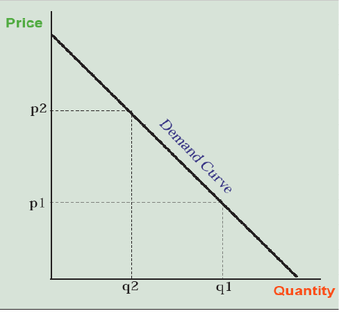
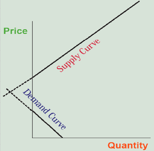
So now that we have explored the notion that economic concepts like supply and demand are theoretical constructs that are specific to the capitalist system, and may someday be modified or rejected in favor of better ideas, let’s take a look at them, starting with demand. Demand is the quantity of a product that customers are willing to pay for at any given price. The higher the price (p2 compared to p1 in Figure 6.1), the less they will buy (q2 compared to q1), making the demand curve downward sloping.
Why is this the case? Certainly because customers can afford less as the price goes up, but that is not a very precise answer. In order to draw from your own personal experience, let’s say the good under discussion is slices of pizza being sold for $1 each from a food truck on campus. How many slices will you buy? If you don’t like pizza (I prefer Chinese food myself), it’s zero—you’ll have something else for lunch. If it’s past noon, you haven’t had lunch yet, you like pizza, and you have $10 in your wallet, you’ll buy a slice of pizza for $1 because you’d rather have $9 in your wallet and a slice of pizza to satisfy your hunger than have $10 in your wallet and no pizza. You think it’s worth it. If you’re still hungry, the pizza is good, you’re engaging in pleasant conversation with the other people buying and eating slices of pizza, and you’re not trying to lose 10 pounds right now, you may part with a second dollar for a second slice of pizza. Or, you may not because that first slice of pizza really hit the spot while the second would just leave you feeling full and sleepy at your next class.
In economic terms, the first slice has a marginal utility exceeding $1 while the second may or may not—it’s up to you to decide. Marginal here means the next unit, the next slice of pizza, given the ones you’ve already had. Utility means the use value that it has for you as the buyer. So, in this context, marginal utility means how much value to you one more slice of pizza has.
Let’s say you go for the second slice, which is to say that you’ve decided the marginal utility of the second slice also exceeds $1, leaving you with $8 while digesting two slices. Now would you rather have $7 and a third slice or $8 and walk away having eaten two slices? How about $6 and a fourth slice? At some point, the marginal utility of another slice of pizza falls to less than $1 (in fact it may become negative if you regret that last slice—something you may have experienced more dramatically with beer).
So, each of us keeps buying slices of pizza (0, 1, 2, 3, 4 . . . ) until the marginal utility—the added value to us on top of the value of the previous slices—falls to less than the $1 price. If the price was $2, we may find that the second or third slice that we were willing to pay for at $1 is not worth it, so we buy fewer slices. At $5 a slice, we can only afford 2 slices, but would likely buy zero, even if we were hungry and like pizza, because we know for less money we can get a good slice of pizza, or something else for lunch that we also like, somewhere else—unless we’re really hungry and stuck in an airport with no other options (a captive market). This is why the demand curve is sloped downward—because each customer is purchasing the product until the marginal utility (the additional value to them) of one more item falls below the price. At a price of p1, this occurs at quantity q1 in Figure 6.1. At a price of p2, it occurs at quantity q2, and so forth along the demand curve.
We’ll draw our demand curves as straight lines for simplicity, but they need not be; in fact, more commonly they are concave curves. Note that the more money we have, the fewer other options we have, the more we like (or have been convinced that we like) the product, and the more the product complements another product that we have already bought, the more of the item we will buy. But we will still buy it until the marginal utility of the next item, as we define it, falls below the price.
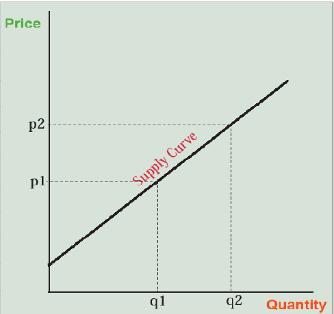
Now let’s turn our attention to the pizza producers. How much pizza will they supply for sale? At a price of zero (free) they won’t offer any. We lose our chance at a free lunch because the producer has to pay production costs—labor, ingredients, an oven, and a building to put it in. Will they supply any pizza slices at $1? That depends; if it costs less than an additional $1 to make one additional slice of pizza, given the pizza slices they have already made, they will, because the $1 they receive in marginal revenue exceeds the marginal cost of producing that last slice of pizza. Marginal revenue is the price of the next slice sold. Marginal cost is a little trickier. It is the extra costs needed to produce one more slice. If this is less than the price (i.e., marginal revenue), producers increase their profits by producing and selling one more slice. At some point, though, as they keep baking pizzas, they have to buy a bigger, more expensive oven or even move to a bigger restaurant building, driving up their marginal costs of production. The $1 per slice may not cover this cost, but at $2 per slice it does. So the higher the price of pizza they can charge, the more pizza they can afford to produce at a profit because the marginal revenue (the price charged) for that last slice of pizza equals or exceeds the marginal costs of producing it. This makes the supply curve upward sloping—the higher the price, the more is produced and placed on the market because each producer keeps making more of the product until the marginal costs of production reach the level of marginal revenues from sales—the price (Figure 6.2).
Now let’s put supply and demand together in what is called price theory. Price theory is the heart of neoclassical microeconomics—in contrast with macroeconomics that deals with national-scale issues like unemployment, inflation, the national debt, and interest rates. Figure 6.3 helps us do this. Let’s say the price of pizza is high—$3 per slice. What happens? Suppliers produce a lot of pizza, hoping to cash in on the profits to be made, but at $3 per slice, customers are unenthusiastic and buy very few of them. We end up with a surplus of unsold slices of pizza on which the production costs have already been paid, but no one has benefited from eating them—clearly not a good situation. What’s the solution? The producers lower the price to say $2 per slice, more customers buy and eat the pizza and the surplus disappears.
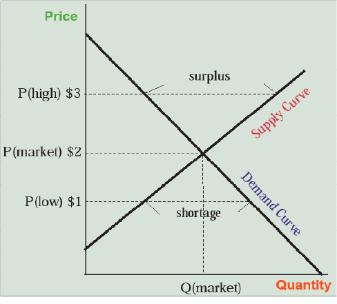
Now let’s say the price is low—$1 per slice. What happens? Sellers are unenthusiastic about hiring people or buying ovens to make more pizza, so they only produce a small number of slices. At $1 per slice, though, the customers come flocking. Unfortunately, only the first few get any pizza and the others wish they had grown up in New York City so they would have learned the art of pushing their way to the front of the line. There is a shortage. What’s the solution? Increase the price to $2 and the sellers will make more pizza while some of the customers will move on and the shortage disappears. In fact, someone waiting in line might offer $2 to the pleased seller in order to get to the front of the line, possibly forcing all the other customers to offer $2 as the scarce pizza slices go to the highest bidder. So it seems as though a price of $2 per slice gets producers and customers on the same page—they make and buy the same number of pizza slices. Prices of $1 or $3 per slice do not—they generate shortages and surpluses, respectively. Note also that the market helps both producers and sellers to find the market-clearing price by forcing sellers to respond to a surplus by cutting prices and to a shortage by raising them. Partly on this basis, neoclassical economists often argue that markets can be self-governing and self-organizing. This is true only to a limited extent, however, as we will see in subsequent chapters.
Production Costs, Consumer and Producer Surplus, and Net Economic Benefits
So is society better off from all this pizza making, selling, buying, and eating? Who in society is better off? Once again, a graph helps us think this through. Figure 6.4 uses the same information and shows the market-clearing price (let’s stay with $2 per slice) and quantity (let’s say 100 slices of pizza to make the math easier). First of all, we now know that the customers took $200 out of their wallets and handed it to the pizza sellers. That’s clear, real, and easy to understand. Now let’s look at it from the producers’ standpoint. The trapezoid in red below the supply curve and up to the quantity of pizza produced represents their production costs. Let’s say it’s $120 that they spent on employees, ingredients, ovens, and so forth. The remaining $80 of revenue represents their profit or what neoclassical economists call producer surplus (Marxist economists call it surplus value) that they walk off with as an economic benefit. This is shown graphically as the green triangle in Figure 6.4.
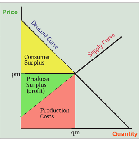
Do the customers also benefit? Yes, because they were all buying pizza until the marginal utility of the last slice purchased was at or above $2. As long as marginal utility is decreasing, their willingness to pay for slices prior to the last one they bought was more than $2. This is reflected in the demand curve which shows some demand for pizza at prices above the market price of $2 (pm in Figure 6.4). For example, if some customers would have paid $3 for one slice of pizza but they only had to pay $2, they got a consumer surplus of $1—its use value to them minus the price they paid for it. This is shown graphically as the yellow triangle between the demand curve and the price line in Figure 6.4. So both producers and customers come out ahead in the exchange and society is better off, by the total of both consumer and producer surplus, than it would have been had nobody made and eaten pizzas and instead stayed home playing computer games. Note that these net economic benefits (yellow plus green areas) are different from the total sales (green plus red areas) and are also different from the total value of the pizza (yellow plus green plus red areas).
As a counterexample, production of something doesn’t always result in net benefits. What if someone wanted to make gold eyeglass frames and sell them at Walmart? They would be very expensive to produce, driving the supply curve upward. They would also be gaudy, driving the demand curve downward—only a few people would be willing to spend a lot of money on gold frames when you could just as easily paint them gold if that’s your favorite color. So what’s the market result? Figure 6.5 shows the market-clearing quantity as negative. The market will produce zero (well, maybe a few in Hollywood).
This odd example tells us that the market instills a rigorous discipline, weeding out the production of things that are expensive to make and nobody wants but encouraging the production of things that have reasonable production costs (which producers have an incentive to drive even lower) and a high value to people, who will then become paying customers. Like biological evolution, where poorly adapted organisms and species are driven to extinction and removed from the ecosystem, producers who can’t control production costs or who can’t find willing customers for their products are driven to bankruptcy and eliminated from the economic system—hopefully to find something more socially beneficial to do with their careers. At the same time, however, new ideas to produce at reasonable cost a good or service that people value are encouraged and work their way into a dynamic economic system that employs a form of social selection that is not too different from biological evolution’s natural selection.
Market Effects of Changes in Demand and Supply
Let’s take our discussion of supply and demand to the next level by facing the fact that they are always changing. We have all modified our consumer preferences for specific products—maybe you tried being a vegetarian but discovered you can’t live without hamburgers, or you got tired of the sneakers, torn blue jeans, and expressive t-shirt “grunge” look and started preferring “office casual.” More substantively, maybe the price of gasoline went through the roof and you realized you were much better off with a hybrid car than an SUV. Or you lost interest in buying a fax machine or even a printer because it’s become so simple to text message or attach documents to an email and save trees at the same time. These are all examples of changes in your demand for products that goes beyond the effects of price that we discussed with pizza slices. So how do these increases or decreases in demand change the market for a product?
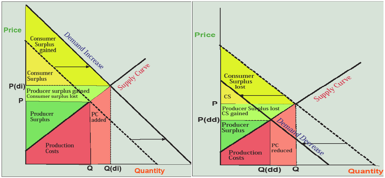
What happens to consumer surplus, producer surplus, and production costs? Production costs increase (note the “PC added” area in Figure 6.6) because more of the product needs to be produced. But producer surplus increases nevertheless (light green “producer surplus gained” area in Figure 6.6) because producers can now sell more of the product at higher prices.
This is an important outcome—producers make more profits if the demand for their product increases. For this reason, producers are constantly trying to increase the demand for their products. That’s why you are inundated with advertisements and commercials on TV, the radio, and the Internet. If you’re smart, you’ll ignore them all, except perhaps as entertainment, because marketers are just trying to use psychology to increase your demand for their product. That way they make more profits off the money that used to be in your wallet. It’s better to teach yourself to use your money to buy only what you’ve previously decided you need or want.
Moreover, the desire of firms to increase demand encourages overconsumption of goods. Our closets are full of unworn clothes, our garages and basements of products we purchased but never integrated into our lives in a constructive manner. The companies that make these products make a profit off our income or even our debt, and natural resource sustainability is undermined by this simple economic fact that producer surplus increases when demand increases—it’s all in that light green trapezoid on the left-hand graph in Figure 6.6.
Now let’s look at the case of a decrease in demand such as with the “grunge” clothes, the SUV, the fax machine and printer mentioned above. In the right-hand graph in Figure 6.6, the new demand curve slides along the supply curve, crossing it to the left and below where it did before, resulting in a lower price and a lower quantity. Producer surplus is reduced. Companies that make SUVs and fax machines lose profits and may discontinue these products. They may even go bankrupt. A decrease in demand for the product you make is the nightmare that haunts the dreams of capitalist producers. This can make “conservation” a hard sell to producers because it results in a decrease in demand and therefore profit.
Note that changes in demand are always associated with how much customers value the product. Changes in supply, on the other hand, are always caused by conditions of production. Technological advance, nearly by definition, causes a reduction in production cost and therefore an increase in supply. This is especially true for incremental improvements, such as in membranes for desalination of seawater through reverse osmosis; bigger, more efficient wind turbines; cheaper solar photovoltaic cells; better methods for turning plant cellulose or algae into ethanol or biodiesel; or computer chips that hold more data and run even faster. It is also true, however, for technological breakthroughs. For example, the cost of sending a human to Mars is infinite—it cannot not be done at all—while in the future it may be possible for a steep price of many billion dollars.
In each of these cases, technological advance is the best example of an economic free lunch, and for that reason, has been an enormously progressive force in the world, especially in the last two or three centuries. We are deeply indebted to the nerds and geeks of the past! It is likely to be even more of a bonus in the future. Note, however, that decreased costs of production can also occur by moving production to regions with lower wage rates, lower taxes, and more lenient labor and environmental regulations, one of the key points of contention in modern globalization.
Increasing costs of production and resulting decreases in supply can also occur when labor becomes more expensive (e.g., due to rising health care costs), taxes and environmental regulations become more onerous, or raw materials or energy become more expensive. This occurred, for example, in the 2008 surge in oil prices that drove up costs of production for most industrial and agricultural goods.
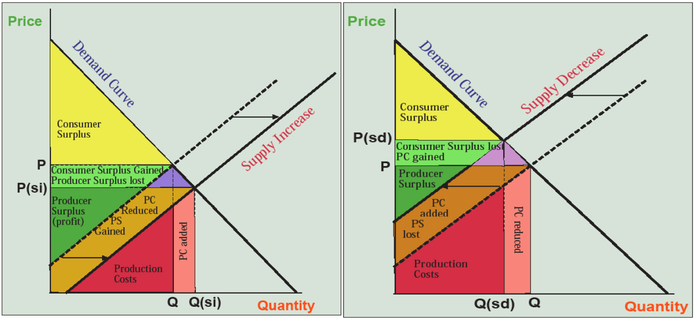
A decrease in supply (right side of Figure 6.7) borne of increased production costs is difficult to cope with because prices (P(sd)) rise while quantity shrinks (Q(sd)). Consumer surplus declines (light green plus purple areas) as customers get less product for more money. Producers lose profits (brown area) as per unit production costs rise, though this may be offset by higher prices (light green area), especially for firms that avoid the problems driving production costs higher. These market effects are cited by those opposing environmental regulations, and they also make an argument for vigorously expanding the supply of natural resources, especially energy, rather than allowing prices to rise, even though high prices reduce quantity demanded and thus encourage conservation.
So we can see that changes in demand and supply make the market dynamic, constantly altering prices and the quantities of goods produced. Moreover, these changes raise difficulties for pursuing natural resources sustainability. In particular, producers have a built-in incentive to encourage consumption, not conservation, and customers have an incentive to avoid the cost increases that can sometimes accompany environmental restraint. Only technological progress can avoid these head-on collisions of economic interest where environmental sustainability is usually the underdog.
Applying the Concepts: The Price of Oil
No product’s price draws more interest than oil, and its rises and falls are watched more closely than any other market, except perhaps the Dow Jones, S&P500, and Nasdaq stock market indicators. Figure 6.8 charts the price of oil over a half-century, starting from 1965. Note that the price of gasoline follows crude oil prices. Currently in the U.S, you can divide the world price of crude per barrel by 42 (gallons per barrel) then add about $1.00, with local variations, to estimate the price of gasoline (e.g., $42/barrel yields $2.00 gas; $84/barrel yields $3.00 gas; $126/barrel yields $4.00 gas).
Rising crude oil prices, such as in the 1970s and 1998–2008, have been more common than falling ones, but there have been some interesting price collapses as well (e.g., early 1980s, late 2008–2009, late 2015). In this time period, I have chosen seven snapshots where the world price of oil per barrel, corrected for inflation by sticking with 2000$U.S. dollars, is plotted against world oil production in billions of barrels (that’s right at 24 billion barrels we surpass one trillion gallons). Note from our philosophical discussion at the beginning of the chapter that the prices and the quantities of oil produced are real, measured empirical data, while the demand and supply curves are a bit murkier theoretical constructs that we assume lie behind the data the way gravity lurks behind the shape of planets’ orbits (that’s why I colored them gray). What we see in the volatile prices is changing supply and demand—prices rise as supply falls and/or demand rises, prices fall as supply expands or demand declines—but there’s a political story to be told explaining why these key levers are changing.

Here’s how I tell that story, drawing from the Pulitzer Prize-winning book by Daniel Yergin The Prize: The Epic Quest for Oil, Power, and Money. In 1966 oil prices were below $10/barrel because oil companies (e.g., the “seven sisters” Exxon, Mobil, Chevron, Gulf, Texaco, British Petroleum, and Shell) could set prices for crude oil pumped from countries belonging to the Organization of Petroleum Exporting Countries (OPEC). World demand was low, though rapidly growing, because only North America had at that time developed an automobile-dependent society, and world population was only 3 billion. The huge oil discoveries of the Persian Gulf had just been brought on line, and the U.S. was a significant world oil producer, making cheap-to-produce oil supplies abundant. In 1973 this all changed. In protest of U.S. support for Israel in its Yom Kippur War against the Arabs, OPEC cut off oil exports (this is called an embargo). By this time, U.S. oil demand had shot past domestic production, and this politically motivated reduction in supply, enabled by OPEC’s wresting of control of crude oil prices from the oil companies, forced oil prices rapidly upward. Global demand had also sky-rocketed, doubling in less than a decade, due to the economic recovery of Europe and Japan. In 1980 these conditions of high demand and politically limited supply became even more extreme as a result of the Islamic fundamentalist revolution in Iran.
By 1987, the oil-importing developed countries had succeeding in fighting back, not militarily but economically. They found oil in Alaska and the North Sea, expanding supply. More importantly, fuel-efficient Japanese cars filled the highways, and the electricity industry phased out oil-fired power plants in favor of coal, natural gas, and nuclear plants. These efforts controlled demand sufficiently to bring prices down to below 1973 levels.
By 2000, however, trends had again reversed. Americans were driving SUVs, minivans, and pickups instead of hatchbacks, and the great Asian economic miracle, especially in China, was increasing demand again. Meanwhile, U.S. oil production was falling due to depletion of spent oil fields, and even the giant Persian Gulf fields were finding it difficult to expand production at a whim. These high demand and falling supply conditions hit the fan in 2007–2008 as prices sky-rocketed to hit an amazing $147/barrel in June 2008. Probably exaggerated by speculators, this oil price peak was short-lived and prices crashed to only $40/barrel by January 2009 in the midst of a deep global recession that plummeted demand for oil. As of this writing, the price has recovered from a 2015–2016 low of under $30/barrel to hover in the $50/barrel range, a mark that has been held at low levels due largely to the influx of North American sources driven by new technologies for extracting and refining oil sands from Canada’s Athabaskan fields and by the 21st century technology of fracking.
So the price of oil has been determined by supply and demand throughout the last half-century, but these are the economic expression of political, technological, and other forces. While resource depletion and scarcity has played a role and will play a much larger role in limiting oil supplies in the future, Figure 6.8 is largely a graph of a power struggle between oil importers and exporters that shows no signs of abating. Consumer surplus resides largely in importing countries, including not only the developed countries of North America, Europe, and northeast Asia, but also most developing countries. They, therefore, want the low prices that arise from high supplies. But OPEC countries want high producer surpluses that come from high prices—which can be created through supply restrictions. That’s the purpose of their cartel. The 21st century will also likely witness actual scarcity due to the inability of this diminishing, non-renewable resource to keep up with expanding world demands.
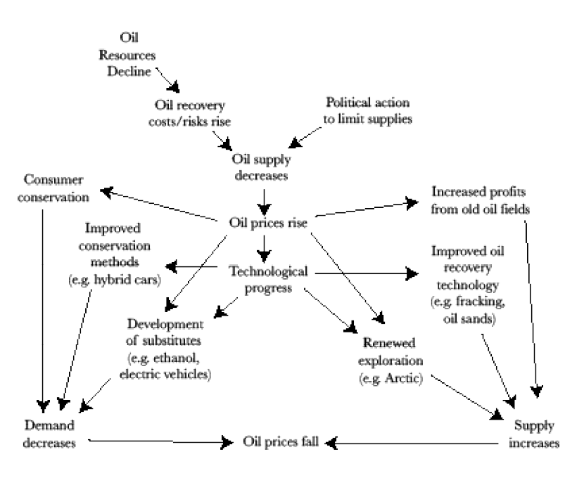
Importing countries have some important cards that they can play. The very increases in prices induced by supply limitations, whether from political action or resource scarcity, can initiate an effective response. On the demand (left) side, consumers can respond to higher prices by driving less—up to a point. Through technological progress, more fuel-efficient cars like hybrids are developed and substitutes for oil like ethanol or electricity are created. New technologies like the hyperloop can also replace driving. These efforts all result in a decrease in demand that has the effect of lowing prices.
On the supply (right) side, price increases cause oil exploration to pick up, and old oil fields again become profitable through the use of improved recovery techniques, such as injection of water, steam, and detergents, or carbon dioxide. Oil sand and fracking activity accelerate. In 1974 the U.S. wisely established a Strategic Petroleum Reserve holding one billion barrels of oil in salt domes in Louisiana purchased when prices are low, so they will be available when prices are high or supplies are unavailable. These efforts result in an increase in supply that lowers prices.
Let’s go back for a moment to the first demand and supply curves in Figures 6.1 and 6.2 where we were talking about pizza. Looking at the left-hand panel of Figure 6.10, this time in reference to oil, let’s take the solid supply curve as the starting point with price of P and quantity of oil produced of Q. Now supply decreases (“reduced supply” curve) and we have a problem. Earlier we showed that a decrease in supply causes prices to rise and quantity to fall, but which changes more? The steeply downward sloping demand curve on the left panel of Figure 6.10 is inelastic—increases in price don’t yield very much decrease in quantity demanded. So price jumps from P all the way up to P(rs,id) (reduced supply, inelastic demand) while the quantity consumed falls only a bit from Q to Q(rs,id). When customers are unable or unwilling to reduce their use of a product like gasoline when supply reductions increase the price, they take it in the teeth (in the form of a greatly reduced consumer surplus). If demand had been elastic, however, like in the green-labeled, dashed, shallow-sloping demand curve, the price would have only increased from P to P(rs,ed) (reduced supply, elastic demand), reflecting their responsive capacity to reduce quantity consumed from Q to Q(rs,ed). The adaptive capacity to reduce use of a product like oil is thus the primary means of defense customers and importing countries have when the resource becomes more scarce and expensive. They are therefore wise to develop such capacities through the means outlined on the left-hand side of Figure 6.9 and discussed above—conservation, substitution, more efficient technology.
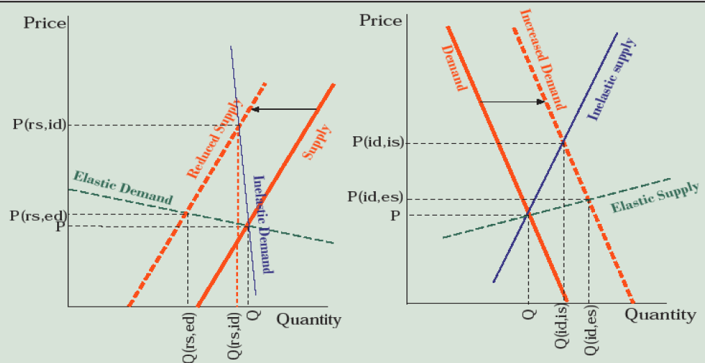
A similar situation follows when we examine the importance of elasticity of supply in response to rising demand. On the right-hand side of Figure 6.10, let’s again start with the curve labeled “Demand” and a market-clearing price of P and quantity of Q. Now, world population increases and economic growth in the Asian demographic giants leads to accelerating use of automobiles in the expanding middle class, increasing demand for gasoline derived from oil. If OPEC can’t or doesn’t respond by greatly increasing production (only from Q to Q[id,is]) making supply inelastic, the price skyrockets to P(id,is) (increased demand, inelastic supply). Supply might be more elastic, for example, if there is excess pumping capacity within OPEC and a willingness to utilize it, alternative sources of oil outside OPEC, the ability to accelerate fracking, or a strategic petroleum reserve that can be accessed. In this case, quantity supplied becomes more responsive (from Q all the way out to Q[id,es] [increase in demand, elastic supply] and prices rise only from P to P(id,es). So again we see that the capacity to adaptively respond through increases in supply is the best way to prevent increasing demand from forcing prices sky-high.
If even my colorful graphs don’t make these market effects apparent to you, I have summarized them in Table 6.1. Working across the rows, demand increases or supply decreases cause prices to rise while demand decreases and supply increases cause them to fall. Note the importance of elasticity on consumer and producer surplus. You can similarly work your way through the other rows, or use Table 6.1 as a quiz to see if you understood the graphical analysis.
Table 6.1. Summary of effects on price, quantity produced, consumer surplus, producer surplus, and production costs when supply or demand change.
| Market Change | Demand Increase | Demand Decrease | Supply Increase | Supply Decrease |
|---|---|---|---|---|
| Price | Rises | Falls | Falls | Rises |
| Quantity | Increases | Decreases | Increases | Decreases |
| Consumer Surplus | Increases if supply is elastic Decreases if supply is inelastic |
Decreases if demand is elastic Increases if demand is inelastic |
Increases | Decreases |
| Producer Surplus | Increases | Decreases | Decreases if demand is elastic Increases if demand is inelastic |
Increases if demand is elastic Decreases if demand is inelastic |
| Production Costs | Increase overall | Decrease overall | Decrease per unit | Increase per unit |
Benefit-Cost Analysis
We have now seen how markets regulate rewards, and thus behavior, in the private sector. Governments, the public sector, also need to know when investments are worthwhile through economic analysis. This issue came especially to the fore when, as told by Marc Reisner in Cadillac Desert, the U.S. Army Corps of Engineers (Corps) in the East and the U.S. Bureau of Reclamation (BuRec) in the West were allying with local private sector beneficiaries and members of Congress (whose districts stood to gain federally funded projects) in an iron triangle of pork-barrel spending. This resulted in the great dam-building era of about 1955–1980 when the Missouri, Columbia, Colorado, and other rivers systems came under the control of human engineering.
The central economic question is: when is a dam or other public investment worth it? The answer is if it has a net economic benefit, or “the benefits, to whomsoever they accrue, exceed the costs.” This is known as the potential Pareto criterion after the Italian economist who argued that if the economic beneficiaries of a project could compensate the economic losers and still have something left over, then the project is worthwhile. Now here’s some easy math. If benefits exceeds costs (B > C), which is the same as saying if net benefits are positive (B – C > 0), which is the same as saying if the benefit-cost ratio exceeds one (B/C > 1), the project is worth it.
One catch that complicates the easy math is that money is a two-dimensional object: amount and time. Would you rather get a check for $10,000 tomorrow or 30 years from now? I’ll bet there’s unanimous agreement on tomorrow. Why? The first reason is that there’s a time preference for money—we are simply focused on the here and now (an ever-present difficulty to achieving sustainability, which is inherently oriented toward the future). The second reason is that if we invested the $10,000, we’d have a lot more than that after 30 years (especially if we can avoid financial disasters like in 2008–2009 or in 2020). The answer to this time dilemma is called discounting.
Let’s say you can make 6 percent interest on your investments (around the average over the past century). That $10,000 in the present (P) becomes $57,435 thirty years in the future (F) based on the formula F = P(1+i)n where i is annual rate of interest, or rate of return, and n is the number of years this rate is applied. So 57,435 = 10,000 (1.06)30. (Try this on a handheld calculator using yx as the “raise to the power of” key.) Remember the doubling-time formula from Chapter 5 on population (DT=70/percent growth rate), where 1.0170 ~ 2. After 50 years, the typical period of analysis on public infrastructure projects, the $10,000 is worth $16,446 at 1%, $26,916 at 2%, $71,067 at 4%, $469,016 at 8%, and $16,707,038 at 16%. The interest rate makes an enormous difference if applied over a long time frame!
The mathematical power of exponential growth also works in reverse where we have half-lives (for example, 0.9970 ~ 0.5) rather than doubling times. This means that if a project is predicted to produce $10,000 in benefits every year for the next 50 years, we have to discount the future benefits relative to the present benefits to calculate the present value using the similar formula P = F/(1+i)n. Try this on a future value of $57,435 at 6% over 30 years and you’ll get $10,000 (10,000 = 57,435/(1.06)30). The present value of that $10,000 benefit in year 50 is $6,081 at a discount rate of 1%, $3,715 at 2%, $1,407 at 4%, $213 at 8%, and a measly $6 at 16%. To put it bluntly, at high discount rates, the distant future is worth next to nothing!
Table 6.2. Formulas for calculating present value.
| Future value of a present investment F = P(1 + i)n |
| Present value of future benefits or costs P = F/(1 + i)n |
| Present value of an Annual benefit stream P = A[(1 + i)n – 1] / [i(1 + i)n] |
| i = annual interest rate; n = number of years |
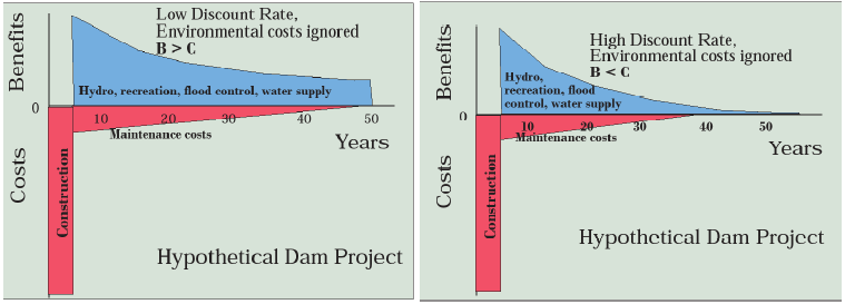
Figure 6.11 traces the costs and benefits for a typical dam or other infrastructure project using a cash-flow diagram, where costs and benefits are graphed over time with a discount rate applied—a low one on the left and a high one on the right. In each case there are large construction costs at the beginning and moderate maintenance costs thereafter. The initial annual benefits of hydroelectricity, recreation, flood control, and water supply are the same, but their present value declines faster over time on the right-hand side because of the higher discount rate. The result is that the total benefits (blue area) exceeds the total costs (red area) (B>C) on the left, but costs exceed benefits (B<C) on the right. So the discount rate determines whether this dam is “worth it” by the benefit-cost criterion. Oddly, this leaves environmentalists who oppose dams arguing for high discount rates, even though discounting the future flies in the face of sustainability.
Given the enormous mathematical power of discount rates in benefit-cost analysis, it seems that it would be critical to use the “correct” discount rate. But what is it? No one knows! Or rather the debate goes on. Given the over $26 trillion U.S. national debt (over $80,000 per American at the time of this writing), one argument that rests on solid ground is, rather than build the dam or other project, the money could be used to pay down a bit of this enormous debt by paying off treasury bonds. The rate of return varies, but in the 21st century has generally been between 2–5%, so that seems like a solid discount rate to use. But what if the project will make a fish species go extinct? Should the value of that species be discounted at 2–5% per year . . . forever? And what about other environmental costs like the flooded valley and altered stream and sediment flow below the dam?
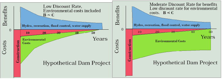
Figure 6.12 (left) uses the same project but with environmental costs of the dam included and discounted. These can potentially negate the net benefits, making the dam not worth it. Economist John Krutilla, however, took the thinking one step further with the concept technological asymmetry. Technological development and economic growth make man-made goods and services ever more available (as we saw with supply increases), but this cannot be said for natural places (e.g., free-flowing rivers, rainforests, coral reefs, etc.) and wild species. Moreover, as population and incomes increase, the demand on the fixed supply of natural places will increase. This increases the value of those few that remain as we can observe, for example, in the sky-rocketing visitations to a fixed supply of national parks. This increase in value over time counteracts discounting as shown in the right-hand side of Figure 6.12. We’re left with a dam project that clearly is not worth it.
In fact, the dam building era in the U.S. largely ceased by 1980 as these arguments gained sway. Moreover, prior to this time, the federal government paid nearly all the costs of projects through the Corps and BuRec so that, from the perspective of the location where the projects were built, the benefits were local while the construction costs were passed on to all the taxpayers in the country. This is the barrel of pork now known as earmarks. After 1980, locals had to pay up to 75 percent of the costs, making the local benefit-cost ratio closer to the overall one. The lobbying of Congress for dams almost ceased, raising skepticism about whether many of the dams built before 1980 were “worth it.”
So we can see that there is considerable room for maneuver in conducting a benefit-cost analysis of a public investment or regulatory decision. Not only will two different analysts arrive at different results, but their results may well reflect the outcome they would like to see. Given this imprecision (after all benefit-cost analysis is usually conducted in reference to the future, which is inherently unknowable) and opportunity for “fixing” the results, there have been many changes in policy in recent decades governing whether benefit-cost analysis should be required for all decisions on public investments and even on all environmental regulations.
In considering this issue, I am comforted by two facts. First, benefit-cost analysis is always an item of information to be considered in making public natural resource and environmental decisions, never a strict criterion for making decisions. Second, benefit-cost analyses have frequently shown that sound environmental management is very economically beneficial. For example, a post hoc (after the fact) analysis of the Clean Air Act obtained a benefit-cost ratio of 42:1! Benefit-cost analysis often reveals that managing natural resources sustainability is also economically beneficial.
Efficiency and Optimal Pollution
Optimal pollution is one of my favorite oxymorons (a contradiction in terms). It seems to make no sense, but then again, does it make sense to stop all soil erosion, all greenhouse gas emissions, all solid waste, and all nutrient runoff? If you wanted to stop all tooth decay, you’d spend half your life brushing and flossing; maybe stopping most tooth decay by brushing and flossing once a day makes more sense. Similarly, optimal pollution addresses the question—how much pollution is efficient? Let’s look at the logic (yes, graphically) using the example of reducing greenhouse gas emissions.
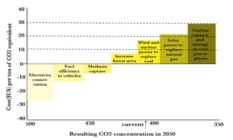
Let’s first introduce the idea of cost-effectiveness. No matter how much we might want to reduce carbon dioxide, methane, and other greenhouse gases, I think we can agree that we would want to do so in the least costly manner. Thought of in the opposite way, if we have a fixed budget for greenhouse gas reduction, we would want to reduce the most emissions possible within that budget. Let’s look forward to 2050 when, if we do nothing, carbon dioxide concentrations will be, say, 500 ppmv (Figure 6.13).
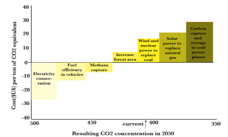
Let’s start with carbon reduction measures that actually yield net benefits (i.e., have negative costs) such as electricity conservation in buildings, and fuel efficiency in vehicles, then turn to capturing methane emissions to use as fuel. These measures get 2050 carbon dioxide concentrations down to, say, 430 ppmv. Next, we increase forest area by reducing deforestation and planting trees at a cost of about $5/ton, which gets us down to 415 ppmv. Then we build wind farms and nuclear power plants to replace coal-fired power plants as they reach the end of their useful life. This gets us down to 390 ppmv or lower at $15/ton. Then we use solar power to replace natural gas power plants to get to 370 ppmv at $25/ton. Finally, we use carbon capture and sequestration at remaining coal plants to get down to 350 ppmv at $30/ton. By applying solutions from the least costly, in fact profitable, first to the most costly last we get the biggest bang for the buck. Of course, costs will vary within these categories, so the most cost-effective strategy may employ a mix of these options (remember the carbon game from Chapter 3).
While this tells us the order in which to apply our climate change abatement measures, it doesn’t tell us when to stop. To answer that question, we also have to look at the benefits of abatement in an optimal pollution framework. The top graph in Figure 6.14 uses the same axes as Figure 6.13, so we can plot total costs of pollution abatement increasing at an increasing rate as we go from the least to the more expensive measures.
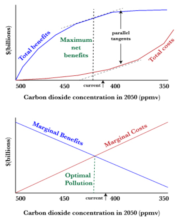
Now, what are the benefits of reducing the 2050 greenhouse gas concentration? One way of looking at this is to acknowledge that as the carbon dioxide concentration goes up and up, the environmental effects become more and more costly. We’ve already seen some of the effects of 415 ppmv, though there is a lengthy lag between carbon dioxide concentrations and their ultimate effects. Sea levels are rising slowly, floods are intensifying, Arctic Ocean sea ice is melting, coral reefs are suffering, hurricanes and wildfires are intensifying, and so forth. At higher levels of greenhouse gases, we proceed through the sequence of intensifying impacts described in Chapter 4’s discussion of Six Degrees.
This progression means that, starting from the origin in Figure 6.14, the benefits of avoiding the 6oC in warming catastrophe are enormously high, perhaps infinitely high. As we reduce carbon dioxide levels in 2050 further, resulting in the 5°C, then the 4°C, then 3°C, then 2°C, then 1°C scenarios, additional benefits accumulate, even if they are less than the benefits of avoiding the worst climate change disasters.
Still looking at the top graph in Figure 6.14, where is the best economic trade-off between the climate change disease and its many cures? Economic efficiency dictates that it is where net benefits (total benefits – total costs) are maximized. This is shown for illustration purposes at 420 ppmv where the total benefits curve has the greatest vertical distance above the total costs curve.
Now let’s proceed to the lower graph, which uses the same axes. Marginal costs increase as we start reducing from 500 ppmv in 2050. This means that the costs of abating an additional ton of carbon dioxide go up as we proceed from the least to the most expensive measures. The marginal benefits of abating each ton go down because this allows us to avoid less and less catastrophic environmental costs.
The point at which these curves cross, 420ppmv, is the same as the point where the gap between total benefits and total costs (net benefits) are maximized in the top graph. Geometrically, the marginal curves are equal to the slope of the total curves at each point along the x-axis. Looking at the top graph, the dashed tangents to these curves are parallel at the optimal pollution point, meaning their slopes are equal and also indicating that marginal benefits and marginal costs are equal. Optimal pollution occurs at that point (in this example, 420 ppmv). That means that, in the hypothetical examples shown in Figure 6.13, we should conserve electricity in buildings and fuel in vehicles, capture methane, increase forest area, and replace coal with wind and nuclear power—but then we stop because further “cures” cost more than further reduction in the symptoms of the “disease.”
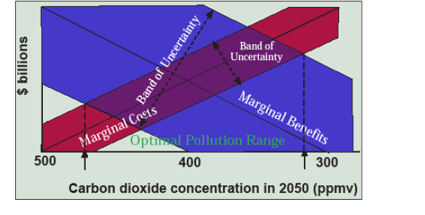
Do you buy this economic argument? I find about half the people do and half don’t. If we’re looking at large volume, non-toxic pollutants like greenhouse gases, soil erosion, or nutrient runoff, the logic makes sense, but perhaps it doesn’t for acutely toxic pollutants like dioxin, where the optimal pollution level must be zero, or species extinctions, where the reason for saving a species is ecological and moral, rather than economic, in the first place. We also run into practical problems in trying to estimate, no less implement, an optimal pollution level because we can’t accurately estimate the nice lean curves shown in Figure 6.14. There is certainly considerable error in figuring out how much any of the abatement measures would really cost, turning the marginal cost line into a band (red in Figure 6.15). It gets even worse when we try to estimate the marginal benefits of avoiding one ton or one part per million of carbon dioxide because the chain of causation from emissions to effects is complex. So we end up with an even wider band of uncertainty when trying to estimate marginal benefits (blue in Figure 6.15, purple where these bands overlap). The result can turn the bottom graph in Figure 6.14 into the mess shown in Figure 6.15, where the optimal pollution level is somewhere in the wide range between 320 ppmv and 470 ppmv—as if we didn’t know that already!
When we have this kind of uncertainty, we can retreat back to cost-effectiveness by setting the pollution target through political negotiation (which it always is anyway), say at the level which would result in 1.5°C or 2.0°C of warming, and then look for cost-effective ways to reach that politically-negotiated goal. Let’s turn our attention to pollution taxes and tradable pollution permits as policies for implementing pollution controls in a cost-effective manner.
Pollution Taxes and Tradable Permits
Our earlier discussion of supply and demand tells us three things about human economic behavior:
- that which is cheap gets wasted
- that which is expensive gets conserved
- that which is rewarded gets produced
If it’s cheap to dump waste (that is, pollution) into the air and water, the air and water’s pollution absorption capacity will be wasted. If it’s expensive, it will be conserved. If pollution prevention is rewarded, it will be adopted. Two economic approaches to incorporating these principles in the service of natural resource sustainability are pollution taxes and tradable pollution permits. As has been said, two certainties in life are death and taxes, so let’s start with the lesser of these two evils.
What if polluters had to pay a tax to emit greenhouse gases into the atmosphere, making it more expensive to use the atmosphere as a carbon dump? Let’s say the tax is $10/ton (Figure 6.16). Since electricity conservation in buildings, fuel efficiency in vehicles, methane capture, and increasing forest area cost less than $10 per ton, these measures are cheaper than paying the tax. They reduce production costs and therefore increase profits. So the tax induces pollution prevention behavior—up to a point. Raising the tax to $20/ton induces further pollution prevention through use of wind and nuclear power to replace coal. At $30/ton, solar power to replace natural gas and carbon capture and storage at coal-fired power plants become economical.
So it seems that taxes are a lot better than death! But we also have to ask the question, who will the taxes be paid to and what will be done with the money? I can guarantee you that polluters will lobby Congress to avoid having the tax policy implemented because it directly transfers money from their profits to the public coffers. But at least the tax is a predictable cost when considering, for example, whether to invest a billion dollars in a coal-fired power plant or a giant wind turbine farm, each of which will run for the next 50 years or more.
Like prices, pollution taxes also create an efficient condition that economists call equimarginality. Remember that everyone didn’t buy the same number of pizza slices. Rather everyone bought slices until the marginal utility of the last slice equaled the price. So prices allocate resources in a manner such that the marginal value of the last unit used is equal among all users. Similarly, a pollution tax induces each polluter to reduce emissions until the marginal costs of the last ton abated equals the tax. In this manner, a pollution tax encourages equimarginality, and thus cost-effectiveness, just like a price does.
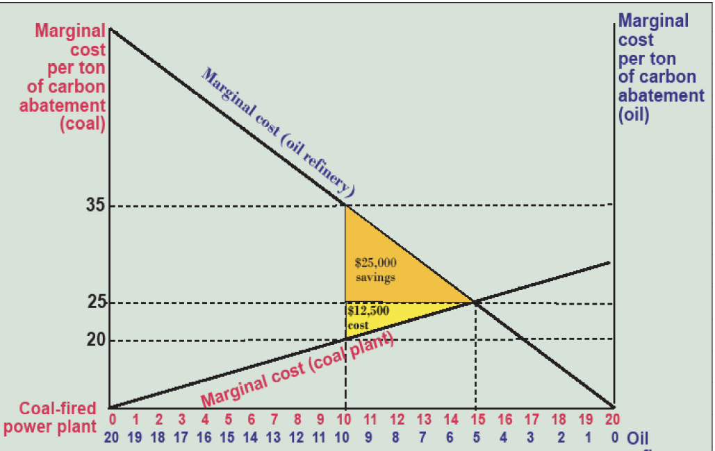
Economist Ronald Coase explored these issues further, and it is on the basis of his ideas that I will try to convince you that tradable pollution permits also induce equimarginality, and therefore cost-effectiveness. Let’s say we have a coal-fired power plant that can reduce its greenhouse gas emissions less expensively than an oil refinery (marginal cost line is steeper for the oil refinery in Figure 6.17). Each is annually emitting 20,000 tons of carbon dioxide, but the Environmental Protection Agency (EPA) says that everyone has to reduce their greenhouse gas emissions by half, in this case abating 10,000 tons each. This seems fair, but it costs the oil refinery $35 to reduce the 10,000th ton while it costs the coal plant only $20 to reduce its 10,000th ton. So the oil refinery manager calls the coal plant manager with a deal: “I’ll pay you $15,000 to reduce your emissions an extra 5,000 tons if I can keep emitting those 5,000 tons.”
Why does (s)he offer the deal? Because reducing that second 5,000 tons (from 5–10 in blue in Figure 6.17) costs the oil refinery $25,000, so they save $10,000 by making the transaction. Does the coal plant take the deal? Yes, because reducing an extra 5,000 tons (from 10–15 in red in Figure 6.17) only costs them $12,500, so they gain $2500 in the deal. It’s a win-win! In fact, any offer between $12,500 and $25,000 produces a win-win because the total costs of abatement are reduced by $12,500 by having the coal plant do the abatement rather the oil refinery.
In theory, this is exactly what would happen if each firm were given 10 permits to emit 1,000 tons of carbon, but they were allowed to trade them at an agreed-upon price. In fact, Coase showed that we’d end up at the cheapest solution of 15,000 tons of carbon abated (leaving 5,000 emitted) by the coal plant and 5,000 tons abated (leaving 15,000 tons emitted) by the oil refinery, no matter how the permits were initially allocated, simply by taking advantage of the costs savings when polluters have different marginal abatement costs and are allowed to trade. This made him famous—it’s called the Coase Theorem! Note that the cost-effective solution occurs where marginal abatement costs are equal—$25/ton in this case.
There are some caveats (i.e., ifs, ands, and buts). If lawyers or the EPA charge $12,500 or more to negotiate the transaction, the gains disappear and everyone says the heck with it. Similarly, if it costs $12,500 to figure out what the costs are and how to implement the trade, it doesn’t happen. Also, with $12,500 in gains to be had, which party gets them? If the oil refinery had offered $25,000—the full extent of their savings—the coal plant would reap the full $12,500 in efficiency gains, but if they had offered $12,500, the oil refinery would reap all the gains. In business, you don’t get what you deserve, you get what you negotiate!
It can work, even for something as smelly as sulfur. Together with nitrous oxides, sulfur dioxide emissions cause acid rain, which damages forests, aquatic ecosystems, and human-built structures. They are also hazardous to human health. Title IV of the 1990 Clean Air Act Amendments set a cap on total sulfur dioxide emissions from coal-fired power plants at 8.95 million tons to be achieved by 2010, a level roughly half of emissions in 1980. The act allocated allowances to coal-fired power plants and allowed firms to trade these allowances throughout the 48 contiguous U.S. states. Phase I (1995–1999) applied to the dirtiest 261 electric power-generating units and Phase II (2000–2010) applied to most fossil-fuel units of 25 megawatts or greater.
There has been 100 percent compliance. In Phase I, sulfur emissions were reduced from 8.7 to 4.4 million tons, and in Phase II to 3.0 million tons. Benefits of the program have exceeded costs by a factor of 10, both because abatement costs have fallen from about $2 billion to about $1 billion and because of the health benefits of reduced exposure to sulfates in addition to reductions in acid rain.
The reductions in sulfur dioxide abatement costs came largely from utilities’ agility in minimizing total abatement costs under the flexible regulatory environment, largely through switching from high-sulfur eastern coal to low-sulfur coal from surface mines in Wyoming and through mountaintop removal in the Appalachians. Initial transaction costs of 30–40 percent of the value of allowances fell to about 1 percent as participation in the program became routine. Despite this overall success, there were drawbacks, including a loss of jobs in high-sulfur coal areas.
Is this the best approach to reducing greenhouse gas emissions? Congress explored this issue when a cap and trade bill supported by President Obama passed the House of Representatives in 2010 but it floundered on a threatened Senate filibuster. We will explore these issues in more depth in Chapter 15.
Further Reading
Tietenberg, T. and L. Lewis, 2009. Environmental and Natural Resource Economics. Pearson: New York.
Media Attributions |
|
