5 Chapter 5: Human Population and Sustainability
As we shift from Nature’s Role in Part II to Society’s Role in Part III we will explore how natural resource decisions are made, emphasizing the role of the economy. We begin, however, with the critical issue of population. In 2020 the world population is estimated at 7.8 billion, and its slowing growth rate is 1.08 percent, or about 82 million per year. The U.S. population is 331 million and growing at 0.7 percent, or about 2 million per year, growth rates that are also slowing. Even those numbers aren’t worth committing to short-term memory, however, because population is dynamic. Demography (the study of population) is inherently a numbers game, one that is central to the analysis of natural resources sustainability. It is also important to go beyond head counting to understand how population intersects with human welfare and natural resource sustainability.
Population and Natural Resources Sustainability
So is the world overpopulated? That turns out to be a devilishly difficult question to answer. To start, what if all the 7.8 billion people in the world were placed in a single crowd, like at an outdoor concert. Let’s give everyone a square meter (about 39 inches on a side)—more than enough room to stand without crushing against one another. How big would the crowd be? The U.S.? Alaska? Rhode Island? Woodstock? We know it would be 7.8 billion square meters, which is 7800 square kilometers, or 88.3 kilometers on a side (54.9 miles on a side). This is about the size of Delaware. Many counties are bigger than that. It would take 70,000 of these crowds to cover the Earth. So certainly the world isn’t physically overrun with people. Rather the issue lies in the natural resources those people consume and the environmental sinks they pollute relative to the Earth’s capacity to provide them.
The relevant ecological concept is carrying capacity, which can be applied, for example, to how many grazing livestock a pasture or section of rangeland can support, or how many wolves the moose population of Isle Royale in Lake Superior can feed. Scholars have tried to estimate this for humans by calculating how much food the Earth can produce and dividing this by the nutritional requirements of a human being. Unfortunately, the estimates range from 1 to 100 billion, although most are between 4 and 16 billion. It seems there’s more to it than that.
Ecology provides us with a number of models of the relationship between the population of a species and the carrying capacity of its habitat: continuous growth, sigmoid or asymptotic approach to equilibrium, overshoot and oscillation, and overshoot and collapse (Figure 5.1). The continuous growth model asserts that the human carrying capacity of the Earth is not a constant. Rather it is as dynamic as technological development, from the evolution of agriculture in the Fertile Crescent over 10,000 years ago to the industrial revolution 200 years ago that harnessed fossil fuels to the service of humans, to ongoing developments to desalinate seawater, capture solar energy, and master nuclear fusion. History gives this cornucopian model the upper hand, but are we now facing more fundamental ecological constraints such as the photosynthetic capacity of the biosphere (over a fourth of which humans now appropriate) the exploding rate of biodiversity loss, and exceeding other planetary limits, such as for atmospheric carbon?
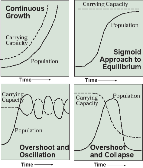
The second model, sigmoid or asymptotic approach to equilibrium, asserts that these carrying capacity constraints are fundamental. The exponential population growth of the 20th century must slow to a stop in the 21st short of the carrying capacity. As we will see, the worldwide decline in total fertility rates since 1970, when the annual rate of world population growth peaked at over 2 percent, seems to capture what we would hope can be achieved by the demographic transition.
If fertility declines fail to slow population growth sufficiently, however, we could face the overshoot and oscillation model. This model characterizes the populations of many wildlife species and the human population during the long millennia between the agricultural and industrial revolutions. Here death rates periodically act as a brake on population growth—not the course any of us would wish for on ethical grounds.
Even worse is the fourth model, overshoot and collapse, where not only does population outrun the carrying capacity, but in desperation to survive, humans undermine that carrying capacity by depleting ecosystems of soil, forests, species, and clean water. They leave behind toxic pollutants and disrupt the climate, leading to a long-term decline in carrying capacity. This model is the epitome of unsustainability where the Four Horsemen of the Apocalypse (pestilence, war, famine, and death) punish humanity for its lack of restraint. It can and has happened, on Easter Island, the Mayans, and other examples documented by Jared Diamond in Collapse and by other authors of environmental history such as Joseph Tainter in The Collapse of Complex Societies.
The debate then comes down to how much restraint is required in the short-term, and what forms that restraint should take, to avoid such a catastrophic long-term outcome—when we don’t know what the carrying capacity is or how it will change. These are issues that have no simple answer and I am not going to provide you with one. Rather I would ask that you keep this mega issue about the threat of overpopulation in mind as we explore demography in this chapter.
The Current World Population
Mapping the distribution of human population on Earth is an interesting exercise in cartography (the art and science of making maps). My preferred method is a dot map precisely because half of the world’s people now live in cities and towns that occur in specific places. In this type of map, we can see geographical detail as long as the size of the dots and the number of people each represents (100,000 in Figure 5.2) are chosen carefully so that the dots merge together in densely populated areas, but the sparsely populated regions can be differentiated from the uninhabited. This technique clearly shows the world’s largest population clusters in East Asia, South Asia, and Europe, followed by the eastern U.S. It also shows the sparsely populated zones in northern North America and parts of the U.S. West, the Amazon, the Sahara Desert of northern Africa and the Arabian Peninsula, Siberia, parts of Central Asia, and most of Australia. Of course, Antarctica and the oceans are uninhabited.
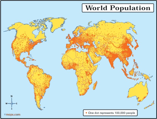
In Africa, note the Nile Valley surrounded by nearly uninhabited desert in the northeast, the West African cluster centered on Nigeria, and the cluster around the East African Great Lakes. In populous Asia, the Indus Valley of Pakistan, the Ganges Valley of north India and Bangladesh, the Yangtze Valley (including its Sichuan Basin) of Central China, the plains of northeast China, the Indonesian island of Java, and the Indian, Chinese, and Japanese coasts stand out as the demographic hubs of humanity. More people live within 200 miles of the Chinese Pacific coast, for example, than in all of South America, Canada, and Australia combined.
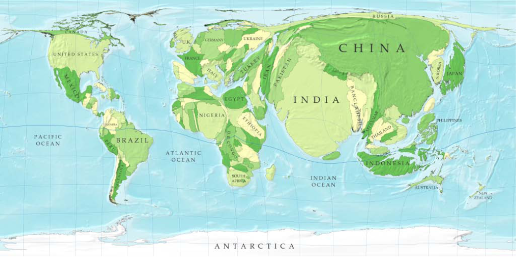
A second, more radical, cartographic approach is the cartogram (Figure 5.3), where each country’s size is proportionate to its population. While we lose the shapes of countries and continents that have become burned into our brains from seeing so many maps, this technique easily conveys the relative population sizes of countries. It is also an appropriate technique for mapping information (e.g., the percentage of people living in urban areas, income, access to safe drinking water, fertility) that pertains to people rather than to land areas.
The History and Future of Population
| Continent/Year | 0 | 1000 | 1900 | 1990 | 2013 |
|---|---|---|---|---|---|
| Asia | 170 | 152 | 903 | 3113 | 4302 |
| Europe/Russia | 43 | 43 | 422 | 787 | 740 |
| Africa | 26 | 39 | 138 | 642 | 1100 |
| Americas | 12 | 18 | 165 | 724 | 958 |
| Oceania | 1 | 1 | 6 | 26 | 38 |
| World | 252 | 253 | 1634 | 5292 | 7137 |
As discussed in Chapter 1, the world of biblical and Roman times, even the world of Christopher Columbus, was empty compared to the 21st century world (Table 5.1). We reached our first billion only about 200 years ago.
| 2019 Population | 2050 Population | |||
|---|---|---|---|---|
| Country | (millions) | Rank | Country | (millions) |
| China | 1420 | 1 | India | 1652 |
| India | 1369 | 2 | Chine | 1314 |
| United States | 329 | 3 | Nigeria | 440 |
| Indonesia | 270 | 4 | United States | 400 |
| Brazil | 212 | 5 | Indonesia | 366 |
| Pakistan | 205 | 6 | Pakistan | 363 |
| Nigeria | 201 | 7 | Brazil | 227 |
| Bangladesh | 168 | 8 | Bangladesh | 202 |
| Russia | 144 | 9 | DR Congo | 182 |
| Mexico | 132 | 10 | Ethiopia | 178 |
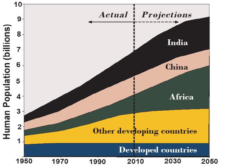
Interestingly, Asia has long been the Earth’s demographic center of gravity (Table 5.1). Asia today hosts 60 percent of the world’s population and this fraction has varied only from 55–67 percent over the past 2,000 years. Nor is it anticipated to change; 5 of the 10 most populous countries in 2050 are projected to be Asian as well, including the top two demographic giants with India anticipated to pass China in the next few decades (Table 5.2). In fact, essentially all population growth anticipated in this century will occur in developing countries, especially South Asia (India, Pakistan, Bangladesh, and smaller neighbors) and the 56 nations of Africa (Figure 5.4).
Population Pyramids
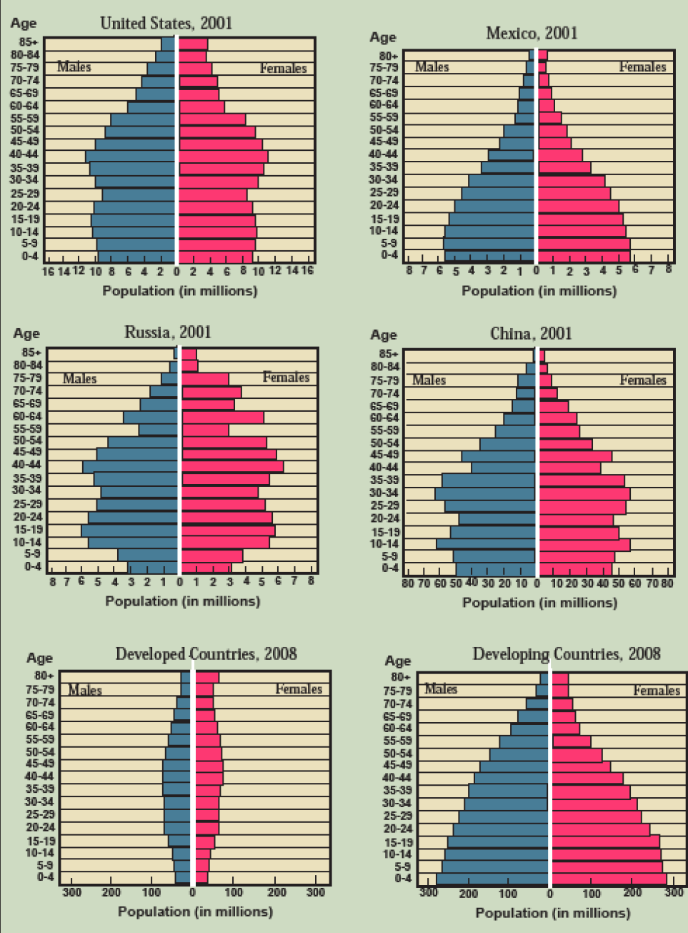
Population pyramids are a visually appealing way to display not only the total population of a country but its age and gender distribution by constructing horizontal bar charts of population around a center line with males on the left and females on the right. Look at the population pyramids for 2001 in Figure 5.5 and see what patterns you can discern.
In all cases, over age 70 or 75 females outnumber males due to longer life expectancies. For the U.S., there is a bulge at ages 30–55 representing the “baby boom” from, counting back from 2001, 1946–1971 and a smaller “echo boom” in the ages 5–25, representing the children of the baby boomers born 1976–1996. The Mexican pyramid shows high fertility and a rapidly expanding population until about 20 years prior, or about 1981, after which the pyramid base stops expanding. The oddly shaped Russian pyramid exaggerates the longer life expectancy of women, partly due to male soldiers dying in WWII, and a marked lack of people 55–59 years old. These are the babies that were not born and small children that died during Adolf Hitler’s ruthless invasion of the Soviet Union in 1942–1944. The base of the pyramid is also shrinking. Over the past 20 years, Russians have been having fewer and fewer children, considerably less than the two who would replace their parents.
The Chinese pyramid resembles the Mexican with the decline in fertility coming sooner and falling farther. The birth dearth during the 1959–1961 famine of Chairman Mao’s Great Leap Forward and its echo 20 years later are also reflected in smaller populations in the 40–44 and 20–24 age cohorts. Overall, China enjoys a large percentage of hardworking young adults in the 25–40 age group, contributing to its recent economic success. This demographic bonus will not last, however, as China’s baby boomers reach retirement age in the 2020s and 2030s. For this reason, China rescinded its one-child policy in 2013.
The aggregate 2008 population pyramid for developed countries of North America, Europe, Australia, and Japan shows a relatively even distribution of people with a diminishing number of children. This is in sharp contrast to the aggregate developing country pyramid where each age cohort is larger than the one before, producing an actual pyramidal shape with a much younger average age than in developed countries. The budgets of developed countries are strained under the weight of retirement and health care programs. The meager budgets of developing countries are often insufficient to provide even an elementary education to the huge number of children aspiring to it.
Population Projections
If there are 7.8 billion people on Earth in 2020, how many people will there be in 2025? 2050? 2100? To begin to answer this question, let’s take another look at the population pyramid for China in 2000, with a projected pyramid for 2050 (Figure 5.6). Here’s a paradox—in 2013 the average Chinese woman had 1.5 children (this is called the total fertility rate), less than the replacement level of a little over 2, yet China’s population is expected to continue to grow through 2050. Why is this the case? It’s called population momentum, and here’s how it works.
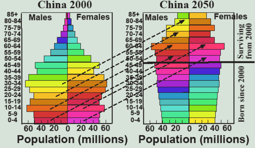
Let’s take the bottom bars on the 2001 pyramid of about 51 million boys and 47 million girls age 0–4. By 2006 they are in the 5–9 cohort, except for those few unfortunate enough to die as babies (this is called the infant mortality rate) or young children (child mortality rate). By 2050 there are about 45 million men and 42 million women aged 50–54 with 4 million of the 51 million males and 3 million of the 45 million females having, unfortunately, died before their 50th birthday. From age 50 and older, the pyramid in 2050 can be derived in a similar way by moving the 2001 bar up by 50 years, while subtracting those who die in the intervening 50 years as estimated by age and gender-specific mortality rates, which, of course, rise as people get older. We must keep in mind here, however, that life expectancy has been steadily increasing, globally at a rate of about one year for every four, from 53 in 1960 to 72 in 2017, so age-specific mortality rates are falling. Some researchers project that life expectancy will continue to climb through the 80s and well into the 90s, while others project that it will reach a maximum in the low-to-mid 80s, the level currently achieved by Japan. Time will tell.
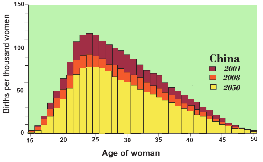
Chinese under the age of 49 in 2050 will have been born since 2001. How do we estimate the number of babies born of each gender each year? Here we refer to age-specific fertility rates (Figure 5.7). While, of course, the probability of men giving birth is always zero, woman have a statistical probability of giving birth that is above zero during the ages of 15–50, corresponding approximately to puberty and menopause. If you add up the annual probabilities, you get the total fertility rate, which was 2.0 in 2001 (red bars), but had declined to 1.6 in 2008 (orange bars), and is projected to decline to 1.3 by 2050 (yellow bars). With this information, we can add babies to the bottom of the pyramid each year simply by multiplying the number of women at each age, times the probability of giving birth at that age from Figure 5.7.
The key to projecting the future population then lies in anticipating how age and gender-specific mortality rates will change over time to account for hoped-for increases in life expectancy and decreases in infant mortality, as well as how age-specific fertility rates will change—usually downward as we will see. Population projections then end up being based on scenarios in which different assumptions are made about how mortality and fertility rates will change in the future, partly guided by how they have changed in the past. Below we will explore the concept of descendant insurance that relates future birth rates to past child mortality rates.
If a population has a large proportion of young people, it will continue to grow, even if the total fertility rate is falling below two. Why? Because young people enjoy a long life expectancy—the age-specific mortality rates for people 5–50 are low compared with more vulnerable babies and older people. In addition, the more women there are age 15–50, and especially age 20–35, the more babies will be born, even if each of those women has on average fewer than two children. This is population momentum, and it is a primary reason why the world’s population will continue to grow to reach 8 billion by about 2023, and likely reach 9 billion, and possibly 10 billion by 2050—depending upon how mortality and fertility continue to change in the future in each of the world’s countries.
While of course we don’t know exactly what will happen, we do have a working theory of population change known as the demographic transition.
The Demographic Transition
A demographic transition—from what to what, you may ask. The answer is from a state of high fertility, short life expectancy, and low population totals to a state of low fertility, long life expectancy, and high population totals. Figure 5.8 captures this graphically. At the beginning of the transition, total fertility rates are high. Women typically give birth to and rear 5 to 8 children, a task that dominates their prime years of young adulthood. The infant and child mortality rates are also high, and famine, pestilence, war, and other enemies of human life periodically drive death rates even higher, leading to a fluctuating population with little to no long-term growth. Note from Table 5.1 that world population grew little in the first millennium C.E.; in fact, modern population growth began only about three centuries ago.
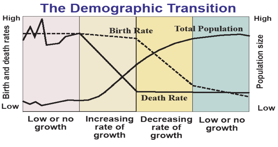
By 1800, and especially by 1900 in Europe and North America, life expectancies began to rise and infant and child mortality began to fall. This was not due so much to advanced medicine, but due to public sanitation measures such as delivering piped, chlorinated water and providing sewage systems to urban populations. With the invention of the microscope and advances in microbiology came the germ theory of disease, the understanding that many ailments are caused by microscopic bacteria and even smaller viruses that multiply in our bodies, making us ill and potentially ending our lives. Exposure to germs can be minimized by keeping them out of the water and food supplies and minimizing contact with contagious diseases, partly through immunizations. Advances in medical knowledge that reduce mortality from childbirth and germs came coincidentally with the industrial revolution that made food supplies more secure, clothing more abundant, and modern comforts available to more than an elite few. People began to live longer and most babies born lived to reach adulthood for the first time in human history.
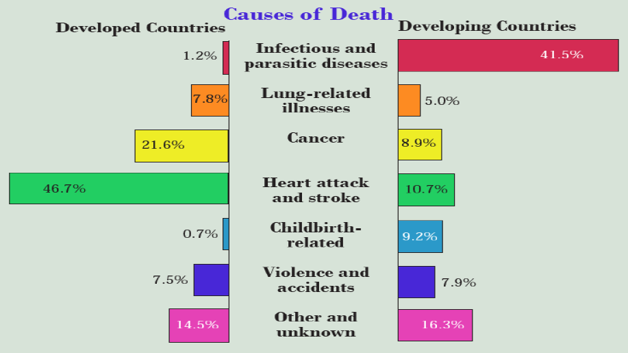
Figure 5.9 compares the causes of death in developed countries that have completed the demographic transition with those in developing countries that are at various stages within it. (Hopefully the rainbow of primary colors will compensate for the macabre subject matter). In developed countries, only about two percent of deaths occur in childbirth or due to germs—infectious and parasitic diseases. As a result, people live long enough to succumb to degenerative diseases, especially heart attacks, strokes, and cancer, which occur primarily in older people. In developing countries, in contrast, half of all deaths occur in childbirth or due to germs. The lower rates of death due to lung-related illnesses, cancer, and heart disease may in part be due to healthier diets and lifestyles but they are primarily attributable to people dying younger, before these chronic diseases develop.
| Demographic Index | Italy 1881 | Italy 2008 | DRC 2008 |
|---|---|---|---|
| Population (millions) | 22 | 60 | 66 |
| Annual births per 1000 people | 37 | 10 | 44 |
| Annual deaths per 1000 people | 29 | 10 | 13 |
| Growth Rate (%) | 0.8 | -0.01 | 3.1 |
| Life Expectancy (years) | 35 | 81 | 53 |
| Total Fertility Rate | 5.0 | 1.3 | 6.5 |
| % Population 0-14 | 32 | 14 | 47 |
| % Population 15-64 | 63 | 66 | 50 |
| % Population 65+ | 5 | 20 | 3 |
Table 5.3 shows a case study of the demographic transition comparing the journey through the demographic transition of Italy (as a typical example of a developed country) to the Democratic Republic of the Congo (as an example of one the world’s poorest countries). Over the 127 year timespan from 1881–2008, Italy’s population about tripled but has now stabilized, while its birthrate and deathrates have dropped by two-thirds. Life expectancy has expanded to over 80 years, while the number of births per woman has fallen from 5 to a very low 1.3. These changes revolutionized the age structure of an Italian population that on average is much older than it was in 1881. In contrast, the DRC is finally experiencing a dramatic decline in child mortality, but total fertility remains very high at 6.5, leading to a population explosion that is likely to continue because of the disproportionate number of young people with long life expectancies that include their childbearing years. This is population momentum. Over time though, can we expect the demography of DRC to resemble Italy’s in 2008? Global experience says that we can, though whether this happens in a few or several decades remains to be seen. We thus now turn to a deeper look at the dynamics driving fertility rates downward across the planet.
From Death to Birth: A Look at Descendant Insurance
In 1968 Stanford biologist Paul Ehrlich wrote The Population Bomb, in which he brought to the world’s attention the dangers of overpopulation depleting the world’s natural resources in an unsustainable manner, and thus arguing that birth control was urgently needed. At the time, the global average total fertility rate was 4.9 and population was growing at 2.2 percent, yielding a doubling time of 32 years, or an 8-fold increase in a century.
Yet, over the intervening half-century the population bomb has been largely defused as total fertility rates have fallen by half to reach 2.4 in 2018. Viewed another way, if replacement level is 2.1, global total fertility rates have fallen by 90 percent of the distance from where they were during the population explosion to where they need to be to stabilize the global population in the long run. Most of us can see this decline in birth rates in our own family histories. In my case, my mother was last of 9 children, while my father was youngest of 2 for an average of 5.5; I am the 3rd of 4 children who have a total of seven offspring for an average of 1.75, just about the current U.S. total fertility rate. You can probably trace a pattern of declining fertility in your own family tree. How did this fertility transition happen? To answer this question, we need to grasp what factors determine birth rates, or more technically, total fertility rates.
Of the many theories proposed, the one I find most convincing, on the cold, hard basis that it fits the empirical data, is called descendant insurance. This idea follows from the simple notion that people would like a high probability, on the order of 99 or 99.9 percent, of having a child that survives to adulthood. This simple notion, however, generates a surprising mathematics that fits remarkably well to data on child mortality rates and total fertility rates around the world in recent decades.
The basic mathematics is quite simple. The number of children one must have to assure a survivor depends upon the child mortality rate and the level of insurance to be achieved. In the simplest example, if the probability of a child’s death is zero, only one child is required to achieve a 100 percent probability of a surviving child. This would lead to population reductions – a population half-life of one generation. If the probability of each child’s death is 50 percent, however, eight children are needed to reach a 99.6 percent probability of a surviving child. A 50 percent child mortality rate seems terribly high by modern standards, yet was typical as recently as the 19th century in the U.S. and the 20th century in many developing countries. With half of these children surviving, the net mean descendants expected is four, leading to population doubling every generation. At a 99.9 percent level of insurance, mean net descendants peaks at 4.5 at a child mortality rate of 37 percent (Figure 5.10).
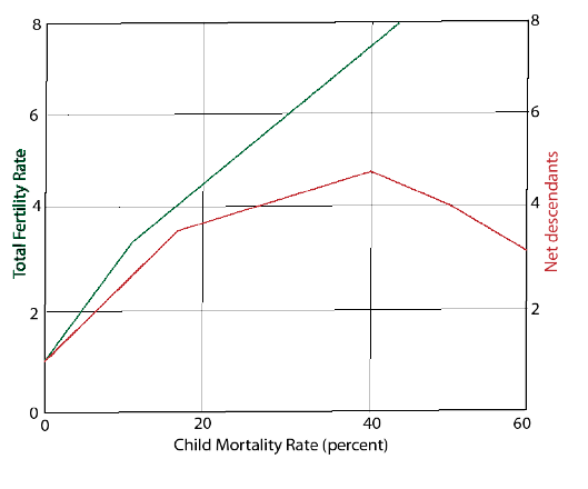
What this proposes, in a bit of a paradox, is that population growth is driven by high child mortality—starting from roughly 60 percent and continuing until it falls to about 20 percent—and people’s response to this social condition in their efforts to guarantee or ensure at least one surviving child. In recent decades, child mortality rates have continued to fall throughout the world, in a success story that is too seldom told, to below 10 percent, and in some developed countries to as low as 1 percent. We see in the green line in Figure 5.10 that corresponding total fertility rates fall from about 3 at 10 percent child mortality, to reach the replacement level of two at 3 percent child mortality and continue to decline to about 1.5 at a child mortality rate of 1 percent.
| Time Period | ||||||
|---|---|---|---|---|---|---|
| Country | 1960-2011 | 1970-2011 | 1980-2011 | 1960-2000 | 1960-1990 | 1960-1980 |
| Ethiopia | 0.75 | 0.94 | 0.97 | Early in fertility transition | ||
| Pakistan | 0.79 | 0.93 | 0.98 | |||
| China | 0.97 | |||||
| India | 0.99 | |||||
| Indonesia | 0.98 | |||||
| Brazil | 0.99 | |||||
| Bangladesh | 0.98 | Middle of fertility transition | ||||
| Mexico | 0.98 | |||||
| Philippines | 0.98 | |||||
| Vietnam | 0.98 | |||||
| Egypt | 0.99 | |||||
| Iran | 0.98 | |||||
| Turkey | 0.99 | |||||
| Japan | 0.97 | |||||
| France | 0.84 | Late in fertility transition | 0.94 | 0.95 | 0.93 | |
| Germany | 0.83 | 0.86 | 0.87 | 0.89 | ||
| U.S. | 0.64 | 0.66 | 0.74 | 0.85 | ||
This is a nice, clean theory and it stands up to the empirical test against real-world experience across the many countries of the world in recent decades for which demographic data are recorded? Table 5.4 sizes this up using correlations; this is a widely used statistical measure of how closely things vary together. If there’s no relationship at all, the correlation is 0, if they go in exact opposite directions, it is -1, and if they follow one another exactly, it is 1.0. In general, a correlation above about 0.7 is high and 0.9 is very high. Table 5.4 shows mostly very high correlations between actual total fertility rates and the total fertility resulting from descendant insurance calculations. These correlations are remarkably high in some cases, such as for the world’s demographic giants like China (0.97) and India (0.99). So for these countries and others in the middle or heart of the fertility transition, (when child mortality rates are falling from 15–25 percent down to 1–3 percent, and total fertility rates are falling from 4–6 down to 1.5–2.5) it seems that descendant insurance predicts remarkably well how total fertility rates respond. There is usually a short lag of 5–10 years between the child mortality rate stimulus and the total fertility rate response. This means that if we know the child mortality rate we can predict quite closely the total fertility rate over the next decade or so.
There are a few exceptions. Countries that haven’t yet begun or are just starting the fertility transition have correlations that aren’t as high. So for example, Ethiopia and Pakistan started to fall in line with descendant insurance starting in the 1970s when they first saw major sustained reductions in child mortality. At the other end of the transition, France, Germany, and the U.S. were all following descendant insurance quite closely from 1960 to 1980 or 1990, but as child mortality started to bottom out at very low levels, their fertility began to depart from descendant insurance. What this means is that descendant insurance is right on target during the critical middle stages of the fertility transition (see Figure 5.8 and compare it to Figure 5.11), more so than when it is just beginning or in the completion stages.
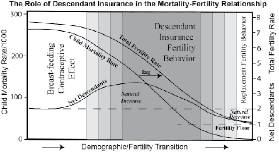
In prior periods, other explanations for people’s fertility hold sway, such as the spacing of births through the contraceptive effect of breast-feeding. Also, towards the end, other explanations like replacing the rare lost child, hold sway. Figure 5.11 captures these relationships over the course of the fertility transition.
This tight relationship between child mortality and subsequent fertility has substantial implications for how we think about the issue of overpopulation, which is really about natural resource sustainability. Figure 5.12 captures the relationships as a system that represents a virtuous cycle, the obverse of a vicious cycle, where the positive feedback loops drive outcomes that we would desire. Let’s start in the center-left at “falling child mortality.” If perceived, this leads to falling fertility due to descendant insurance behavior – if access to contraception enables it. Fewer children means more investment in each child, especially in the form of health care and education. Better education for girls leads directly to falling child mortality, completing one virtuous cycle, while it also reinforces falling fertility through better economic opportunities, changing cultural norms and rising costs of having large families.
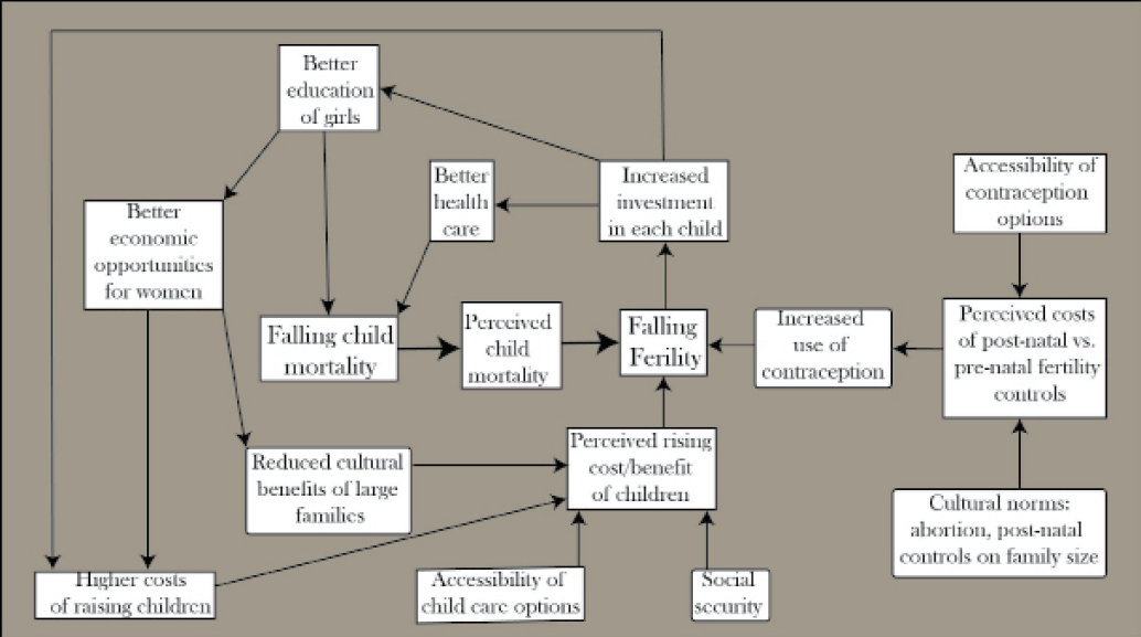
Thus, reducing child mortality, beyond being an unquestioned good in itself, is a linchpin of population stabilization and therefore of natural resource sustainability. Low child mortality leads to a stable, or even slowly shrinking, population of healthier, better-educated people. High child mortality leads to high fertility, rapid increase in a population that is less well-educated and cared for, high demand on basic resources such as water and land for food, and degradation of those resources, leading to continued high child mortality—and the vicious cycle continues.
Thus by taking a systems approach and including descendant insurance behavior in that system, we can see that devoting resources to reducing infant and child mortality has the important secondary benefit of population stabilization. Returning to Figure 5.1, the result is the most sustainable one—the “sigmoid approach to equilibrium.” It is through investments in public health and making contraception widely available that the population bomb has been defused, thus controlling one of the most important threats to natural resources sustainability, while improving human welfare immeasurably.
Media Attributions |
|
