13 Chapter 13: Wealth from the Earth – Mineral Resources
While our most essential natural resources come from ecosystems—air, water, forests, soil, and the food that it grows—many important industrial raw materials are mined from beneath the Earth’s surface. Fossil fuels, metallic ores, phosphorus for fertilizer and materials for roads, concrete, and bricks are stock resources with a fixed geologic resource base (as defined in Chapter 7 on ecological economics). In thinking about the sustainability of stock resources, we want to consider how large the geologic stock is, the process and rate through which humans use, recycle, or consume that stock, and, through these factors, assess how long the stocks are likely to last.
Figure 13.1 helps us think about that process, which we will explore using an important metallic ore (copper) as an example. The original resource base, the total mass of copper in the Earth’s crust occurring as crystals in igneous rocks, has changed little in a billion years, but that doesn’t make it easy to estimate how much copper there is. Gordon and colleagues in a 2006 paper on metal stocks and sustainability estimate the world total at 1,600 million tonnes, though other analysts come up with different numbers. For this reason, we call estimates of ore that may someday be found by geologists speculative resources. When, in fact, they are found and measured, they become proven reserves. Since most ore prospectors work for private companies, the actual amount of proven reserves is privileged information that is sometimes overestimated or underestimated based on whether recording reserves is a cost or an asset to the company. Companies also need an economic incentive to invest large amounts of money in resource prospecting. If reserves are large and prices are low, this incentive is lacking.
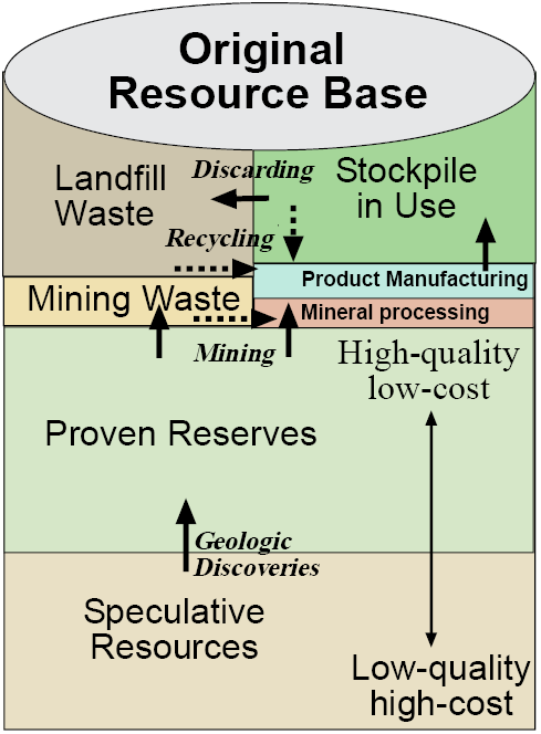
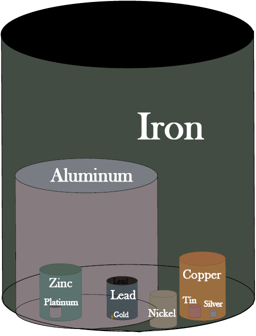
With these qualifiers, proven reserves for copper are estimated at 590 million tonnes (MT). In comparison, proven reserves of iron ore are 230,000 MT and of aluminum are 28,000 MT, so copper is not an abundant metal, but more so than zinc at 330 MT, lead at 130 MT, nickel at 110 MT, tin at 10 MT, and gold at 0.04 MT, which has reserves roughly 1/10,000,000th of those for iron (Figure 13.2).
Copper was the first metal to be mined and forged in the bronze age several thousand years ago because it is the easiest of the common metals for smiths to forge into tools and weapons. Nevertheless, in all of human history through 1900, only about 2 MT of the Earth’s resource base of 1,600 MT of copper had been extracted. In the 20th century, however, about 400 MT were mined, a quarter of the global resource base, with an additional 590 MT in reserves awaiting mining. This degree of rapid acceleration in global mining over the last century is evident for many other minerals as well.
All mining occurs from reserves, but often only a small fraction of the material mined becomes pure copper metal. Most of the ore is materials other than copper and becomes mine waste and an environmental problem if it is not managed carefully. Even some of the copper crystals never make it out of the smelter to become a raw material for the manufacturing of products.
Once copper enters the economy, it is made into industrial goods that form an above ground stockpile of resources in use (Figure 13.1). In the U.S in 1900, this was about 1 pound of copper per person, but in 2000 it was 525 pounds contained in infrastructure (209 pounds), buildings (168 pounds), industrial and domestic equipment (39 pounds), and vehicles (62 pounds). It should amaze you that the amount of copper each American is utilizing multiplied over 500 times in the 20th century. Data for many other countries are similar. This shows us how forceful global industrialization, and its demand on natural resources, is. Globally, 56 percent of all the copper ever mined, 222 MT, is in products now being used while 44 percent or 176 MT has been discarded—someplace. While this copper still exists on the planet, it is in a form that is much more difficult and expensive to recover than the high-quality reserves from whence it came, or from the products it now resides within that could be recycled later. To the extent that copper has been consumed, it is via this one-way ticket from high-quality ore that is mined and processed into metal to make products that are then discarded in a manner that would be very expensive to recover. Perhaps 11 percent (176 out of 1,600 MT) of the Earth’s resource base of copper has met this fate so far.
Fossil fuels, on the other hand take a one-way trip from reserves to consumed (except when oil is used to make recyclable plastics, much of which ends up polluting the oceans where it is found in alarming quantities in the digestive tracts of marine animals). Gold, due to its high value and ease of recycling, is never discarded, meaning it has a 100 percent recycling rate!
Currently, 45 percent of new copper produced comes from recycling of old products or, far less often, is recovered from landfills. A higher proportion of copper contained in obsolete products is recovered for remanufacturing, but as long as the above ground stockpile-in-use is growing—as it continues to do as developing countries play catch-up in constructing industrial infrastructures—even 100 percent recycling must be augmented by new mining of reserves.
The process of prospecting for, hopefully discovering, mining, and utilizing minerals is driven largely by economics, following neoclassical rules. When reserves are large relative to rates of use, or prices are low, it doesn’t make economic sense to prospect for new deposits. Among proven reserves, the highest quality and cheapest to produce are mined first and not until industrial demand makes it profitable to do so. Industrial demand for specific raw materials depends on specific technologies that utilize it. Copper is an excellent conductor of heat and electricity, and so demand for it has continued to climb as a raw material for industries like motor vehicle electronics and air conditioning. These new and growing uses of copper have offset declines in demand for high-voltage transmission lines (where cheaper aluminum has served as a substitute) telephone lines (which cell phones have made obsolete), and plumbing (where plastic PCV pipe is the new standard). These examples show how resource substitution through technological change is an essential factor in the natural resources sustainability equation. For example, the last cryolite mine was closed in 1987, but the mineral is easily replaced by synthetics, so the loss of this natural resource has not been missed.
So how sustainable is our use of copper? A first approximation can be made by looking at reserve-to-production ratios. Given reserves of 590 MT, current production of about 5 MT per year would last 118 years, but I think you can already see the fallacy in using that figure as an estimate of when we will run out of copper. New reserves may be produced through geologic discoveries from the remaining resource base, leaving us a nearly 600-year supply. If we can recycle, say 75 percent of the copper we use, then the supply will last for 2,400 years. Most of the copper that was once in the Earth will accumulate in the above ground stockpile-in-use, which is used again and again.
But then again, current rates of extraction are increasing steadily at 3.3 percent per year, yielding a doubling-time of 21 years. At that rate of increase, all the copper would be mined out and placed in the stockpile in use or discarded in less than a century. Along the way, the availability of copper ore for new products would be steadily declining, but the availability of copper in obsolete products for recycling would be increasing.
Clearly, recycling replaces mining as a source of raw materials as we go through this process of transforming the Earth’s copper from ore to industrial products. So we will never entirely run out of copper even if remaining resources are so remote or poor in quality that they can’t be profitably mined. This is called economic exhaustion.
Preventing the dissipation of copper by discarding it is critical in the long run. However, a metal like zinc is harder to recycle than copper because it is mostly used as a thin film on iron-based steel to prevent corrosion and is very difficult to separate for recycling. So the recycling of metals and other materials is tied to the technologies through which they are used and how easily they can be separated out or disassembled from the products that contain them so they can be recovered for recycling. Otherwise, generic junk, such as landfill waste, can be viewed as a low-grade ore.
Economics helps us understand this process as well. As high-quality reserves of copper become scarce, the price of new copper from ore will rise, decreasing the quantity demanded and increasing the incentives to recycle copper. Moreover, rising prices for copper will induce engineers and manufacturers to come up with substitutes—like aluminum or plastic—in various end uses.
Resource substitution is not automatic, however. It must be vigorously pursued by technologists as a response to rising prices, and sometimes compromises must be made. For example, aluminum is not quite as good a conductor of electricity as copper, and I’d rather cook with a copper-bottomed pot than aluminum or iron. History has shown that substitution can almost always be accomplished, given time and the right economic incentives, allowing the economy to shift from use of scarce to more abundant resources (Figure 13.2). So I find myself feeling optimistic about the future availability of copper and many similar industrial raw materials even though they are stock resources.
Technological change can also intensify demand for a scarce resource. Coltan is a rare mineral containing the metals niobium and tantalum used in cellular phones and laptop computers. The rapid rise in demand for it has catalyzed conflict between Congo and Rwanda in East Africa. Rare platinum, with a resource base of only 37 MT, is a key component of current technologies for manufacturing hydrogen fuel cells, a product that may or may not become more important in the future. Demand for lithium is skyrocketing as electric cars using lithium-ion batteries penetrate the automobile market. Critically, resource substitution is usually not a viable option for ecosystem services or biodiversity. Have you got any substitutes for oxygen or the photosynthesis that produces it? How about the blue whale or polar bear if they go extinct? This is referred to as technological asymmetry—technologies for making products advance much more quickly than for maintaining nature.
Carroll Ann Hodges of the U.S. Geological Survey makes the case that, with the exception of petroleum that we will explore in depth, “running out” is not the issue with stock resources mined from the Earth, though certain regions and countries can face a problem of dependence on imports. For example, the U.S. is more self-sufficient than all but a few countries, yet it still relies on imports for all of its bauxite (aluminum ore) and manganese, nearly all of its industrial diamonds, platinum, tungsten, chromium, tin, and potash. On the other side of the coin, several developing nations (e.g., Surinam and Jamaica in Latin America; Zambia, Zaire, Guinea, Botswana, Niger, and Liberia in Africa) are economically dependent on minerals as their primary export, yet their overall social and economic progress has lagged so badly that economists refer to the resource curse—a far cry from sustainable development.
Closer to home, consider a 1994 sale to a Canadian corporation of 1,800 acres of federal lands in Nevada containing 8–10 billion dollars worth of gold (not counting exploration and production costs) for a mere $9,000! Even more than the prior appropriation system for allocating water, policies such as the Mining Law of 1872 are based on 19th century objectives to provide economic incentives to quickly settle the West by developing its natural resources, not contemporary concerns for natural resources sustainability or a fair return to the taxpayer for resources on public lands.
Mining currently occupies only 1 acre in 400 in the U.S., and only one tenth of that for metals. Nonetheless, its environmental impacts can be devastating—complete destruction of vegetation and soil—and reach beyond the mine site, especially through leakage of toxic heavy metals and sulfur into streams (known as acid mine drainage). Fifty-two historic mines are Superfund sites with estimated cleanup bills in the billions of dollars. Fortunately, new U.S. environmental laws have done much to internalize the environmental costs of current mining and to slowly restore past mining sites, one at a time. The greatest problems now occur in developing countries, less from multinational corporations, who have mastered modern environmental protection technologies, than from small local and national companies lacking it.
This brief exploration into nonfuel minerals tells us that stock resources mined from the Earth and used as raw materials can be used sustainably if three requirements are met:
- As any particular resource becomes scarce, a process is developed for relying increasingly on recycling of materials from above ground stockpiles and for resource substitution to more abundant materials through technological change.
- The ecological impacts of mining are minimized by mining in suitable sites using modern technology and applying post-mining environmental restoration techniques.
- Foreign exchange earned through mineral imports is channeled into investments in sustainable development and human capital such as family planning, agricultural improvements, health care, and education.
Now let’s look at the nonrecyclable fossil fuel minerals—oil, gas and coal—and assess their sustainability.
Fossil Fuels: Oil
Americans are more dependent upon auto-mobiles for transportation than any other country, but they aren’t worth anything if the gas tank is empty. This makes a concern for security of fuel supplies legitimate, yet it still doesn’t explain the fascination with, bordering on paranoia about, gasoline. Everyone born before 1965 or so remembers the 1973 OPEC oil embargo when gas stations ran out or offered only a couple of gallons after waiting in line for hours (using up what little gas was left while idling). When news of the September 11, 2001, terrorist attacks hit the airwaves and the Internet, many American’s first response was to rush to the gas station to fill up. Concern over vehicle fuel supplies goes even further back. Daniel Yergin in his 1990 Pulitzer Prize-winning book The Prize: the Epic Quest for Oil, Money, and Power (updated in 2011) argues that the Allies’ superior access to oil, and starving Japan and Nazi Germany of the fuel for their war machine, was a key factor in winning WWII. Oil is clearly the natural resource that has raised the greatest issues of security of supply.
As recently as the first decade of the 21st century, the world’s oil reserves were concentrated in the OPEC countries surrounding the Persian Gulf, the sheikhs of oil, and most other countries, including the United States, imported the majority of their oil from this politically volatile region, raising repeated political calls for energy independence to reduce supply vulnerability. Things have changed. Technology has enabled development of two more difficult sources of oil—oil sands and shale oil—increasing world reserves substantially and changing the geography of who’s got the oil (Table 13.1). Two countries in the Western Hemisphere that could not be more different politically—Venezuela and Canada—are the new kings of oil sands or heavy oil, while the U.S. has emerged as the king of shale oil through the 21st century technology of fracking. The geography of production is more diversified than it was with Russia and the United States alongside Saudi Arabia as the leading oil producers and with China and Brazil breaking into the top ten.
Table 13.1. Leading countries in oil reserves and production. Source: Energy Information Administration
|
Country |
2017 Oil Reserves (billion barrels) |
Rank |
Country |
2016 Oil Production (billion barrels per year) |
2008 Reserve/ Production Ratio |
|
Venezuela |
301 |
1 |
Russia |
3.85 |
21 |
|
Saudi Arabia |
266 |
2 |
Saudi Arabia |
3.82 |
69 |
|
Canada |
170 |
3 |
United States |
3.24 |
10 |
|
Iran |
158 |
4 |
Iraq |
1.62 |
88 |
|
Iraq |
143 |
5 |
China |
1.45 |
17 |
|
Kuwait |
102 |
6 |
Canada |
1.34 |
126 |
|
United Arab Emirates |
98 |
7 |
United Arab Emirates |
1.14 |
86 |
|
Russia |
80 |
8 |
Kuwait |
1.07 |
95 |
|
Libya |
48 |
9 |
Brazil |
0.92 |
14 |
|
Nigeria |
37 |
10 |
Venezuela |
0.83 |
362 |
|
United States |
35 |
11 |
Nigeria |
0.73 |
51 |
|
World |
1,727 |
World |
29.43 |
59 |
Peak Oil?
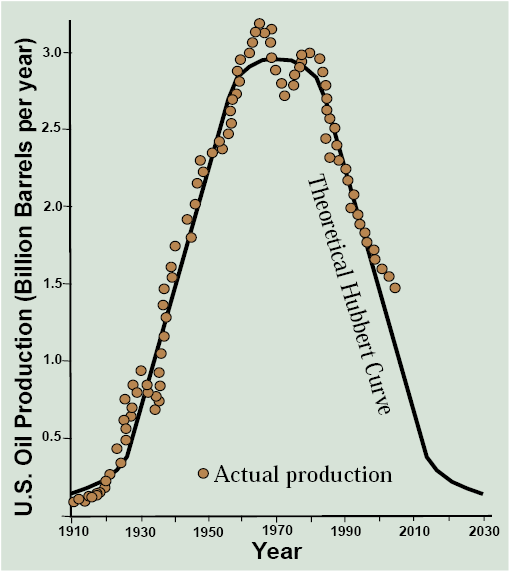
You’ve probably never heard of the late American geologist and petroleum engineer M. King Hubbert. He developed a method in 1956 to assess the future lifespan of fossil fuels and used it to predict that U.S. oil production would peak in 1970 and then start a long decline following a bell-shaped curve. If we compare Hubbert’s 1956 predictions with actual production of U.S. oil through 2004 (Figure 13.3), it looks to me like he nailed it. Except for some ups and downs associated with the OPEC troubles of the 1970s, the empirical dots fall almost exactly on the theoretical curve! As an experienced scientist, I can tell you that the empirical data rarely fit the theory this cleanly.
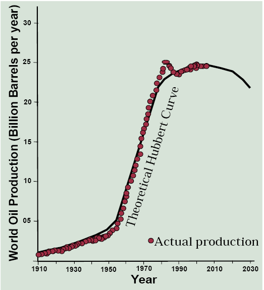
The question then emerges whether world oil production will follow the Hubbert curve, and if so, when is the peak? It turns out that the data fit the Hubbert prediction very well with a minor exception of the 1970s when the oil world industry was spasming from the effects of the OPEC oil embargo and the Iranian Revolution (Figure 13.4). If we take this curve as a prediction, world oil production peaked in 2005 and will fall to half of that peak level in about 50 years!
Stop and think about that. The good news is we won’t run out of oil tomorrow, in fact, half of the original resource base of two trillion barrels is still left in the ground and some oil is likely to be produced for the rest of your long life. But think about the economics of the ever-diminishing world production of oil. During the upward slope of the Hubbert curve, world oil production is demand-driven—as more countries get more cars, trucks, and airplanes and need more oil, demand increases, driving production up. But on the downward slope, world oil production is supply-constrained—there is only so much oil that can be produced and only the highest bidders will get any, even if all of Asia is acquiring automobiles like Americans. You learned in Chapter 6 to know that this means one thing—higher oil and gasoline prices in the long run. Moreover, much of it would be imported from the OPEC countries bordering the Persian Gulf.
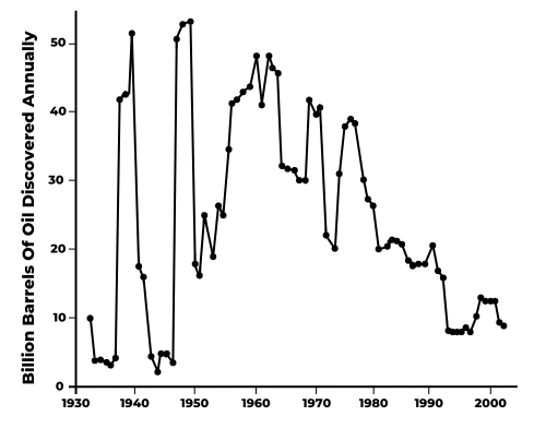
To argue that there’s a lot more conventional oil out there if we only look for it is to argue that geologists have done a poor job locating oil, and the million or so dry holes that have been drilled are due to their incompetence. This isn’t likely. With so much money at stake, some of the best scientific talent and enormous technological resources have been devoted to finding oil fields. The inevitability of global peak oil seems to be reinforced when we examine trends in oil discoveries over the past several decades (Figure 13.5). The big oil fields of the Persian Gulf region were discovered in a few waves of successful exploration between the late 1930s and the mid-1960s. Since the late 1970s, global oil discoveries have been steadily dropping to quite low levels since the early 1990s. Will more oil be discovered? Of course, but for a generation, discoveries have been disappointing despite the most sophisticated natural resource exploration endeavor in human history. So, as the raft of books about peak oil in the first decade of this century foretold, it seems we better get ready for declining oil supplies and spiking gasoline prices!
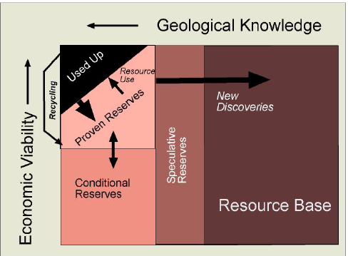
Now let’s look at economic viability. Less economically viable than proven reserves are conditional reserves: well-known resources that are not profitable to produce—under current economic and technological conditions. Economic conditions are always in flux, with higher prices potentially making some conditional reserves profitable and therefore proven reserves. It is the state of technology, however, that changes the game more fundamentally. The 20th century ran automobiles on liquid oil that could be pumped from conventional oil fields. For this low-hanging fruit among petroleum resources in the Earth, the peak oil predictions are probably near the mark. But conventional oil is only the tip of the iceberg of all the fossil fuel resources that it is technologically feasible to turn into gasoline for our vehicles.
First come tar sands, now renamed oil sands as they move from conditional into proven reserves in places like Canada and Venezuela. These are not high quality supplies of oil, which is why they were deliberately left in the ground for most of the 20th century. Rather they are a sticky goop: heavy, carbon-rich oils with a high viscosity. They probably originated as oil that migrated up toward the surface because a geological trap was lacking and then began to evaporate away the lighter portions, leaving the heavy oil behind. They must be mined out of the ground like strip-mining of coal, then elaborately refined with natural gas to reach the right mix of carbon and hydrogen to produce a liquid you can put into a gas tank. As these technologies have progressed, however, this process has become economically viable, if environmentally costly. The Athabaskan oil sand pits of Alberta were an ugly scar on the landscape even before the 2016 Fort McMurray fire, the worst natural disaster in Canadian history. The controversial Keystone XL pipeline would link Alberta’s oil sands with refineries in Houston and Louisiana. It seems that your vehicle may be running more and more on oil sands in the future.
Shale oil also has an enormous resource base of perhaps two trillion barrels. It is “uncooked” petroleum occurring as a greasy substance in the thin-layered, brittle sedimentary rock called shale, the rock type where most petroleum originates. Here again, technology changes the game. Hydraulic fracturing or fracking (which we will discuss in more depth below in relation to natural gas) is now producing oil shale in large enough quantities to substantially decrease U.S. dependence on oil imports. The Bakken fields of North Dakota have the largest shale oil production to date.
It is also possible to make gasoline from coal through the Fischer-Tropsch process developed and applied by the Nazis during WWII. The process is expensive and emits enormous quantities of carbon dioxide. So oil sands, shale oil, and oil from coal are prominent examples of conditional reserves—well-known resources that only become economically viable when technology improves and/or prices rise.
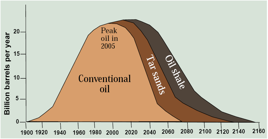
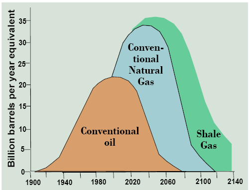
These unconventional oil sources developed though modern technologies can potentially extend oil’s lifespan and broaden the period of peak production as pictured in Figure 13.7. If so, note that as the 21st century proceeds, a larger and larger proportion of oil would have to come from these more economically expensive and environmentally problematic sources, changing the technology and geography of oil production, refining, and use. Note how this scenario is quite different from simply relying on Hubbert’s peak oil curve because it takes technology and economics, rather than geology, as the driving factors.
Will this scenario of high oil production with a shift from conventional oil to oil sands and shale oil materialize? Only if technologies to free automobiles from liquid fuels or to free people from automobiles fail. Only if the world tolerates high levels of greenhouse gas emissions, because there is no feasible way to capture carbon dioxide from a tailpipe. Amory Lovins calls our current scenario the “oil end game” after the game of chess where the players have only a few pieces left and are trying to queen a pawn by getting it to the end row. We win the oil end game by making it obsolete. As the saying goes, the Stone Age didn’t end because the world ran out of stones.
I think the 2013 book by Berners-Lee and Clark entitled The Burning Question: We Can’t Burn Half the World’s Oil, Coal and Gas. So How Do We Quit? gets it right. It’s not about peak oil; it’s about peak emissions. Will we run out of oil, and if so, when? This is not the right question because if we are willing to pay an escalating economic and environment cost there is plenty of oil, perhaps way too much, to put into our cars for the remainder of the century and beyond. Rather the pertinent questions are, when will other transportation technologies supersede gasoline-powered vehicles? And, based largely on the answer to this question, when will carbon emissions from fossil fuel burning peak and start their desperately needed decline? This framing of the issue says that it is not the size of the nonrenewable fossil fuel resource base that is central to sustainability, and this also makes a switch from nonrenewable to renewable energy supplies a secondary issue. Rather it is how we make fossil fuels obsolete or environmentally benign so that the real constraining factor—carbon emissions—can peak sooner rather than later. We will return to this issue at the end of the chapter, after bringing two nearly as important fossil fuels into the picture—gas and coal.
Natural Gas
As we explored in Chapter 3, natural gas is created by the same geological process as oil of slowly cooking ancient organic matter, though at a temperature above the oil window. This is why they are together called petroleum. Natural gas (mostly methane or CH4) occurs in almost every oil field, but sometimes it also occurs without oil. The geography of gas reserves and production resembles that for oil but with some important differences that reflect oil-rich vs. gas-rich petroleum provinces and the new shale game where gas is more prevalent than oil (Table 13.2). The Persian Gulf is well-represented, but Russia leads the list with enormous reserves in western Siberia. U.S. reserves have climbed in recent years with major shale gas discoveries and leads all countries, slightly topping Russia, in gas production.
Table 13.2. The top ten list for natural gas reserves and production. Source: Global Energy Statistical Yearbook
| Country | 2018 reserves trillion m3 | Rank | Country | 2017 production billion m3 |
|---|---|---|---|---|
| Russia | 47.8 | 1 | United States | 767 |
| Iran | 33.7 | 2 | Russia | 694 |
| Qatar | 24.1 | 3 | Iran | 209 |
| United States | 15.5 | 4 | Canada | 184 |
| Saudi Arabia | 8.6 | 5 | Qatar | 166 |
| Turkmenistan | 7.5 | 6 | China | 147 |
| U Arab Emirates | 6.1 | 7 | Norway | 128 |
| Venezuela | 5.7 | 8 | Australia | 99 |
| Nigeria | 5.5 | 9 | Saudi Arabia | 98 |
| China | 5.4 | 10 | Algeria | 95 |
Natural gas got a later start than oil or coal, with large-scale production only about a century old, because gas is inherently dangerous, and therefore technologically demanding, to store and transport. Within the U.S., high-quality steel pipelines with calibrated pressure controls move natural gas from wells to consumption sites, a complex infrastructure network of which few are even aware. To ship it overseas requires even more sophisticated facilities to cool it to -260°F when it liquifies and can be shipped on specially designed liquified natural gas (LNG) tankers. For this reason, oil, with its ease of transport in supertankers, is more of a global energy commodity while gas is usually consumed within the continent where it is produced.
In the 21st century, gas has continued to climb in importance for two reasons. First, it burns cleaner than oil or coal. This is true with respect to carbon dioxide emissions per unit of energy produced, where it emits about half that of coal. Gas is also relatively free of other pollutants that are a hazard to human health. That’s why you can burn it right in your house for the furnace, clothes dryer, or, in the case of the stove, even without ventilation. Second, much natural gas can be found in shale, where the 21st century technology of hydraulic fracturing can be brought to bear. It is to this game changer in the fossil fuel industry that we now turn our attention.
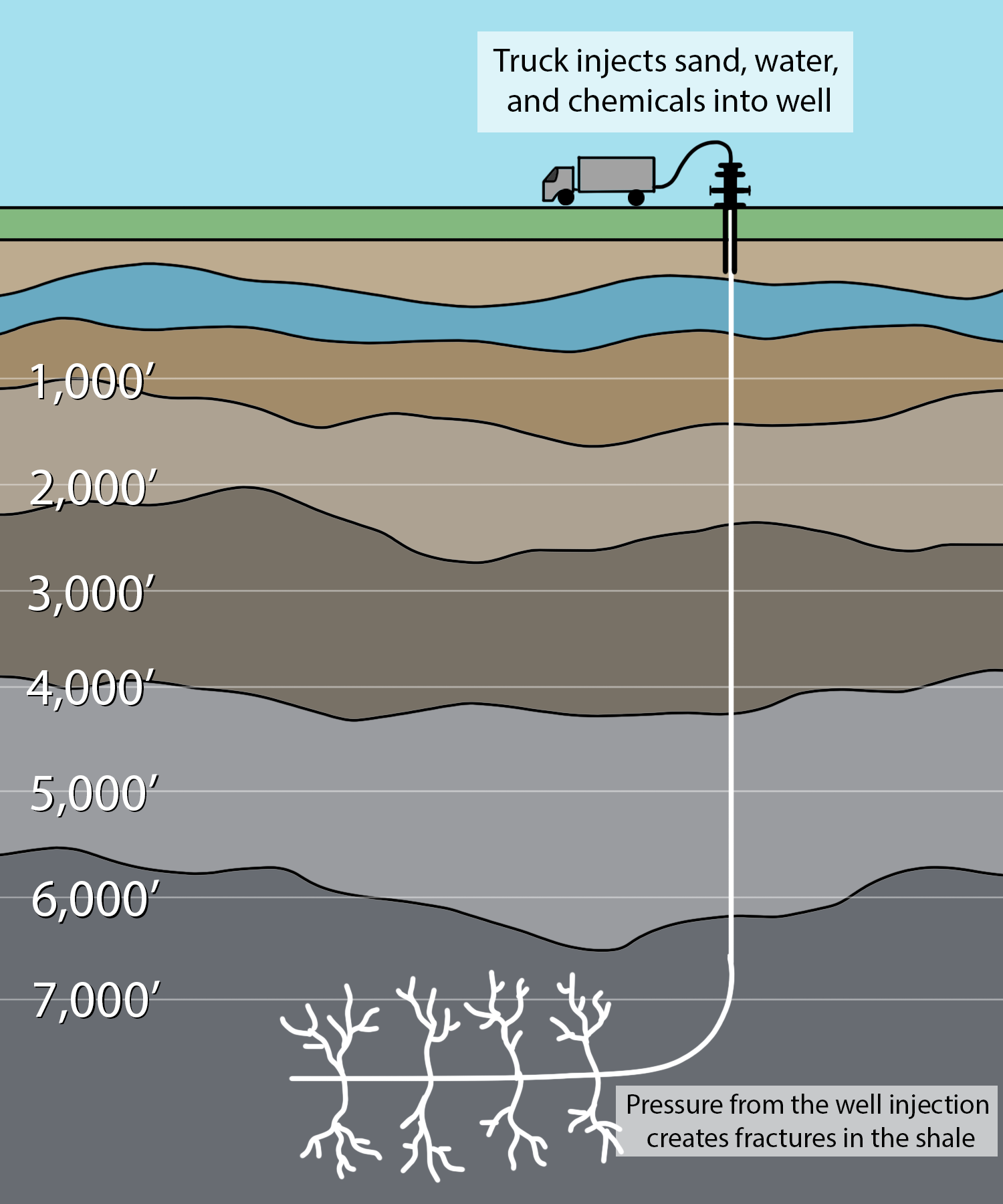
Fracking
It has long been known that natural gas is formed in shale and much of it remains locked within this impermeable rock in a fashion similar to shale oil. In the 20th century, the technology to release it from these shales and bring it to the surface was lacking. In this century, a technology known as fracking has been developed where highly pressurized water is brought to bear on gas-rich shales in order to fracture it, thereby creating permeable pathways for the gas to migrate to a well (Figure 13.8). The fractures are kept open using sand and slick water: water treated with chemicals (often undisclosed) to make it less viscous. This is combined with advances in horizontal drilling to capture gas from shale plays that may be rather thin but stretch over long distances removed from the wellhead (Figure 13.9).
The size of this newly available resource of shale gas continues to be assessed, but there is no doubt that it is large. With global conventional natural gas reserves greater than oil on an energy basis, and a later start in producing it leaving a higher proportion still in the ground, gas has a longer lifespan than oil, so no one is yet predicting “peak gas” (Figure 13.10). Shale gas resources promise to extend the lifespan of natural gas through the remaining decades of the 21st century. These developments are interesting, but questions remain. Just how huge is the shale gas resource in the U.S. and globally? How widely distributed is it around the world? How effective is fracking technology at recovering shale gas resources? Is fracking environmentally sound compared to other energy production technologies? Will it be placed under normal environmental regulations? What other energy sources will these new gas resources replace (e.g., coal or wind)?
The Coal Phaseout
Whenever oil, gas, or other energy resources are available at reasonable prices, no one wants to use coal. Why? Try putting coal in the gas tank of your car. Airplanes can only run on oil, and while the Titanic ran on coal, all modern military and civilian boats and ships run on oil because it allows higher performance designs. Very few Americans heat their home with coal anymore in favor of cleaner-burning natural gas. For the production of electricity, it does serve well but again with much higher levels of air pollution than for natural gas and far greater environmental costs in mining it compared to conventional oil and gas that can be pumped from wells. So it’s an economical and available, but undesirable, source of energy that has a long history of being replaced by something better. As told by Barbara Freese in the 2003 book Coal: A Human History, this abundant fossil fuel has cost countless lives from mine accidents and air pollution, but it spurred first the English, then German and American, then Eastern European, then Chinese economies forward in their 18th, 19th, and 20th century industrial revolutions.
Coal has a distinctly different geography than petroleum. Figure 13.11 provides a global map of major coal deposits. The U.S. is the world leader with stupendous reserves of 251 billion tonnes, a fourth of the world total, followed by widely distributed countries such as Russia, Australia, China, and India (Table 13.3). Unlike petroleum, there is no Persian Gulf where global resources are concentrated. In coal production, China’s coal-based economy is far in front, followed by the U.S. where coal still produces over one-third of all electricity, down from one-half at the turn of the century. Reserve-to-production ratios are high, compared to oil or even gas, in most countries, including the U.S., with reserves to last two centuries at current rates of production.
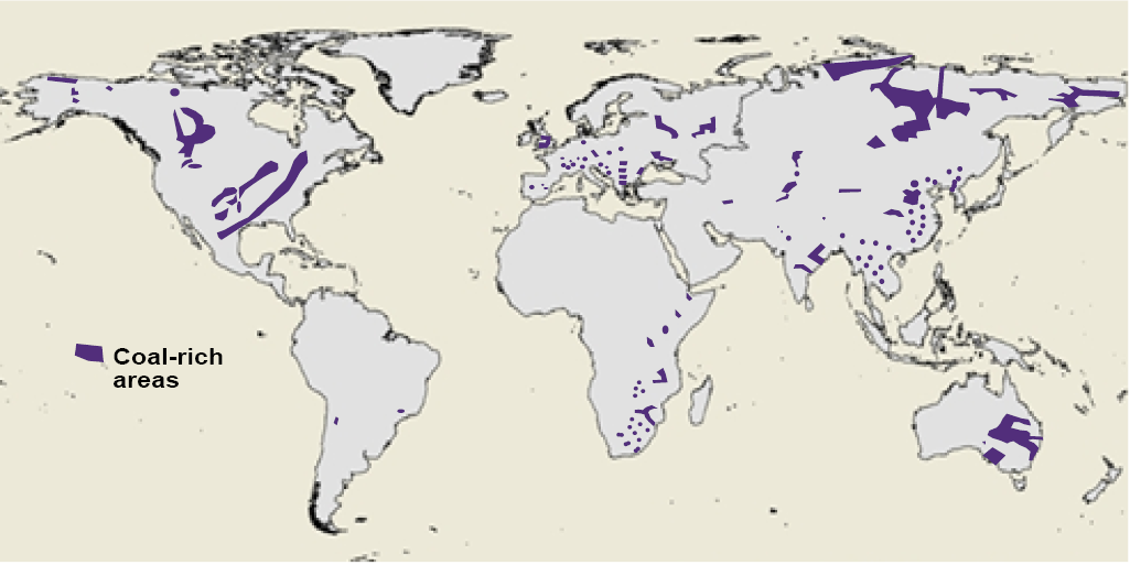
Table 13.3. Countries leading in coal reserves and production. Sources: Reserves and Production
| Country | 2017 coal reserves (billion tonnes) | Rank | Country | 2017 coal production (million tonnes) |
|---|---|---|---|---|
| United States | 251 | 1 | China | 3,874 |
| Russia | 160 | 2 | United States | 907 |
| Australia | 149 | 3 | Australia | 644 |
| China | 139 | 4 | India | 538 |
| India | 98 | 5 | Indonesia | 458 |
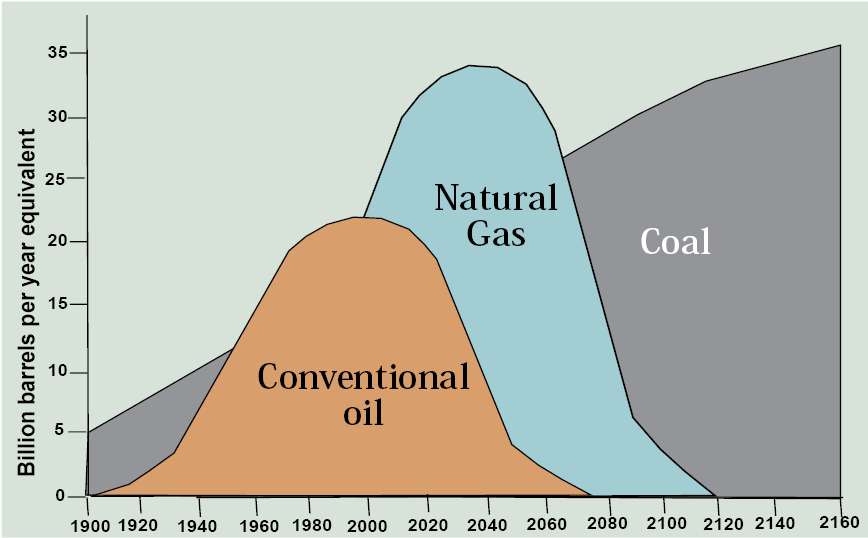
How does the Hubbert curve for coal stack up against oil and gas? The answer looks something like Figure 13.12 where coal gets an earlier start and the total area under the curve is several times larger than for oil and gas, reflecting its much larger original resource base. So there’s more than enough coal to go around not only for your lifetime, but for your children’s and possibly grandchildren’s as well, especially in the U.S. So when the oil and then the gas run out, we just switch over to coal. Right?
I think you can already tell what’s missing from this line of argument. The limiting factor in the world’s use of coal is not the size of the resource base. It is the atmosphere’s capacity to absorb the carbon dioxide and other pollutants emitted by burning it. So it’s not about peak oil, peak gas, or peak coal; it’s about peak carbon emissions.
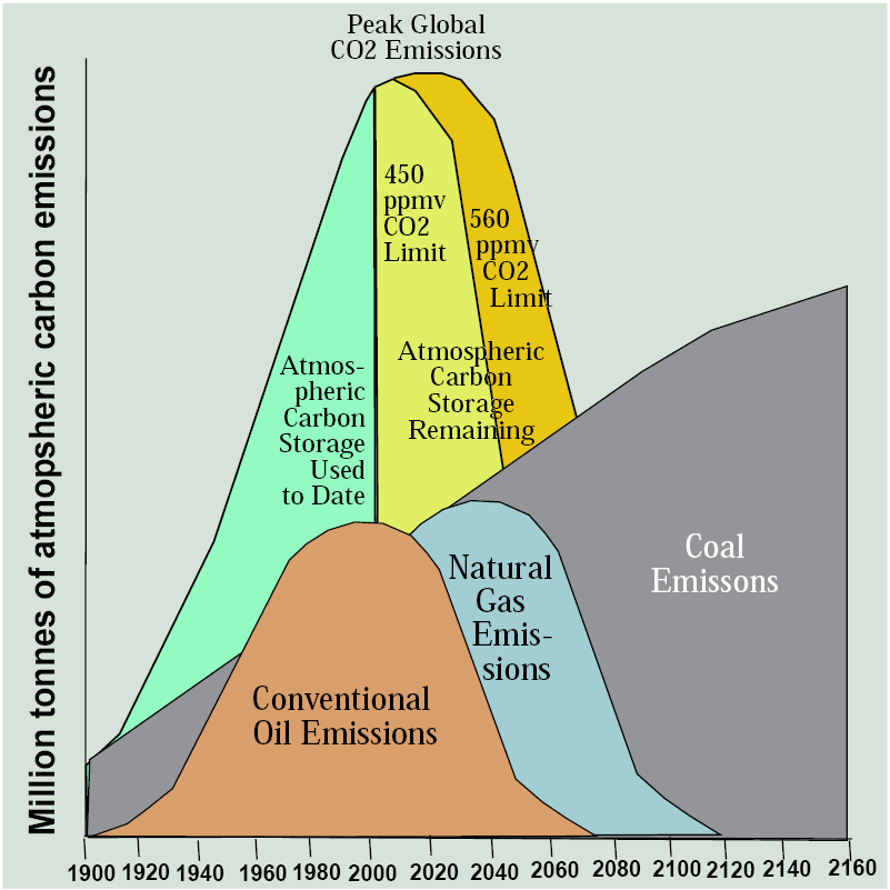
Let’s redraft the Hubbert curve to focus on emissions from burning rather than the size of the resource base of the three fossil fuels (Figure 13.13). As you may recall from Chapter 3, the preindustrial level of carbon dioxide was 280 ppmv, corresponding to an atmospheric carbon pool of 550 million tonnes. The concentration recently passed 400 ppmv corresponding to an atmospheric carbon pool of about 800 billion tonnes, 200 billion tonnes larger. Reflecting a goal of limiting warming to 1.5°C, if we set a limit at 450 ppmv, corresponding to an atmospheric carbon pool of about 884 billion tonnes, the atmosphere can absorb only another 84 billion tonnes from fossil fuel emissions, assuming other atmospheric inputs and outputs of carbon like land use change cancel each other out (which is close to being correct). That means that emissions from burning fossil fuels have already used up nearly 90 percent of the augmented atmospheric carbon sink that can ultimately be tolerated. We can bump that up to the CO2-doubling scenario that climate modelers frequently utilize of 560 ppmv corresponding to an atmospheric carbon pool of about 1,100 billion tonnes leaving us with 300 billion tonnes to go but with an understanding that climate change effects would be correspondingly more severe with warming in the neighborhood of 2°C.
With this in mind, Figure 13.13 uses the Hubbert approach to show a curve for atmospheric emission of carbon dioxide from all fossil fuels over the same time span as fossil fuel use. Note that the natural gas curve shrinks a bit and the coal curve grows a bit compared to the Hubbert curves for reserves to reflect the relative carbon emissions per unit of energy produced—lowest for gas, highest for coal.
The green section of the curve shows the increase in emissions since 1900 and the area under it reflects the cumulative storage of surplus carbon in the atmosphere, just as the area under the Hubbert curves for fossil fuels reflects cumulative consumption. For any peak level of carbon dioxide concentrations, such as 450 ppmv or 560 ppmv, we can identify a curve of emissions that has a moment of peak emissions in the same way that we are likely now seeing peak production of conventional oil.
When these graphs are compared, the conclusion I reach is that remaining reserves of conventional oil and gas will use up the remaining atmospheric carbon sink—if burned with carbon dioxide emissions vented to the atmosphere. Enormous reserves of coal, oil sands, and oil shale can never be used so long as this results in atmospheric carbon emissions. For this reason, most remaining fossil fuels, especially coal, are useful natural resources only if a way can be found to utilize their energy content without venting carbon to the atmosphere, such as through carbon capture and storage. If this technology never proves to be viable economically, most of the remaining reserves of fossil fuels, especially coal, are stranded assets. They’re no more valuable than a typewriter factory.
With that thought, let’s proceed from mineral resources to a broader discussion of energy sustainability in Chapter 14.
Further Reading
Deffeyes, K.S., 2005. Beyond Oil: The View from Hubbert’s Peak. Hill and Wang, New York.
Gordon, R.B., M. Bertram, and T.E. Graedel, 2006. Metal stocks and sustainability. Proceedings of the National Academy of Science 103(5): 1209-1214.
Berners-Lee, M. and D. Clark, 2013. The Burning Question: We Can’t Burn Half the World’s Oil, Coal and Gas, so How Do We Quit? London: Profile Books.
Media Attributions |
|
