3 Chapter 3: Relevant Fundamentals of Physical Geography and Geology
The Earth is a dynamic planet of interacting spheres: the atmosphere, the hydrosphere, the lithosphere, and the biosphere. In Chapter 4, we will focus on the last of these, the biosphere, by taking a look at the fundamentals of ecology. In this chapter, we will examine the nonliving spheres that form the environment in which the biosphere thrives (we hope). We need not try to cover all of the fascinating fields of physical geography nor of geology here but only those parts that bear most directly on natural resources. We will accomplish this primarily by focusing on what are termed biogeochemical cycles—the Earth systems for circulating critical materials among environmental components. We will focus on the three most prominent biogeochemical cycles: water, carbon, and nitrogen. Lastly, we will discuss a critical natural resource that emerges when all these cycles come together: soil, the lifeline of the human species.
What is a cycle? We can start with the notions from thermodynamics that matter circulates and energy dissipates. A material cycle is thus a way of understanding the circulation of a particular substance, such as water or carbon or nitrogen, by first examining where the substance is stored—its stocks or pools—and then examining how it moves among these pools—its fluxes or flows. This gives us an understanding of that substance’s metabolism, and by looking at how the cycles interact, we can gain a broad scientific understanding of the Earth as a working system. A quantitative approach is helpful since this gives us a sense of relative magnitude, provided we make an effort to grasp the units involved. For example, from daily life you probably have a thorough grasp of temperature in degrees Fahrenheit, people’s heights in feet and inches and their weight in pounds, driving distances in miles, and prices of common items in dollars. Here we will expand that quantitative repertoire. We also want to examine trends: which stocks or flows are increasing and decreasing? Are these increases and decreases due to nature or human activity? Beyond this objective approach, we also need to evaluate stocks and flows as well as their trends. Which are valuable resources? Which are environmental problems?
The Hydrologic Cycle
We’ll start with the hydrological cycle, with which you have some familiarity, and a unit of measure, the cubic kilometer (km3), that you should take a moment to imagine—0.62 miles long, wide, and deep, weighing 1 billion metric tonnes (we’ll use “ton” for an English ton of 2,000 pounds and “tonne” for a metric ton of 1,000 kilograms or 2,204 pounds, 10 percent larger). Figure 3.1 is a simple representation of the Earth’s pools of water, with the oceans containing 1,338 million km³ (Pacific 680 million km³, Atlantic 313 million km³ , Indian 269 million km³, and Arctic 17 million km³ not counting adjacent seas) 97.2 percent of the world’s total. All of it, unfortunately, has a heavy dose of 3.0–3.8 percent salt by weight.
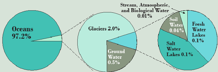
Most—24 million km³ of the 35 million km³ of the freshwater on Earth—is contained in glaciers, of which 90 percent is in Antarctica, 9 percent is in Greenland, and the remaining 1 percent is scattered in high mountain valleys. The third largest pool is groundwater, 10.5 million km³ of freshwater plus 12.9 million km³ of saltwater saturating the pore spaces in rocks and capable of moving slowly and steadily whenever pressure and gravity push it, so long as there is a permeable pathway through the rocks. Permafrost (permanently frozen soils of the arctic and subarctic, especially in Canada and Russia), comes next at 300 thousand km³. Next is lakes, both saltwater lakes, like Great Salt Lake and the far larger Caspian Sea, and freshwater lakes, where the ten most voluminous exceeding 1,000 km³ each (Table 3.1) hold over 80 percent of the world’s freshwater lake total.
| Lake | Location | Volume (km3) |
|---|---|---|
| 1. Baikal | Russia | 23,600 |
| 2. Tanganyika | East Africa | 18,900 |
| 3. Superior | North America | 11,600 |
| 4. Michigan-Huron* | North America | 8,260 |
| 5. Malawi | East Africa | 7,725 |
| 6. Victoria | East Africa | 2,700 |
| 7. Great Bear | Canada | 2,236 |
| 8. Issyk-Kul | Kyrgyzstan | 1,730 |
| 9. Ontario | North America | 1,710 |
| 10. Great Slave | Canada | 1,580 |
| *Actually one lake with a strait at the Mackinac Bridge | ||
The rest of the pools are small and are only worth mentioning because of their importance in evaluating water as a resource, which is to say there are large flows of freshwater through them and they are accessible for human use. Wetlands and soil moisture hold 17,000 km³ each, the atmosphere holds 13,000 km³, rivers hold 2,000 km³, and living organisms, mostly plants, hold about 1,000 km³.
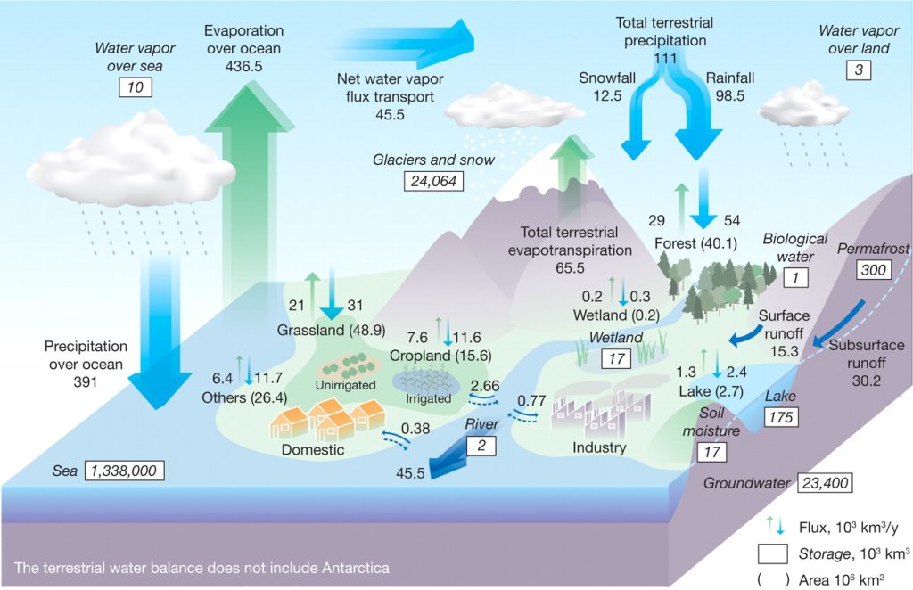
Of equal or even greater importance, and a bit more complex, are the fluxes or flows of water, where the atmosphere and rivers are of central importance. Figure 3.2 from an article in Science diagrams these flows among the pools in units of thousands of cubic kilometers per year. On average, 502,000 km³ evaporate into the atmosphere each year—436,500 km³ of this by applying solar energy to distill ocean saltwater into freshwater and 65,500 km³ of this either evaporating from land or transpired by plants into the atmosphere. Because it can be difficult in practice to distinguish evaporation from transpiration, they are often lumped together and called evapotranspiration. This means that the atmosphere exchanges its water pool 39 times each year, calculated as total annual evaporation (502) divided by average atmospheric stock (13). This results in a residence time, or average length of stay, of less than ten days (365/39) compared to the oceans that have a residence time of over 2,500 years. This is calculated by taking the volume of 1,338,000 km³ and dividing by the annual loss to evaporation of 502 km³.
Precipitation is 391,000 km³ over the oceans and 111,000 km³ per year over land, so the lands have a net gain of 45,500 km³ of precipitation over evapotranspiration. It is no coincidence that the flow of water down rivers to the oceans is also 45,500 km³ with about a third of this (15,300 km³) from surface runoff of rainfall and snowmelt and about two-thirds as base flow (30,200 km³) from groundwater seepage.
Think a bit more about that equal exchange of a net 45,500 km³ of water traveling through the atmosphere from the oceans to the land then returning to the oceans as river discharge. During the onset of an ice age, less water is flowing from the land to the oceans down rivers and the glacier pool on land is growing while the ocean pool is shrinking—hence sea level is dropping. At the end of an ice age, the reverse occurs; the glacial pool diminishes as it melts, rivers carry copious quantities of water to the oceans every summer, and sea level rises. Sea level is estimated to have risen by 120 meters (394 feet) at the end of the most recent (Wisconsin) glaciation between 18,000 and 6,000 years ago. In fact, this process is occurring now due to global climate change as we will see.
Still using Figure 3.2, let’s look at some human uses of water in the context of the overall hydrologic cycle. Croplands receive 11,600 km³ as precipitation plus 2,700 km³ as irrigation and transpire 7,600 km³ back to the atmosphere. The remaining 6,700 km³ runs off crop fields to streams and rivers, often carrying pollutants such as fertilizers with it. Industries use less (770 km³) while domestic applications in homes use only 380 km³, with most of both returning to its source. We will return to these human uses of water in detail in the context of the hydrologic cycle in Chapter 12.
The Thornthwaite Water Balance
Using Figure 3.2, we have quickly learned a great deal about the global water cycle. This doesn’t tell us much, however, about any particular place at any specific time. Charles W. Thornthwaite (1899–1963), an American climatologist and geographer, developed a water balance approach that compares precipitation and evapotranspiration over time at any location. Table 3.2 and Figures 3.3 and 3.4 show how Thornthwaite thought about water supply from the point of view of the primary user of water – plants, either natural or cultivated – and the amount of water that they can potentially utilize in the process of photosynthesis to maximize their health and growth if it is abundant—potential evapotranspiration.
| Element of Water Balance | J | F | M | A | M | J | J | A | S | O | N | D | Total |
| Precipitation | 1.6 | 1.7 | 3.8 | 2.3 | 5.1 | 5.4 | 2.4 | 3.7 | 2.2 | 3.7 | 3.0 | 1.4 | 36.3 |
| Potential EVT | 0 | 0 | 0.2 | 1.6 | 3.3 | 4.8 | 5.7 | 5.0 | 3.3 | 1.7 | 0.3 | 0 | 25.9 |
| Precipitation – Potential EVT | 1.6 | 1.7 | 3.6 | 0.7 | 1.8 | 0.6 | -3.3 | – | -1.1 | 2.0 | 2.7 | 1.4 | 10.4 |
| Change in soil storage | 0 | 0 | 0 | 0 | 0 | 0 | -3.3 | – | 0 | 2.0 | 1.5 | 0 | 0 |
| Soil storage remaining | 3.5 | 3.5 | 3.5 | 3.5 | 3.5 | 3.5 | 0.2 | 0 | 0 | 2.0 | 3.5 | 3.5 | – |
| Actual evapotranspiration | 0 | 0 | 0.2 | 1.6 | 3.3 | 4.8 | 5.7 | 3.9 | 2.2 | 1.7 | 0.3 | 0 | 23.7 |
| Water deficit for plants | 0 | 0 | 0 | 0 | 0 | 0 | 0 | 1.1 | 1.1 | 0 | 0 | 0 | 2.2 |
| Water surplus (runoff) | 1.6 | 1.7 | 3.6 | 0.7 | 1.8 | 0.6 | 0 | 0 | 0 | 0 | 1.2 | 1.4 | 12.6 |
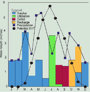
The year begins in this example of a corn field in northern Illinois in January with the soil saturated with 3.5 inches of water. Note that how much water the soil can store, largely a function of organic matter content, is important and is therefore a key component of soil fertility. Rain and snowmelt that month amount to 1.6 inches, but since the corn is not in the field and temperatures are low, none of this is evaporated or transpired (EVT). It would soak or infiltrate into the soil, but the soil is already saturated, so instead it percolates into groundwater or runs off to streams as surplus.
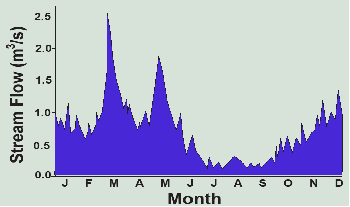
February is similar, but in March there are heavy rains that melt the remaining snow for a total of 3.8 inches of precipitation. A bit of this evaporates (0.2 inches), but with the soil still saturated, 3.6 inches runs off, generating a moderate flood downstream (see hydrograph in Figure 3.4). In April, the rains diminish, but evapotranspiration climbs to 1.6 inches. The soil remains saturated, but only 0.7 inches of surplus runs off to streams and the flood recedes. May brings heavy rain again and 1.8 inches of runoff while the seedling corn crop enjoys all the water it can use, now up to 3.3 inches. June remains rainy at 5.4 inches, but the growing corn in the warm temperatures uses almost all of it (4.8 inches).
In July, only 2.4 inches of rain falls, just as potential evapotranspiration hits its annual peak of 5.7 inches. Here’s where soil storage comes to the rescue, making up the entire 3.3-inch difference and the corn grows unabated by the drought. That leaves only 0.2 inches of soil moisture for August, however, when potential EVT of 5.0 inches again exceeds precipitation of 3.7 inches. The crop uses the remaining 0.2 inches of soil moisture, but then it runs out of water. Actual EVT is thwarted by the drought and falls below potential EVT by a deficit of 1.1 inches. This happens again in a dry September with another deficit of 1.1 inches and the streams, which have not seen runoff since June, are reduced to a trickle of groundwater discharge (Figure 3.4). The farmer may wish he had installed an irrigation system since these two months with a deficit of 2.2 inches are reducing his crop to below average yields. Without it, he can only wish the flood-producing rains in March and May had fallen in late summer when the water was needed.
By October, the rains pick up again to 3.7 inches while the crop’s needs fall to only 2.0 inches. Finally, the soil is replenished, gaining the 1.7 inches as storage, but the streams still aren’t seeing much relief. In November, the crops have been harvested, the weather is chilly and potential EVT falls to only 0.3 inches while the cold rains deliver 3.0 inches. The soil regains its full storage of 3.5 inches and the streams finally see some runoff of 1.2 inches. The year ends in December with 1.4 inches of rain and snowmelt which pushes the annual total of 36.3 inches slightly above the average of 34.7 inches, all of which goes to groundwater percolation and stream flow.
Despite the slightly wetter than average year, the damage to the corn crop of the late summer drought is done. If the soil had a storage capacity of 5.7 inches instead of 3.5 inches, however, the corn would have had all the moisture it needed throughout the growing season. The spring floods would also have been less severe. Too bad half of the organic matter the soil contained when the prairies were first plowed has been lost to erosion and the atmosphere.
Farther west near Lincoln, Nebraska, annual precipitation averages only 28 inches and potential evapotranspiration is somewhat higher due to the air’s greater aridity. Corn finds itself in water deficit for some of every growing season. Farmers there either have to drill wells to tap into the Ogallala Aquifer to irrigate their corn crop through the late summer drought or switch to less water-needy, but also less profitable, wheat. By the time we reach the semiarid lands along the Wasatch Front in Utah, annual precipitation of only 15–20 inches makes crop production hopeless without irrigation, and only a few locations in Utah get all of the irrigation water that is available. Ranchers graze herds of cattle looking for grass amid the sagebrush.
This Thornthwaite water balance narrative, “a year in the life of a corn field,” illustrates how the timing of precipitation relative to plant needs, as expressed by potential evapotranspiration, is the key in determining the water balance in both agricultural and ecological settings. Most species of trees are less tolerant of water deficits than grasses, while cactus have adapted to arid conditions by storing water inside the plant itself, but sagebrush grows long tap roots to access groundwater and goes dormant during droughts. Corn, soybeans, cotton, rice (which requires seasonal flooding), as well as many fruit and vegetable crops, do poorly when water deficits persist. Wheat and some Mediterranean crops like grapes are more tolerant of drought.
Water storage helps balance temporal discrepancies. The first reservoir is the soil. In a place like California, the summer water deficit is severe, even in a moist year, and so farming is dependent on irrigation. Water surpluses from winter snows must be stored somewhere if they are to be delivered in the summer growing season. The snowpack in the mountains becomes a natural reservoir as it melts steadily over the summer to generate stream flow that farmers can access. But when this is also insufficient, the question arises of building dams on rivers to store water from wet years in reservoirs for use in dry years. Clearly, we can see that having enough water on average misses the point because we may not have the water when it is needed, though storage in reservoirs or aquifers can improve the imbalances.
Global Geography of Freshwater Resources
With the help of the Thornthwaite water balance approach, we can see that runoff, both surface and groundwater, represents the surplus of precipitation over evapotranspiration, taking into account soil and groundwater storage. It is the freshwater that is available in streams, rivers, and lakes for purposes beyond plant growth (including rainfed crops). We can then take a more geographic approach to the hydrologic cycle by looking at runoff (as shown in the hydrograph in Figure 3.4).
Figure 3.5 shows average annual runoff around the globe. First, note the scale. It is in millimeters per year (mm/y) (there are 25.4 mm in an inch) as the depth of non-evaporated rainfall and snowmelt that runs downhill to and through waterways. It is not a linear but a logarithmic scale, so it varies over three orders of magnitude, from less than 5 mm/y (0.2 inches, the width of your pen) to 5,000 mm/y (about 16 feet). The availability of fresh water varies enormously from place to place!
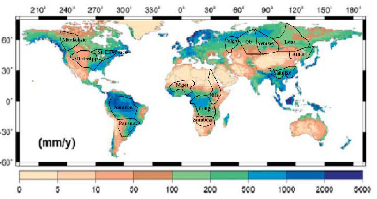
At less than 50 mm (2 inches) per year of annual runoff (the northern Illinois case had 12.6 inches), rainfed agriculture is all but impossible; plants do not cover most of the soil surface, leaving it vulnerable to erosion, and runoff does not give rise to permanent streams. This occurs on about a third of all land on Earth, including a vast arid stretch from the Atlantic coast of North Africa to northeastern China, in much of Australia and southern Africa, the Pacific coast of Peru and northern Chile and southern Argentina, and from central Mexico through the western U.S., except west of the Cascades. and the high Rockies. In these places, land is nearly worthless if it does not have available water, which is the limiting factor ecologically, agriculturally, and often in human economic development.
At more than about 2,000 mm (2 meters) per year of runoff, copious rainfall and infiltration leaches soils of nutrients, which must be completely covered by dense vegetation if they are to be protected from severe erosion. The human habitat is thus considerably defined by water – to areas where runoff is about 50–2,000 mm/y, or able to access irrigation water from wetter places. Note where this range occurs in Figure 3.5 in dark brown through green to medium blue. Over 90 percent of humans live in the third of the Earth’s land surface where annual runoff is within this range and the mean annual temperature is above freezing (0°C, 32°F).
Watersheds
Water runs downhill to the ocean. This simple fact gives rise to the central geographic and topographic concept governing the hydrologic cycle—watersheds. Also known as a drainage basin, or in Australia as a catchment, a watershed is the area of land where water drains downhill to a particular point in a stream channel. Table 3.3 lists the 10 largest watersheds in the world along with the ten largest rivers by discharge (the volume of water that flows by a point on the river in a specific span of time). These are also mapped in Figure 3.5. Why is the Amazon’s discharge five times larger than any other river on Earth at over 18 quadrillion gallons per year? It has the largest watershed by far and all of this area has over 20 inches per year (500 mm/y) of runoff.
| Watershed | Area (1000 km2) | Area (1000 miles2) | Rank | River | Average Discharge (m3/s) | Annual Discharge (trillions of gallons) |
| Amazon | 6,144 | 2,372 | 1 | Amazon | 219,000 | 18,257 |
| Congo | 3,730 | 1,440 | 2 | Congo | 41,800 | 3,485 |
| Nile | 3,255 | 1,257 | 3 | Ganges | 40,000 | 3,335 |
| Mississippi | 3,202 | 1,236 | 4 | Orinoco | 31,900 | 2,659 |
| Ob | 2,972 | 1,147 | 5 | Yangtze | 31,900 | 2,659 |
| Parana | 2,583 | 997 | 6 | Parana | 25,700 | 2,143 |
| Yenisei | 2,554 | 986 | 7 | Yenisei | 19,600 | 1,623 |
| Lena | 2,307 | 891 | 8 | Lena | 17,100 | 1,426 |
| Niger | 2,262 | 873 | 9 | Mississippi | 16,200 | 1,351 |
| Amur | 1,930 | 745 | 10 | Mekong | 16,000 | 1,334 |
We can also usefully define watersheds at smaller scales by utilizing tributaries. In this way, a watershed address can be determined for every place on land. For example, my old office at Southern Illinois University Carbondale is in the Mississippi watershed, the fourth largest on Earth at over 3 million km², but within that, it is in the Upper Mississippi watershed (490,000 km²) that drains to the junction with the Ohio River at Cairo, IL, from the north. Within that, it is in the Big Muddy watershed (6,071 km²) which drains to the Upper Mississippi, and within that the Crab Orchard Creek watershed (213 km²), a tributary of the Big Muddy. We can go to even smaller scales, placing my office in the Piles Fork watershed (about 40 km²), but at scales smaller than that, it becomes difficult to identify a stream channel to which water falling on the roof of the building my office was in drains (Figure 3.6). Even U.S. Geological Survey topographic maps are inconsistent in their mapping of the smallest of stream channels.
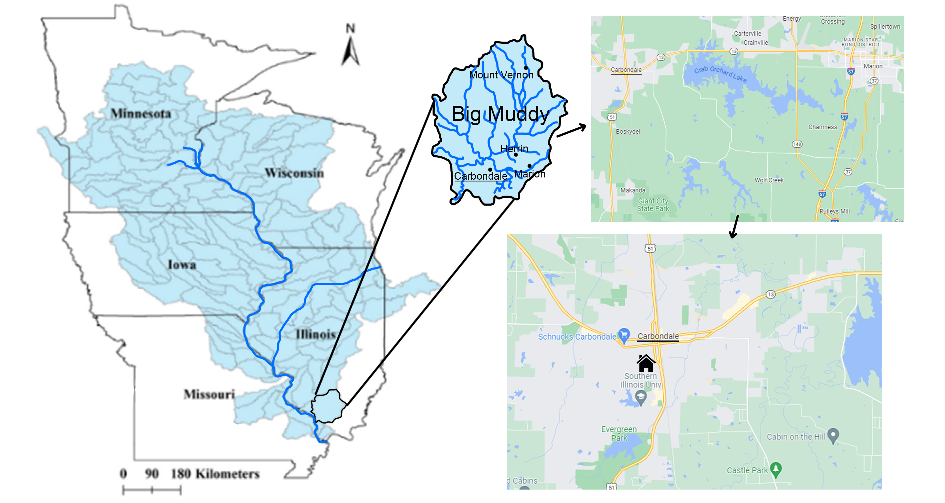
In the reverse direction, when it rains on my building’s roof, some of the water takes the opposite route on its 1,700 kilometer journey to the ocean—down hills, rills, and narrow ephemeral channels to the Piles Fork less than a kilometer away, down to the Crab Orchard Creek, Big Muddy River, Upper Mississippi River and Lower Mississippi eventually flowing to the Gulf of Mexico.
My current office at Utah State University, however, has a very different watershed address. Rain falling on the Natural Resources building can quickly find its way down to the Logan River a mile away, which drains to the Bear River, which provides the majority of the water feeding into Great Salt Lake. Thus, like 18 percent of Earth’s area and 5 percent of North America’s area, I live in an area with no outlet to the ocean. Take a moment to identify your watershed address and water route to the ocean (or terminal lake) in a similar manner.
Watersheds usually have distinct boundaries called drainage divides that can be drawn from a topographic map. For example, the continental divide in the Rocky Mountains marks the western boundary of the Mississippi and Rio Grande watersheds, both of which flow to the Gulf of Mexico. To the west of this line, water flows to the Pacific Ocean via the Columbia, Colorado, and other rivers. Similarly, the Appalachian divide marks the eastern boundary of the Mississippi watershed and the western boundary of rivers that flow to the Atlantic, such as the Susquehanna and Potomac. Drainage divides can be mapped at smaller scales as well to delineate smaller watersheds.
Watersheds are critical in assessing the hydrologic cycle and water resource issues. As we have seen, the quantity and quality of water in a stream or river is determined by climate and land use—within the watershed area that drains to it. A rainstorm in a neighboring watershed will cause a flood in that watershed’s streams, not yours, but a feedlot in your watershed will pollute streams in your watershed, not the neighboring watershed. Watersheds thus define the zone of water resource and aquatic ecological impacts of climate and climate changes, of human and ecological water uses, of water pollution emissions, of land use decisions, and of engineered alterations of streams and rivers such as dams and levees. Every watershed is unique. As Massachusetts Congressman Tip O’Neill said of politics, all water issues are local.
At this point, we have set the stage sufficiently for a more in-depth discussion of water resource sustainability in Chapter 12. Two other critical biogeochemical cycles we need to investigate at this juncture are the carbon cycle and the nitrogen cycle.
The Carbon Cycle, Fossil Fuel Formation, and Climate Change
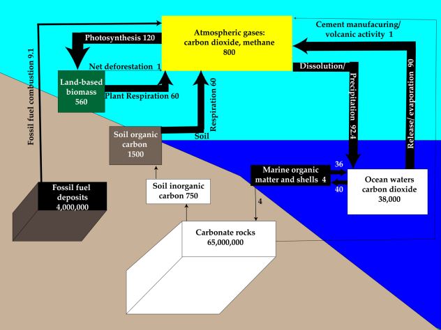
A diagram of carbon stocks and flows, together constituting the carbon cycle, is shown in Figure 3.7. The carbon cycle is critical in understanding one class of vital natural resources—fossil fuels—and one overarching environmental problem— climate change. Like with water, the first question to ask when considering a cycle is “where on Earth is the carbon?” The largest pool or stock by far is carbonate rocks such as limestone (composed mostly of calcium carbonate—CaCO3), which contains about 94 percent of all the carbon on Earth or 65,000,000,000,000,000 (65 x 1015) tonnes. The second biggest is fossil fuels, mostly coal, that store most of the remaining 6 percent (4 x 10¹⁵) tonnes. Though far smaller in tonnage, the remaining carbon pools are very important because they interact very actively with the biosphere and atmosphere. Ocean waters contain 39,000 billion tonnes (mostly as dissolved carbon dioxide), the soil contains 2,300 billion tonnes as humus and weathered limestone, land-based biomass (e.g. tree trunks) 550 billion tonnes, and the atmosphere 800 billion tonnes, mostly as carbon dioxide, but also as methane.
This last figure is critical because two hundred years ago it was 550 billion tonnes. The 250 billion tonnes of carbon that have accumulated in the atmosphere, largely from the combustion of fossil fuels, are at the heart of the climate change issue. Let’s focus first on the flows that store carbon as fossil fuels in the Earth and then at the flows that store carbon in the atmosphere.
Fossil Fuel Formation
Oil, gas, and coal—in a total of just ten letters we can spell out the energy source that has defined the industrial era. But what are they, where does their energy come from, and how did they get in the Earth’s crust? To answer the first question, they are hydrocarbons. Chemically speaking, if we start with hydrogen gas (H2), we can add on groups of one carbon atom and two hydrogen atoms to get first gas then oil, collectively known as petroleum. Natural gas is primarily methane or CH4 but also includes C2H6, (ethane), C3H8 (propane), and C4H10 (butane). Then comes C5H12 (pentane), C6H14, (hexane), C7H16 (heptane), C8H18 (octane, used to measure the energy value of gasoline), and up through about C15H32, which constitutes most of what we put in the gasoline tanks in our cars and trucks. Here it is burned using oxygen gas (O2) from the air to produce heat energy plus water and carbon dioxide according to the chemical formula 2 C8H18 + 25 O2 → 18 H2O + 16 CO2 + heat. Keep going up to C16H34 and you have diesel fuel. Note that when you burn (i.e. combine with oxygen) a hydrocarbon, you get water and carbon dioxide, plus a variety of pollutants due to impurities or incomplete combustion.
Coal is a heavier, more complex, and more carbon-rich hydrocarbon. For example, one analysis of abundant bituminous coal gives a formula of C137H97O9NS (N is nitrogen, S is sulfur) and one for less abundant, but cleaner burning, anthracite coal is C240H90O4NS, but these are just examples of a diverse hydrocarbon that is often infused with water.
Hydrocarbons derive their energy from the sun, but this requires some explanation. Inside the sun, nuclear fusion produces helium from hydrogen releasing incredible quantities of energy. This radiates as shortwave radiation, much of which plants capture during photosynthesis, most typically expressed as the chemical formula 6H2O + 6CO2 + solar energy → C6H12O6 + 6O2. This reaction converts solar energy into the energy-packed carbohydrate molecule known as glucose. The chemical energy in fossil fuels is derived over millions of years from glucose, and so they are, in effect, stored solar energy.
When they die, most plants and animals lose their chemical energy through decay when their bodies are burned or devoured, and the energy dissipates through respiration, which is the reverse of photosynthesis. If they die in a water-logged environment lacking oxygen (this is called a reducing or anaerobic environment), however, the carbohydrates accumulate at the bottom of wetlands, shallow lakes, river deltas, estuaries, and continental shelves. Over millions of years, the carbohydrates are buried by sediments, crushed, and, as they are buried deeper in the Earth’s crust, slowly cooked until the oxygen is driven out and hydrocarbons form. Higher temperatures and greater depths tend to produce gas while more moderate temperatures and depths produce oil, what petroleum geologists term the oil window.
Oil and gas often occur together in fields as much as five miles below the land surface or sea floor within sedimentary rocks like sandstone, limestone, or shale. There they coexist with groundwater filling in the tiny, interconnected pore spaces in the permeable reservoir rock (Figure 3.8). Oil is generally lighter than water, so it migrates above it. Gas is lighter still, but under the enormous pressures deep in the Earth, much of it is dissolved in the oil like a carbonated drink. Petroleum will rise to the surface and evaporate or oxidize unless there is a geologic trap—an impermeable layer above that prevents its escape.
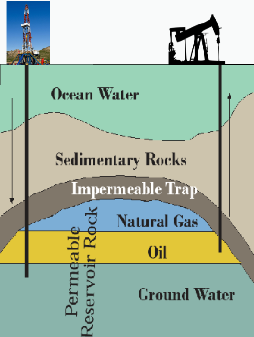
If a well is drilled through the trap, the oil and gas will migrate to it under pressure, at first enough to generate a gusher like a shaken sodapop when opened. Once this pressure dissipates, however, it is difficult to get all of the oil out. It can get trapped in tight or impermeable places in the reservoir and heavier oils stick hard to the reservoir rock. Often, only a third of the oil in the reservoir can be recovered. This percentage can be improved by loosening the oil with steam or even detergents or by adding pressure by injecting water, natural gas, or carbon dioxide—a practice that can sequester that pollutant underground as we will discuss later. Fracking, however, can often substantially increase recovery as we will discuss in Chapter 13.
Coal, which is roughly ten times as abundant as petroleum, also starts with ancient plants that die and fall to the bottom of swamps and seas. Here they accumulate as organic-rich, wet peat, a fuel that is dug up by hand and burned in some countries. As the peat is buried by sediments and crushed, the water is driven off and it hardens into first lignite, a soft, poor-quality coal, then bituminous coal, which constitutes the vast majority of coal production on Earth, then hard anthracite coal. Extreme pressure can even produce diamonds.
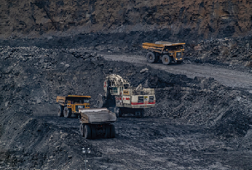
As a solid, coal is not pumped from the Earth like water, oil, or gas using wells but must be dug out from a mine. If the overburden is less than about 100 feet thick, it can be stripped away, revealing the coal seam to the air, where enormous shovels and cranes dig it out to be shipped to the coal processing plant (Figure 3.9). Clearly, surface or strip mining has enormous environmental impacts ranging from land degradation to acid mine drainage to mountaintop removal, problems that plague coal mining areas wherever they occur.
If the coal seam is deeper, underground mining techniques are employed. In room-and-pillar mining, columns of coal are left behind to hold up the roof of the mine in an effort to prevent collapse, and consequent land subsidence. In long-wall mining, essentially all of the coal is removed as the mine collapses and the land subsides above mined-out areas. While, on balance, underground mining is preferable to surface mining on environmental grounds, it is a dangerous occupation and land subsidence is a serious issue for any structures lying above it.
When the oil, gas, or coal are brought to the surface and burned as fuel, water and carbon dioxide are the primary products. Individual oil and gas fields and coal seams are thereby depleted over time as their products are produced, refined, and consumed, and the chemical energy in the hydrocarbons is released in the pistons of your car or truck, the furnace in your basement, or the power plant that generates the electricity for your computer. The global distribution, production, and depletion of fossil fuels is a topic for further investigation when we dig into the fascinating issues of energy in Chapters 13 and 14.
Climate Change
The critical environmental issue of climate change is also related to the carbon cycle. Figure 3.10 is a simple diagram explaining why atmospheric carbon warms the Earth. Because the sun’s surface is very hot (5,400°C; 9,800°F), incoming solar radiation is shortwave. At this wavelength, light passes through nitrogen (78%), oxygen (21%), and everything else in the atmosphere except clouds. The proportion that is reflected from the Earth is called albedo, but except on ice and snow, most is absorbed, warming the Earth. The Earth then radiates heat as longwave radiation that you can almost see as waves on a blacktop road on a hot summer afternoon.
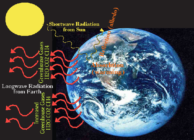
On the moon where there is no atmosphere, all of this radiation escapes to space, but on Earth, the atmosphere contains greenhouse gases. In order of importance, these are water vapor (H2O), carbon dioxide (CO2), and methane (CH4), plus more minor effects from nitrous oxide (N2O), halocarbons (like CFCs), and ozone (O3). This natural greenhouse effect raises the average temperature of the Earth’s surface from about 4°F to 58°F and enables most life to exist on the planet. When carbon dioxide, methane, and other greenhouse gases are added to the atmosphere, however, they absorb more longwave radiation, warming the lower atmosphere. This impacts the weather (short-term) and the climate (long-term).
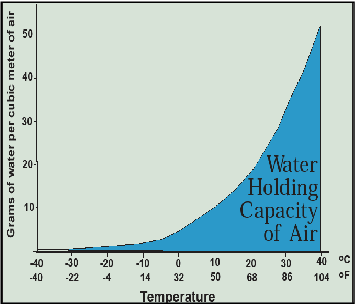
Water vapor, the most important greenhouse gas, also plays a crucial role because the warmer the atmosphere gets, the more water it can hold, as shown in Figure 3.11. Thus, a positive feedback process is initiated where greenhouse gases warm the atmosphere, which enables it to hold more water, which warms the atmosphere further, which enables it to hold yet more water, which warms it yet further. Greenhouse gases are thus a catalyst that sparks a warming process that is primarily carried out by water vapor. When you see scientific predictions of how much the Earth is expected to warm if carbon dioxide and methane concentrations reach certain levels, this positive feedback effect induced by water vapor is already taken into account.
Returning to Figure 3.7, also note the flows (or fluxes) of carbon shown as arrows to denote the direction of movement as well as relative volume of annual flow. The oceans absorb 93 billion tonnes per year from the atmosphere, releasing 90 billion tonnes for a net removal of about 3 billion tonnes per year, much of which forms marine organic matter and seashells. In fact, over hundreds of millions of years, this marine ecological process created the carbonate rocks from what was once carbon dioxide in the Venus-like atmosphere of early Earth.
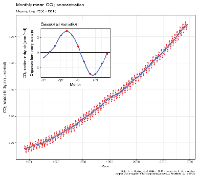
At 102 billion tonnes per year, photosynthesis is the largest flux of carbon and removes over 13 percent of all atmospheric carbon each year, though on a global annual basis it is balanced by respiration, which returns the same amount back to the atmosphere. Seasonally, photosynthesis wins the race in spring and summer when atmospheric concentrations actually fall by about part per million by volume (ppmv) or roughly 12 billion tonnes, though they rise by about 8 ppmv or 15 billion tonnes in the autumn and winter. The Keeling Curve in Figure 3.12 shows both this seasonal pattern and the annual increase. The difference of about 2 ppmv or nearly 3 billion tonnes is primarily due to emissions from fossil fuel burning (and secondarily from cement manufacturing, which uses crushed limestone) at a rate now exceeding 10 billion tonnes per year, exceeding the rate of net uptake by the oceans (about 3 billion tonnes per year).
As a thought experiment on how to address the climate change problem as an accumulation of atmospheric carbon, look over Figure 3.7 and see how many ways you can think of to remove carbon from the atmosphere. Of course, we want to focus on this carbon pool since the other pools are a good thing (land-based biomass, soil organic carbon, fossil fuels) or neutral (e.g., carbonate rocks). Above some threshold size (say, 600 billion tonnes), where the negative effects of climate change become evident, removal of carbon from the atmospheric pool to some other pool is a positive thing from the perspective of human well-being and sustainability.
Here’s my list of how the atmospheric carbon pool can be reduced:
- Reduce the rate of carbon emissions from fossil fuel burning
- Reduce the rate of carbon emissions from cement manufacture
- Reduce the rate of carbon emissions from volcanic activity
- Reduce the rate of respiration
- Reduce the rate of oceanic release of carbon
- Reduce the rate of weathering of carbonate rocks into soil inorganic carbon
- Increase the rate of oceanic uptake of carbon
- Increase the rate of oceanic carbon uptake by marine organisms
- Increase the rate of carbon uptake through photosynthesis
- Increase the size of the land-based biomass carbon pool
- Increase the size of the soil organic carbon pool
- Recycle fossil fuel emissions into the lithosphere (sequestration) rather than venting them to the atmosphere.
Now, some of these, like the rate of oceanic or volcanic carbon release, are completely out of human control. Others would have small effects. So here is a culled list of the five most viable options:
- Reduce the rate of carbon emissions from fossil fuel burning
- Increase the rate of carbon uptake through photosynthesis
- Increase the size of the land-based biomass carbon pool
- Increase the size of the soil organic carbon pool
- Recycle fossil fuel emissions into the lithosphere (sequestration) rather than venting them to the atmosphere
This list of five options, in combination, might actually do the trick of slowing and even reversing the buildup of carbon in the atmosphere that is causing climate change.
Consider a giant atmospheric carbon removal machine built by combining some of these factors. Grow trees on plantations (removing carbon from the air through photosynthesis), burn the trees in a power plant, capture the carbon dioxide gas, and sequester it in a geological repository. Carbon takes a one-way trip from air to Earth—and electricity is produced as a by-product.
Note again that the oceans absorb 3 billion tonnes per year more from the atmosphere than they release, so if we can get the net emissions to the atmosphere from other components down below 3 billion tonnes per year (compared to the current 10 billion tonnes), the oceans can absorb the rest, though at the expense of making them less alkaline (this is ocean acidification). For example, if (a) emissions from fossil fuel burning and cement manufacturing were reduced from 10 to 3 billion tonnes per year, through greater energy efficiency and switching to lower carbon fuels, (b) 1 billion tonnes of those emissions were stored in geologic sequestration sites instead of vented to the atmosphere, and (c) the combined land-based biomass and soil organic carbon pools were increased by 1 billion tonnes per year through photosynthesis, the atmosphere would be losing 1 billion tonnes per year. Problem solved! (at least in the long-run). Of course, those things are easier said than done, but would we even know what we want to try to achieve without examining the carbon cycle? We’ll discuss these approaches to limiting atmospheric carbon in considerably more detail in the context of energy (Chapter 14) and environmental policy (Chapter 15).
Climate Change Impacts
There are many views on how severe a problem climate change is, ranging from a few that still assert that it is hoax, to absurd Hollywood disaster movies like Waterworld and The Day After Tomorrow.
For an objective view, we must turn to the best science, and there is no shortage—studying climate change and its consequences has been a mainstay for environmental scientists for over a decade and shows no signs of abating. The gold standard is the Intergovernmental Panel on Climate Change (IPCC), a large group of renowned scientists from many countries who received the Nobel Peace Prize in 2007. Climate change is far more subtle than a rise in the thermometer, though that is where our discussion must begin. From there we will look into impacts on the hydrological cycle and sea level, leaving further consideration of its effects on agriculture and ecosystems until later when we have established greater knowledge of those two important topics.
The story line on climate change is really quite simple and consists of five elements, the first of which we have explored and the second through fourth we will explore here, leaving the fifth until later chapters:
- Human impacts on the composition of the atmosphere have thus far caused an increase in absorption of longwave radiation (called radiative forcing). Increases in the greenhouse gases carbon dioxide (76% of radiative forcing), methane (16%), nitrous oxide (6%), and halocarbons (2%) absorb longwave radiation at very well-determined rates, thus both warming the lower atmosphere directly and indirectly through their effect on increasing water vapor. These combined effects are about 1oC in warming from 1950–2020.
- Atmospheric concentrations of carbon dioxide and methane have increased in recent times and are at levels higher than have occurred over tens of thousands of years over which temperatures and greenhouse gas concentrations are very highly correlated.
- The increase in atmospheric concentrations of greenhouse gases is due to human activities such as burning of fossil fuels, deforestation, and cement manufacturing.
- The increase in temperature changes and other elements of the Earth’s environment, such as a rise in sea level, an acceleration of the hydrologic cycle, and an altered geography of climatic effects on agriculture has, on balance, serious overall negative consequences for humans.
- Humans have the power to ameliorate and even reverse climate change, and doing so presents less hardship than enduring its consequences.
Figure 3.13 from the 2007 IPCC report shows carefully gathered data from air bubbles in ice cores from Vostok, Antarctica. The concentration of carbon dioxide in parts per million by volume (ppmv) (rather than by weight) in the air bubbles is plotted on the y-axis compared to years before now on the x-axis. Clearly, prior to the industrial revolution in 1800, the range was only from 180–300 ppmv. Since 1800, it has climbed at an increasing rate to reach 400 ppmv in 2013, and 415 ppmv in 2019, a 48 percent increase over pre-industrial levels and is climbing at a rate of about 2 ppmv every year.
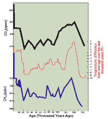
Over the same time period, methane concentrations have more than doubled from the pre-industrial range of 300–700 parts per billion by volume (ppbv) and now average over 1,850 ppbv as of this writing in 2020. Note that methane is over 200 times less abundant than carbon dioxide, but its radiation absorption capacity is much higher. In the first 20 years after emission it is 84 times as potent, but it has a shorter residence time in the atmosphere than does carbon dioxide; these balance to a century-long 21 times higher total climatic forcing effect per unit volume of gas. Thus the roughly 130 ppmv increase in carbon dioxide has about 4 times the radiation absorption effect than the roughly 1.3 ppmv increase in methane concentrations.
Past temperatures can be determined using isotopes, in this case the ratio of O16 to O18. Using this accurate method of estimation, temperatures have ranged over the last 160,000 years from 6°C (11°F) colder to 2°C (4°F) warmer than today, very closely tracking the variations in CO2 and CH4 concentrations. The rock-solid relationship that CO2 and CH4 have on the absorption of longwave radiation points to CO2 and CH4 as the cause and temperature as the effect.
If you look closely, you can also see the cycle of ice ages with the current warm Holocene interglacial evident over the past 15,000 years, the cold Wisconsin glaciation going back from there to about 110,000 years ago, the quite warm Sangamon interglacial preceding that for about 30,000 years, and the very cold Illinoisan glaciation ending about 140,000 years ago.
Temperatures are indeed rising, about 1.0°C (1.8°F) since 1850, raising the average temperature of the surface of the Earth from 56.5°F to 58.3°F and on a steady rate of increase of about 1°C every 10–20 years. If you were to go outside, you probably wouldn’t even notice this 1.8°F difference. But compare these changes to a fever. If your temperature was 98.0°F and it rose to 99.8°F, you may notice the slight fever. That’s about where we are now with climate change. If it were to go up by another 1.8°F to 101.6°F, you’d be at home sick rediscovering how bad daytime TV is rather than going to class. One more 1.8°F to 103.4°F and you’ll be at the doctor’s office searching for a remedy. One more 1.8°F to 105.2°F and you’d be in the hospital going through a battery of tests to determine what’s wrong before it’s too late. One more to 107°F and you’re in intensive care because if it doesn’t come down soon it will quickly drop to room temperature because you’re history. So, as described by Mark Lynas in Six Degrees: Our Future on a Hotter Planet, let’s take a look at how the Earth changes with rising temperatures to see if this fever metaphor holds any water.
Predictions of the Earth’s temperature are made using a couple dozen atmospheric-oceanic global circulation models that run on supercomputers. Depending on the model used and the assumptions made about whether greenhouse gas emissions will increase or decrease in the future, Earth’s average surface temperature is predicted to increase by 1.5–4.0°C (2.7–7.2°F) by 2,100, in the range of the fevers described above.
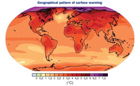
The temperature increases won’t be the same everywhere, however. Figure 3.14 is one example of the predicted geography of temperature increase by 2100. The interior of continents such as Asia and North America are expected to warm more than the oceans, with their gargantuan capacity to absorb heat. As they do, the oceans delay the warming of the atmosphere but they lock in the effects of climate change long after greenhouse gas emissions have slowed or even ceased. Said another way, climate change has stored about 100 times as much heat in the oceans than in the atmosphere, so, even after greenhouse gas emissions cease, the slow release of this heat from the oceans will control the climate for many decades. This means today’s emissions have long-term climatic consequences.
Note that the maximum temperature increases occur in the arctic. In fact, we know that the ice pack in the Arctic Ocean is already melting, much to the consternation of polar bears, and it may become completely water in late summer by mid-century, opening up the long-sought Northwest Passage from the Atlantic to Asia. Will this melting also cause sea level to rise? The answer is no because the ice is already displacing ocean water like a melting ice cube in a glass. Sea level rise has other causes discussed below.
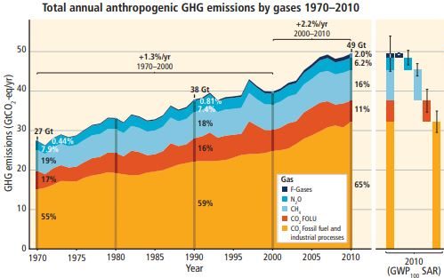
Where are these increases in greenhouse gas concentrations coming from? When the total radiative forcing effect of all greenhouse gases is taken into account, Figure 3.15 from the 2014 IPCC Report shows that global emissions have steadily increased from 28.7 gigatonnes (billion metric tonnes) in 1970, increasing each decade to 52.0 gigatonnes in 2010 and rising at 2.2% annually. In 2010 carbon dioxide emissions from fossil fuel combustion was the biggest source with 65 percent of all emissions, plus carbon dioxide emissions from land use changes such as deforestation at 11 percent. Next is methane at 16 percent, followed by nitrous oxide emissions from fossil fuel burning and fertilizer application at 6 percent.
When all the emissions are reorganized by economic sector, the energy sector, especially electricity production, leads at 25 percent, with land use changes at 24 percent, industry at 21 percent, transportation at 14 percent, residential and commercial buildings at 6 percent, and other energy and indirect emissions as the remaining 10 percent. We’ll revisit this widespread distribution of sources from a policy and economic perspective in Chapter 15, but for now, what about the impacts?
As we have seen, sea level has always fluctuated, by up to 120 meters or 400 feet, due largely to enormous changes in the volume of glaciers as ice ages have advanced and retreated. Sea level has risen by 200 mm (about 8 inches) since 1870 and is now rising at a rate of 3 mm per year, which is expected to continue (Figure 3.16b). This is caused by the melting away of alpine glaciers, documented from around the globe, and glaciers in Greenland and Antarctica, as well as by thermal expansion of the oceans. Because atmospheric warming is increasing ocean temperatures to a depth of at least two miles, the water volume increases, just like air in a basketball or bicycle tire as it warms, but to a lesser extent.
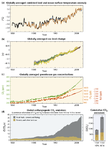
What is less well understood is what effect climate change will have on the great ice sheets of Antarctica and Greenland. Fortunately, the great East Antarctic Ice Sheet is unlikely to melt, because if it did, sea level would rise by 65 meters, over 200 feet, inundating every coastal city and ecosystem on Earth. Still scientists have been alarmed and puzzled by instability in the West Antarctic Ice Sheet. More troubling yet is Greenland, which holds enough ice to increase sea level by 7 meters (23 feet), a catastrophic outcome if it were to melt completely. Ice sheet collapse is notoriously difficult to predict. The melting of white and silver ice reduces albedo (reflection of sunlight), which warms the location, causing further melting and so on in a positive feedback or self-reinforcing process. Another positive feedback occurs because as the ice melts down, its elevation above sea level gets lower, which warms it further. Also, ice sticks hard to the rocks beneath it when it is cold, but it becomes slick when melt waters lubricate the ice-rock interface. Sometimes huge lakes of melt waters are held behind ice dams—until the dams suddenly break or holes form in the bottom, releasing a flood to the sea while scouring out more ice. James Balog has risked his life to photograph and film this fascinating and beautiful process in Greenland in a documentary called Extreme Ice which I highly recommend. Unfortunately, it’s really hard to say whether there will be massive ice collapses in either West Antarctica or Greenland this century that causes sudden and substantial increases in sea level. Let’s hope those massive glaciers hold up.
Beyond sea level, let’s take a look at the effect of climate change on the hydrologic cycle by beginning with a simple fact: when it’s warmer, there is more evaporation because the atmosphere can hold more water. Figure 3.11 should have convinced you of this. As we have seen, this reinforces temperature increases, but its effect on the hydrologic cycle is not so much that the atmospheric water pool is increased, because this effect is very small, but that the hydrologic cycle is accelerated—more evaporation means more precipitation. The question we would want to answer for any particular location is—will it get wetter or dryer? The increased evaporation makes it somewhat drier—in Thornthwaite’s terms potential evapotranspiration increases—but does increased precipitation make up for it?
Globally it does, but for any specific location it turns out to be very hard to say. Computer simulations on Atmospheric-Oceanic General Circulation Models (AOGCM) don’t always agree. So will the Colorado River have more or less water? We don’t know, but most models indicate it will have even less. Will the corn belt contract eastward as well as shift northward? Will Iowa farmers have to switch to wheat or develop irrigation systems? We don’t yet know, but the predictive capability of models is improving.
There are other trends that are becoming very clear. In the U.S. there has been a 5–10 percent increase in precipitation, generally a good thing, but there has been an increase in the number of days with more than 2 inches and more than 4 inches of precipitation. The added precipitation is coming in big rainstorms that are more likely to generate runoff, producing floods and erode soil. The Mississippi River set an all-time record flow in April–May 2011 following such downpours and in 2019 suffered from floods of record duration.
A second trend is toward less snow and more rain, combined with snowmelt occurring earlier in the spring. For California, this means that the steady melting of Sierra Nevada snows that maintains stream flow during the summer is instead producing spring floods while trout die in the warm, drying streambeds of summer. Similar effects are occurring throughout the mountain west. With the loss of snowpack as a natural reservoir, new dams have been contemplated as an adaptation to climate change.
Until the really big earthquake hits California, the biggest natural disasters in the U.S. have been floods, and damages are mounting. The price tag on the 1993 flood on the Lower Missouri and Upper Mississippi Rivers is estimated at $19 billion. Hurricane Katrina trumped them all at roughly $100 billion, most of it due to the collapsing and overtopping of levees that “protect” New Orleans from storm surges, flooding 81 percent of the city in 2005. In 2012 Hurricane Sandy became the second most costly natural disaster in U.S. history at $62 billion, but then Hurricane Harvey in 2017 deluged Houston, TX with 40 inches of rain in a few days, causing about $125 billion in damages to rival Katrina.
Are hurricanes increasing in intensity due to climate change? It’s an interesting hypothesis because it is clearly the case that the warmer the ocean surface is, the more intense the hurricane passing over it will become. Because only a few hurricanes occur each year, it takes a long time to show conclusively that they are intensifying, but a statistical trend is developing.
There is also evidence that climate change will intensify over time due to time lags and feedbacks. Time lags means that greenhouse gas emissions raise atmospheric temperatures slowly over time rather than immediately. Because of this, we can expect global temperatures to rise by 1.5°F over the remainder of the 21st century even if greenhouse gas concentrations do not rise from their current 415 ppmv. Emissions now commit the future to a warmer climate. Secondly, positive feedbacks can further amplify the effects of emissions. Here are two important examples.
Climate change can be best understood as a human-caused modification of the carbon cycle. This is both a fascinating journey in understanding the planet’s metabolism and a cause for concern that motivates progress toward natural resources sustainability.
The Carbon Simulation
At Weidong’s Projects Homepage you will find a simulation or game that allows you to manage human impacts on the carbon cycle. This is accomplished by employing a variety of management options in three sectors: energy efficiency (e.g., improve insulation), energy production (e.g., solar panels on rooftops), and land management (e.g., reduce quantity of cattle). Each option has different desirable effects on reducing atmospheric carbon and ocean acidification, conserving fossil fuels and adding biomass to the landscape, and thus scores a different amount of carbon points. If carefully employed in a cost-effective manner, you can maximize your carbon points. The Carbon Simulation makes for a very good classroom exercise or homework assignment.
The Nitrogen Cycle
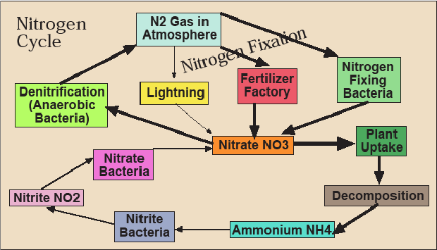
Let’s look at the third and final cycle—nitrogen. Most of the nitrogen on earth exists as N2 gas, which constitutes 78 percent of the atmosphere. While not technically inert, we’ve been breathing this in and out every few seconds our entire lives and it hasn’t made much of a difference. Both plants and animals need nitrogen—it’s a necessary component of protein from which most of our body is made—but neither can extract it directly from the atmosphere. Therefore, the issue is how to get nitrogen out of the atmosphere into some biologically usable form. Some bacteria can “fix” nitrogen—turn it into ammonium (NH4), nitrite (NO2), or, especially, nitrate (NO3), which plants absorb greedily through their roots (Figure 3.17). Along with phosphorus (P) and potassium (K), nitrogen (N) is a fertilizer. In fact, if plants have warm temperatures, sunshine, and water, nitrogen is often the limiting factor in their growth. This means that their growth is constrained by the necessary resource in shortest supply. If you increase the supply of the resource that is the limiting factor, plants will grow faster, while if you increase the supply of a resource that is already sufficient, it will have no or a negative effect.
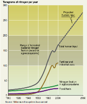
During WWII, American chemists working on weapons found a way to make inexpensive explosives by fixing nitrogen using the energy from natural gas. Serendipitously (i.e., in a fortunate accident), after the war they discovered that this anhydrous ammonia from explosives stimulated plant growth, and the chemical fertilizer industry was born. Humans joined legumes and bacteria to become nitrogen fixing species—in fact, the most important one (Figure 3.18). Crops responded to it wonderfully and yields went up, especially for corn that grows from a seed in April or May to a 6–8 foot tall stalk by August yielding 100–200 bushels of grain per acre. Geneticists bred crops that could respond to high doses of nitrogen to produce high grain yields. World food production has nearly tripled in the last 50 years and the nitrogen in manufactured chemical fertilizers has been a major reason.
Of course, at some point, nitrogen stops being the limiting factor and yields stop increasing when more fertilizer is applied because the plants can’t absorb it or the rain washes it away before they do so. What happens to it then? Nitrates are soluble (i.e., they dissolve in water like salt), so they follow the water in the hydrological cycle. They evaporate and fall back down in the rain. They percolate into groundwater. They run off downhill to streams, rivers, lakes, and the ocean. In the water-logged, oxygen-poor soils of wetlands, anaerobic (this means not dependent on oxygen) bacteria perform a valuable service by transforming nitrates to harmless N2 gas and releasing it back to the atmosphere (this is called denitrification).
Drinking nitrates is inadvisable; it has been associated with bladder cancer and other ailments. It’s particularly hazardous for babies where it interferes with the delivery of oxygen in their bloodstream (this is called blue baby syndrome or the unpronounceable methemoglobinemia). Keeping them out of the public water supply is therefore essential and the EPA has set a drinking water standard of 10 mg/l (equivalent to 10 ppm).
In aquatic (e.g., streams, rivers, ponds, lakes) and marine (e.g., estuaries, oceans) ecosystems, nitrates are also fertilizers, just as they are in a crop field, but in these environments, this is rarely a good thing. They fertilize algae. Aquatic and marine ecosystems are categorized by the availability of nutrients, especially N and P, since one of these is usually the limiting factor in plant growth and therefore biological productivity. Oligotrophic (nutrient-poor) lakes common in the Canadian Shield, for example, often have beautifully clear water, but a low density of plant and animal life because of the lack of nutrients. Mesotrophic lakes are more nutrient-rich and therefore ecologically productive, while eutrophic (very nutrient-rich) lakes have an abundance of nutrients and therefore an abundance of plants, which seems like a good thing until you realize that the plants are predominately algae. Algae not only form a green scum that makes drinking or swimming in the water undesirable, they are ecologically destructive as well through the process called eutrophication.
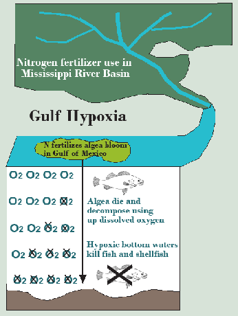
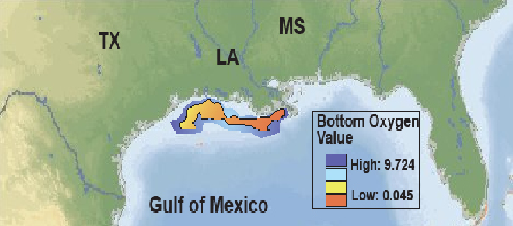
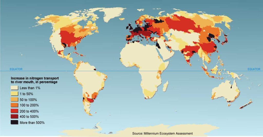
It’s straightforward to see that algae make the water turbid (hard to see through because light is blocked). This alone inhibits the growth of larger aquatic plants that form excellent habitat for invertebrates and fish because solar energy cannot penetrate to the bottom to facilitate photosynthesis beyond a shallow depth (Figure 3.19). Some species of algae are also toxic. In 1997 swimmers in Chesapeake Bay, for example, contracted neurological problems from algae called pfiesteria and there was a major fish kill. Worse yet is algae’s effect on the oxygen supply in the water. At first, you might think that algae produce oxygen through photosynthesis, and this is true, but algae have a short life span of around a month. When they die off, they sink to the bottom and their decay consumes oxygen. This results in episodes of hypoxia (oxygen levels below what is needed for breathing animals to survive) with consequent fish kills. Eutrophication is a widespread plague in aquatic ecosystems wherever fertilizers that crops and adjacent ecosystems fail to absorb runs off the land. Even the ocean is affected. The hypoxic zone to the west of the mouth of the Mississippi and Atchafalaya Rivers in the northern Gulf of Mexico sometimes grows to the size of the state of New Jersey (Figure 3.20). While it has received the most attention, Gulf hypoxia is only the tip of a very large iceberg. Nutrient enrichment (i.e., eutrophication), including both N and P, is the most important water pollution problem on Earth—at least from an ecological perspective (Figure 3.21). For this reason, perhaps we should start talking about our nitrogen footprint alongside our carbon footprint.
Let’s do another thought experiment like we did in thinking through how to keep carbon out of the atmosphere, but this time we’re concerned with how to keep nitrogen out of the water by studying the nitrogen cycle in Figure 3.18. Make your list of options before looking over mine.
Here’s my list, which is a lot shorter than for carbon:
• Decrease the rate of natural nitrogen fixation
• Decrease the rate of artificial nitrogen fixation and land application (especially through the manufacture of fertilizers)
• Increase the rate of denitrification
You will quickly note that the first option is both unviable and unwise, leaving only two options: restrict fertilizer use and enhance denitrification, especially in wetlands and filter strips. We’ll explore these two options in Chapter 11 on land use and agriculture.
The Nitrogen Simulation
At Weidong’s Projects Homepage you will find a simulation that allows you to manage the nitrogen cycle in the Mississippi watershed with the objective of minimizing or eliminating the Gulf Hypoxic zone. This is accomplished by employing only two management options: reducing fertilizer applications, which has nonlinear effects on yields, and restoring wetlands, which takes land out of crop production. These options can be employed either for the entire watershed or for its six major sub-watersheds (Missouri, Ohio, Tennessee, Arkansas-Red-White, Upper and Lower Mississippi) individually. Simulations can be run for dry, medium, or wet years and for a range of crop prices. Read more about the nitrogen simulation and its use in the classroom in Lant et al. (2016) listed at the end of this chapter.
Putting the Water, Carbon, and Nitrogen Cycles Together: Soil
Kids call it “dirt.” Most farmers I’ve met call it “ground.” I call it one of our most critical natural resources—the soil. Soil is a complex combination of weathered rock, air, water, and decayed plants as well as living roots, burrowing animals, invertebrates, fungi, and microbes. Plants can grow without it (e.g., hydroponics, stunted trees clinging to rocks in the mountains), but most grow so much better with it. As we have seen, it is the first reservoir of water supplying plants between rains. It stores and recycles nutrients (e.g., nitrogen, phosphorus, potassium). It anchors plants’ roots, which in turn hold the soil in place and when they decay provide humus. Plants and soil have a mutualistic relationship; in fact, they make each other. Take away one and you lose the other.
What makes a soil fertile? (By fertile we mean helpful in growing plants, especially crops.) An ideal soil is deep, well-drained (meaning it is not always fully saturated with water), full of soil organic carbon (i.e., humus), and is a loam containing fine-grained (clay), medium-grained (silt), and course-grained (sand) particles.
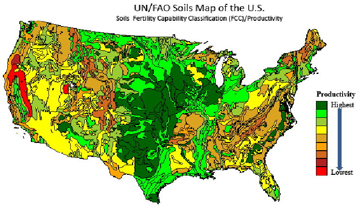
The fertility of soils varies enormously (see U.S. map in Figure 3.22). The Midwest supports some of the most fertile soils in the world—thanks largely to the glaciers that scraped the Canadian Shield clean and deposited the glacial till from North Dakota to southern Illinois. Widespread wetlands also helped by accumulating organic carbon. The rocky Northeast and arid and mountainous West are not nearly as fertile, although southeast Pennsylvania, the Central Valley of California, and Willamette Valley of Oregon are grateful exceptions. The southeast is perhaps most intriguing with its favorable climate for agriculture, but soils that are most often lacking due to the absence of glacial till as well as heavy rainfall and high temperatures that leach the soils of nutrients. As one proceeds toward the equator, these factors intensify, making tropical soils generally infertile compared to those in the midlatitudes.
Soil scientists love taxonomies, so you’ll be grateful that I’m sparing you their endless categories of soil types. For our purposes, it is important to know simply that humus is the silver bullet of soil fertility, constant waterlogging is not, and salt is a soil’s undoing.
What makes soils erode or degrade? If the soil is completely protected from the wind and rain by plants—grass, shrubs or trees will do—it will continuously form and rarely erode. Not only do the roots hold the soil, but also the blades of grass, leaves, and leaf litter block the surprisingly forceful impact of raindrops. The same organic matter absorbs water. Little tunnels built by roots, fungi, worms, and all the other cornucopia of small living things in the soil that help dead plants and animals decay, increases the soil’s porosity, giving the rain and snowmelt a chance to infiltrate. If it’s raining so hard that it can’t all infiltrate and starts to run off over the surface, the soil is anchored and has a protective barrier. Moreover, all the blades of grass and leaf litter give the runoff a tortuous obstacle course in its path downhill, slowing it down and giving it an opportunity to find another low spot where it can infiltrate. Therefore, under naturally vegetated conditions, erosion only occurs during the largest of rainstorms and only in low-lying swales where rushing water accumulates in temporary stream channels.
Even under natural conditions, however, soils in semiarid environments erode quickly because the rainfall is insufficient to support enough plant life to completely cover the soil surface, yet it does rain often enough to provide substantial erosive energy. This, along with the easily erodible nature of glacial powder called loess, is why the Yellow River in China is, in fact, yellow and why the Missouri River that Lewis and Clark explored was “too thin to plow and too thick to drink.”
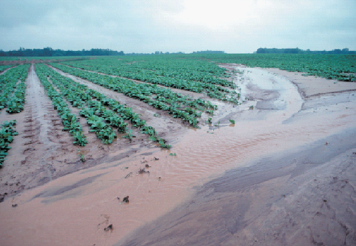
In a city, covered with impervious roofs, roads, sidewalks, and parking lots, the rain runs off with little infiltration, but pavement is specifically designed to resist water erosion. The problem lies in barren agricultural soils unprotected by vegetation where raindrops form little craters in the soil. The debris from these little explosions plug up pore spaces in the soil, reducing infiltration. Now the water starts running downhill where its energy detaches soil particles, carrying them along until that energy is reduced wherever the water slows down (Figure 3.23). Here the soil is deposited. It might be at the bottom of the hill, or along a row of denser vegetation. In this sense, soil erosion is really downhill soil transportation. For this reason, valleys are usually more fertile than hillsides or ridge tops. If the soil reaches a channel, it will take a longer journey toward the sea as the sediment load of a stream or river, but it will still likely be deposited on a floodplain along the way. Rarely will it reach the sea at the mouth of a river. This is all a normal process that erodes away mountains and builds river deltas and coastal plains over millions of years. Exposed soil is subject to accelerated erosion, however, at 10 to 1000 times the natural rate.
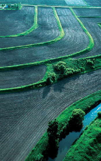
Soil conservation largely consists of keeping as much of a vegetative cover in place as possible, consistent with the production of crops, and inhibiting rapid runoff during rainstorms. Tools in farmers’ arsenals to keep their precious asset of the soil where it belongs—in the field, producing crops indefinitely, are listed. See if you can identify them in Figure 3.24.
- Reduced tillage and no till
- Leaving the residue of last year’s crop lying in the field
- Adding manure
- Planting a nitrogen-fixing cover crop like clover
- Planting across the slope (contour) rather than up and down it
- Planting filters strips along stream channels
- Building terraces along slopes
While somewhat less common than water-based erosion, dry, unprotected soils are also vulnerable to wind erosion. In Chapter 2, we explored the catastrophe of the Dust Bowl in the American Great Plains, but wind erosion is also chronic in the drylands of Central Asia. The process of desertification occurs when dry grasslands are over-grazed by livestock. During the next drought, the remaining grasses wither and the soil is exposed to the wind, which removes it in some areas while building infertile dunes in others. Then when the rains return, the grasses can’t recover, leaving the soil further exposed in a vicious cycle. Soil and plants either prosper together or, in desertification, fail together.
Soils can also be degraded—lose their fertility—without being transported downstream or downwind. The overapplication of irrigation water can create a wet corridor to underlying salts, which dissolve in the irrigation water and are carried toward the surface. When salts are left behind by evaporation, soil salinization destroys fertility. Soils can be depleted of organic matter and nutrients through intensive farming—hence the need to add manure or some other form of compost and fertilizer. Soils can be compacted by vehicles. Tropical soils are even more dependent on the plants they support to protect them and can turn to brick-like laterite when exposed to rain and sun.
The erosion and degradation of soil is not to be taken lightly or underestimated in its importance to humans. Soil has a long memory. Vast areas in the old cradles of agricultural civilization in the Middle East and the Mediterranean have eroded, salinized, and desertified soils that show little sign of recovering from abuses thousands of years in the past. In the U.S., the Dust Bowl has not fully recovered, and the old cotton lands of the South lack much of the fertility they had before the Civil War. As we will explore in Chapter 11, the world is already challenged, and will become even more hard-pressed, to meet the food needs, most of the fiber needs, and some of the fuel needs of the entire human population from the land. This world needs all the fertile soil it can get. The wise use of soil is thus a foundation of natural resource sustainability.
Conclusion
Geology and physical geography are fascinating topics that we have here only taken a glimpse at. Yet in this chapter we have examined much of what we need to know in the study of natural resources sustainability. The Earth runs on cycles such as the hydrologic cycle, the carbon, and nitrogen cycles. They are its metabolism. Often they interact, such as in the soil. These cycles are millions of years old, and will likely continue for millions more, with or without humans. From a human perspective, however, we can identify how we would like these cycles to work: a stable hydrologic cycle rather than one based on droughts and floods, a stable and modest pool of carbon in the atmosphere, a moderate flux of soluble nitrogen to water bodies.
We can also identify ways in which humans are affecting these cycles that produce negative consequences: erosion and depletion of soils so that they no longer store water and nutrients, emission of carbon-based greenhouse gases to the atmosphere leading to climate change, and overloading of aquatic and marine ecosystems with nitrogen, producing eutrophication and hypoxia.
Finally, an understanding of cycles suggests solutions that become cornerstones of natural resources sustainability. These include (1) protect soils from erosion by using plant cover to limit their exposure to wind and rain so they can store runoff during floods for use during droughts, (2) reduce greenhouse gas emissions and sequester carbon in the soil, forests, and geologic environments, and (3) reduce fertilizer use and utilize wetlands to return nitrogen to the atmosphere.
With this understanding of how the Earth’s physical environment generates natural resources, we are prepared to delve into its living components—the biosphere—through the lens of ecology.
Further Reading
Intergovernmental Panel on Climate Change, 2014. Summary for Policy-Makers, Part I, II, III and IV.
Lant, C.L., B. Perez-Lapena, W. Xiong, S.E. Kraft, R. Kowalchuk, M. Blair, 2016. Environmental systems simulations for carbon, energy, nitrogen, water, and watersheds: Design principles and pilot testing. Journal of Geoscience Education 64:115–124.
Lynas, Marl. 2009. Six Degrees: Our future on a warming planet. National Geographic.
Media Attributions |
|
