u1273832
Long Descriptions for Figures
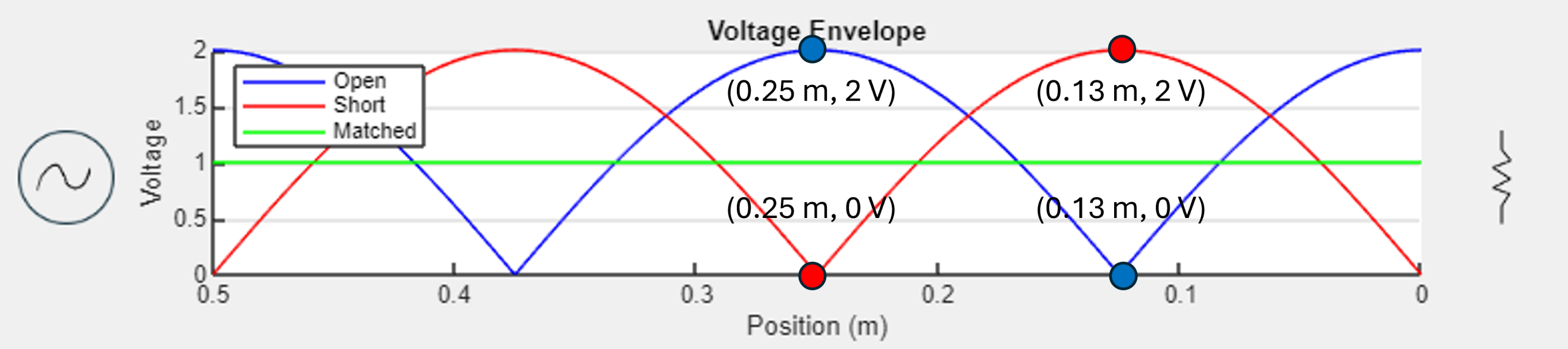
Open, short, and matched voltage envelopes
The graph shows how an open, short and matched load affect the envelope for a simple one volt amplitude sinusoidal signal on a fifty Ohm transmission line. The signal source is indicated on the left by an AC source symbol and the load on the right is indicated by a resistor symbol. Recall that for transmission lines, distance is measured from the load and not from the source. The right end of the x-axis is, then, labelled as zero and increases toward the left. The graph only analyzes up to zero point five meters from the load.
The envelopes for the open and short loads appear as the absolute value of a sinusoidal signal multiplied by two. They look like periodic hills of a sort where the peaks of the open load are the low points of the short load and vice versa.
Annotated on the graph is two volts at zero point one three meters on the short load’s envelope. Directly below that point is the open load’s antinode of 0 volts also at zero point one three meters from the load. The opposite scenario is indicated as well as zero point two five meters from the load.
The open load’s envelope has a maximum of two volts at the load itself and the short load’s envelope has a minimum of zero volts. Note that the nodes of the open load are the antinodes of the short load. The matched load’s envelope is a constant, flat one volt across the entire transmission line since there is no reflected energy. For an interactive version, go to the envelope calculator app.
[Return to chapter] (Must be updated when full book is written)
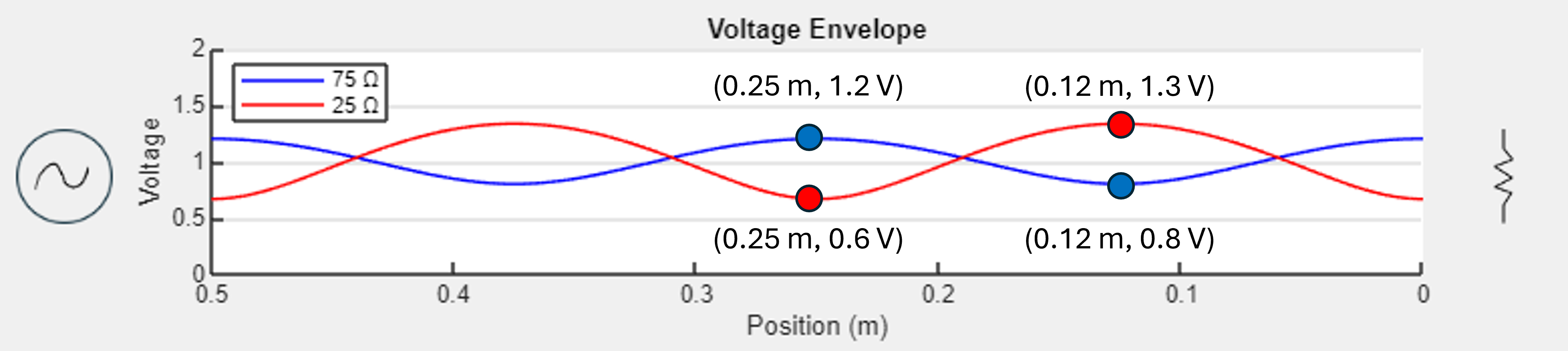
75 and 25 Ohm voltage envelopes
The graph shows how a seventy five ohm and twenty five ohm load affect the envelope. The load, indicated by a resistor symbol, is on the right side and the source, indicated by an AC symbol, is on the left. The x-axis begins at 0 on the right and increases toward the left. Both the seventy five ohm and twenty five ohm load envelopes appear as raised sinusoidal graphs with magnitudes less than one. The seventy five ohm envelope has annotated points at zero point twenty five meters one point two volts as well as zero point twelve meters zero point eight volts. The twenty five ohm envelope has annotated points at zero point twenty five meters zero point six volts as well as zero point twelve meters one point three volts.
Note that since seventy five ohms is greater than fifty, the resulting reflection coefficient is positive whereas for the twenty five ohm load the reflection coefficient is negative. This yields a higher envelope at the load for seventy five ohms than does twenty five ohms. Since neither of these loads yields a maximum reflection coefficient, the envelopes do not indicate a pure standing wave since only some of the energy is reflected from the load. There are, then, no minimums for either line at zero volts. For an interactive version, go to the envelope calculator app.
[Return to chapter] (TODO insert link)
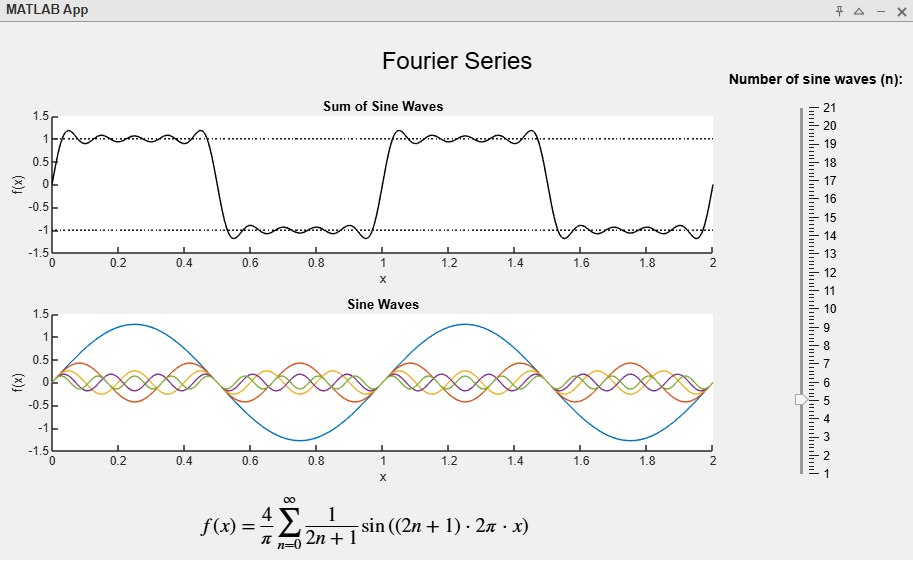
Fourier series app thumbnail
You can interact with the Fourier series application to get a better idea on how a square waveform can be composed of multiple sine waves through a Fourier Series equation. You can increase the number of terms in the Fourier series using the slider on the right indicated by “Number of sine waves (n)”. “n” is used in the equation at the bottom of the application. The bottom graph shows the series function as a function of x as well as the top graph. All the sine waves used in the series is shown on the bottom graph and the top graph shows the sum of those sine waves. You’ll notice that the more terms you add, the more the sum will appear as a square wave. In the thumbnail, 5 terms are used. The bottom graph shows several sine waves of differing amplitudes and frequencies all centered at zero. The top graph shows a waveform that is almost like a square wave. The rising and falling edges are slanted (as opposed to vertical in an ideal square wave) and the top and bottom portions show a “wiggle” of sorts.
[Return to chapter] (TODO add link)
Fourier series video
In the video, there are two graphs and an indicator for “n”, starting at n equals 1. The top graph shows the sum of all sine waves indicated a Fourier series for a square wave. The bottom graph shows each individual since wave overlayed on each other. As the video progresses, several sine waves overlay onto a larger sine wave with an amplitude of about 1.2 and “n” increments for each sine wave added. As the sine waves add, they get smaller in amplitude and higher in frequency. As n increases for the top graph, a wiggly shaped square wave begins to form. At first, it appears as a sort of trapezoidal wave with the top and bottom portions having a distinct low-amplitude sinusoidal pattern. As “n” increases, the sinusoidal pattern decreases in amplitude and the rising edges’ slopes increase drastically and become more distinct and sharp. Eventually when n equals 100, there is a square wave on the top graph with amplitude 1. There are, though, periodic and small overshoots at the rising and falling edges. This is called “Gibb’s phenomenon”.
[Return to chapter] (TODO insert)
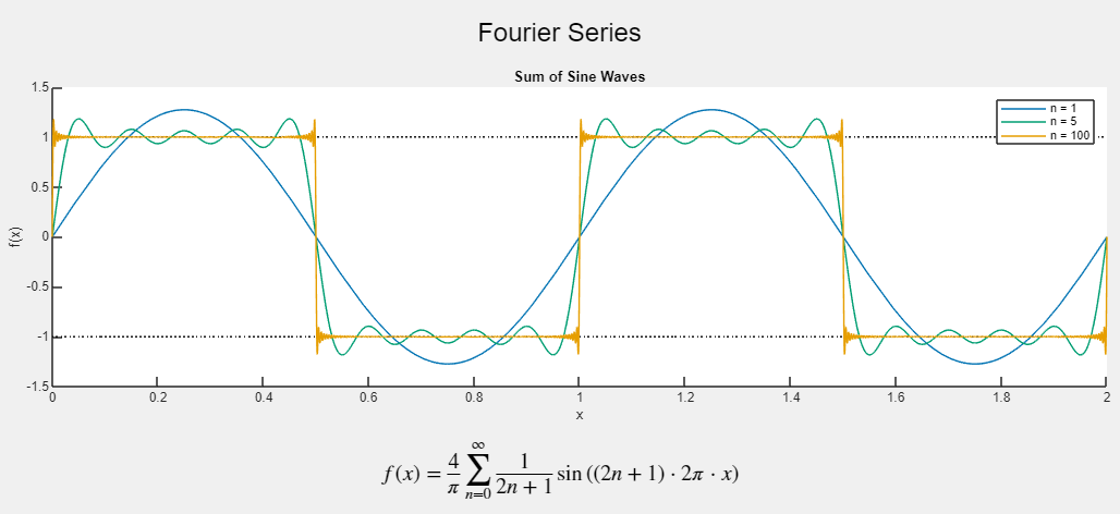
Fourier series graph
The graph shows different Fourier series, indicated as a function of “x”, for different number of terms overlayed on each other. 1 term is a simple sine wave. 5 terms approximates a square wave with some “wiggle” and slanted rising and falling edges. 100 terms has near vertical rising and falling edges as well as sticking to the 1 and -1 volt values rather well besides briefly at locations where Gibbs phenomenon takes effect. 1 and -1 volt values are indicated by horizontal dotted lines. The equation for the series is below the graph. TODO: write in equation? You can investigate further how the number of terms affects the shape of the square wave in the Fourier series app.
[Return to chapter] (TODO insert)
other text!
Pulse simulation app thumbnail
This is a thumbnail showing the pulse simulation application. The application allows you to examine how different loads affect the transmission of a pulse. The application has three graphs showing voltages against distance from the load. The right end of each x-axis is indicated as 0 and increases toward the left. The top graph is the incident pulse, the graph below is the reflected pulse, and the final graph at the bottom shows both the incident and reflected pulses and how they interact with each other. To help indicate the direction, the pulse appears as a type of sawtooth waveform: a right triangle where the falling edge is the direction of propagation. You maybe pause the simulation, manually send pulses, and select, in real time, different load types between SHORT, OPEN, MATCHED and RESISTIVE (27 ohms).
[Return to chapter] (TODO insert link)
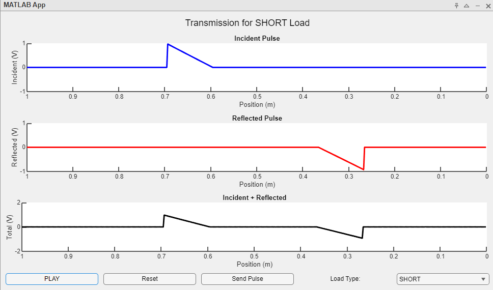
Pulse with short load
The diagram shows how a pulse interacts with a short load. There are three graphs that all show voltage against position from the load. The top graph shows the incident pulse. There is a horizontal line with a right triangle at 0.7 meters ejecting upward. Its peak is 1 volt. The horizontal line is at 0 volts. The triangle’s hypotenuse is slanted downward toward the right. There is an arrow next to the pulse pointing toward the right indicating a rightward propagation.
The next graph shows the reflected pulse. There is a horizontal line centered on 0 volts with a right triangle ejecting downward at roughly 0.3 meters. Its peak is -1 volt. There is an arrow next to this pulse pointing toward the left indicating its leftward propagation.
The final graph shows the incident and reflected pulses overlayed on each other with arrows pointing toward each other.
Two pulses have been “sent” in this figure. The first has already been reflected as shown in the reflected pulse graph. The incident pulse and reflected pulse are about to collide into each other. See pulse load simulation app to investigate the short load more.
[Return to chapter] (TODO insert link)
a
Pulse with matched load video
The video shows periodic pulses sent from the source and how they interact with a matched load. The layout is the same as figure [???] above. There is lack of activity on the reflected pulse line, showing only a flat 0 volt line. See the pulse load simulation app for more.
[Return to chapter] (TODO)
a
Pulse with short load video
The video shows periodic pulses sent from the source and how they interact with a short load. The reflected pulse graph is the incident pulse graph animation but negative and heading in the opposite direction. The reflected pulse graph shows right triangles heading leftward and face down. In the combined graph, the pulses collide into each other and create a superposition of the two pulses, yet do not alter the waveforms after collision, meaning the incident and reflected pulses appear the same before and after the collisions. This exemplifies the principle of superposition for waves. See the pulse load simulation app to investigate more on superposition.
[Return to chapter] (TODO)
Pulse with open load video
The video shows periodic pulses sent from the source and how they interact with a open load. Note that the reflected pulse graph is the incident pulse graph animation but heading in the opposite direction. The pulses, unlike the in the short load example, are now positive instead of negative, meaning that the reflected pulse triangles are oriented upward from the 0 volt line instead of downward. In the combined graph, the pulses collide into each other, yet do not alter the waveforms after collision like above in the short load example. Notice that since both pulses have an amplitude of 1 volt, their superposition momentarily reaches 2 volts before both pulses separate. See the pulse load simulation app for more.
[Return to chapter] (TODO)
Pulse with resistive load video
The video shows periodic pulses sent from the source and how they interact with a resistive 27 ohm load. The reflected pulse graph is the incident pulse graph animation but heading in the opposite direction with a decreased amplitude. The triangular pulses are still right triangles, yet their vertical edges are now roughly 0.4 volts instead of 1 volt. In the combined graph, the pulses collide into each other, yet do not alter the waveforms after collision like the other load scenarios. Since both pulses have a positive amplitude, their superposition momentarily reaches higher than 1 volt when they collide before both pulses separate. See the pulse load simulation app for more.
[Return to chapter] (TODO)
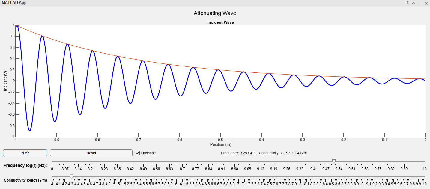
Attenuating wave app thumbnail
The attenuation simulation application in the the thumbnail will allow you to see how adjusting a signal’s frequency and a transmission line’s conductivity will affect the signal’s attenuation. The graph shows the voltage of a signal against the distance from the load. The load is always matched in this application. There is a play button to see how the wave evolves over time as well as a reset button. There are two sliders: one for frequency in Hertz and another for the conductivity of the transmission line in Siemens per meter. Both sliders are on a logarithmic scale. The particular frequency and conductivity are shown in a textbox below the graph and above the sliders. You may also see the signal’s envelope by selecting a checkbox below the graph.
[Return to chapter] (TODO)
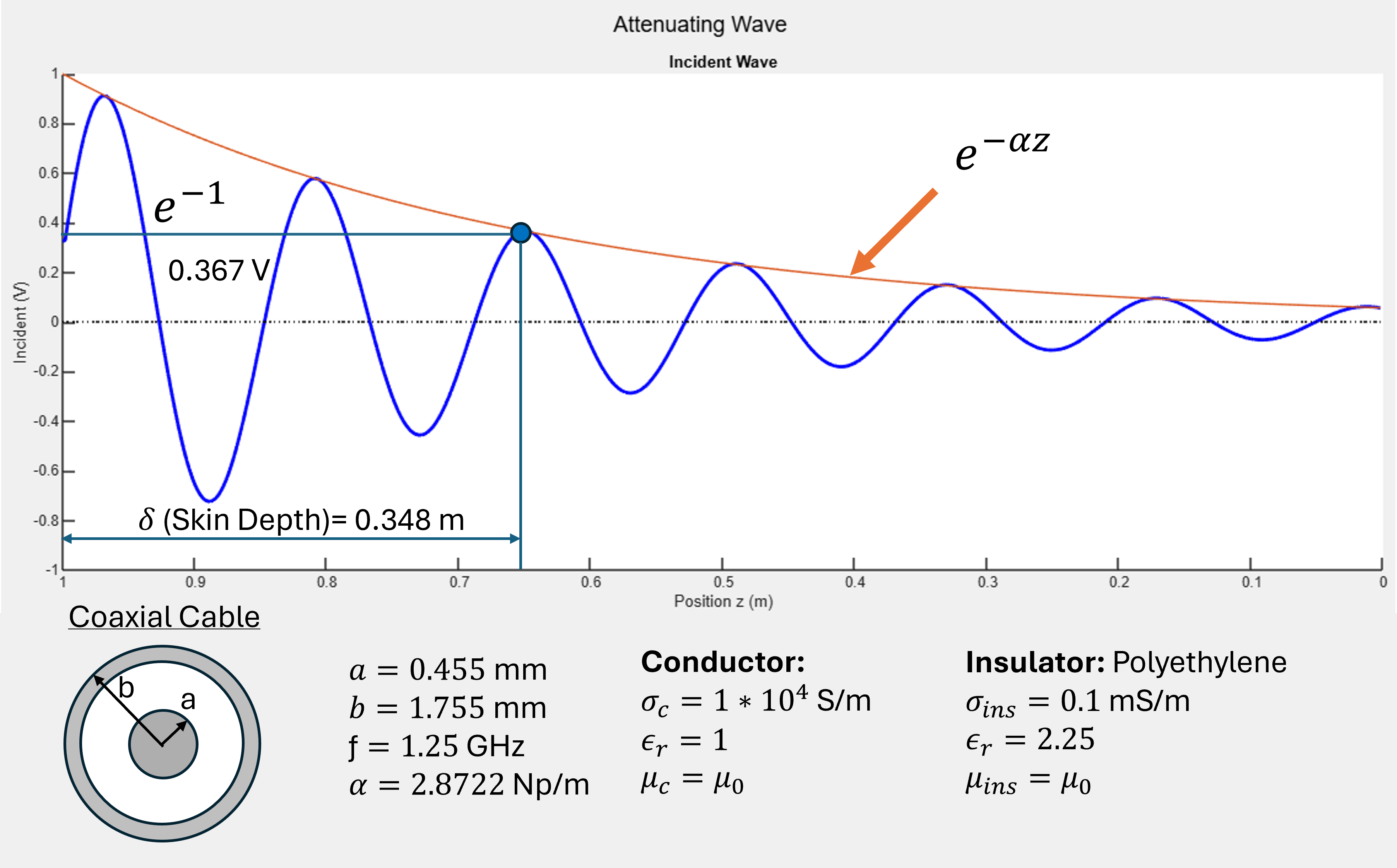
Attenuating wave diagram
The diagram shows an attenuating wave for a 1 volt amplitude sinusoidal signal. The graph shows voltage against position from the load. The signal is shown at a time where the signal has propagated through the entire designated length.
The sinusoidal signal is centered at 0 volts and its amplitude decreases with distance from the source on the left. It appears as though the sinusoid shrinks as it travels to the right. The envelope annotated with the envelope attenuation equation is overlayed on the graph as well. It is a decreasing exponential function that touches the peaks of the sinusoid but does not intersect them. The skin depth is annotated at 0.348 meters from the source with 0.367 volts marked on the signal. Below the graph are the specifications of the signal and transmission cable.
There is a cross section diagram of a coaxial cable. (TODO see–for description of coaxial cables) It looks like 3 concentric circles where the innermost layer’s radius is marked by “a” and the outermost circle’s radius is marked as “b”. the innermost layer and outermost layer are shaded to show the conductive portions of the cable. Innermost radius “a” is 0.455 meters, outermost radius “b” is 1.755 meters.
The frequency of the signal is 1.25 gigahertz. The attenuation coefficient “alpha” is 2.8722 nepers per meter.
The conductor of the cable has conductivity of 1 times 10^4 Siemens per meter. Its relative permittivity is 1 and its permeability is vacuum permeability or mu naught.
The insulator of the cable is polyethylene. Its conductivity is 0.1 milli Siemens per meter. Its relative permittivity is 2.25. Its permeability is vacuum permeability or mu naught.
See the attenuation simulation app to explore how conductivity and frequency affect the skin depth.
[Return to chapter]
Attenuating wave video
The video shows the evolution of an attenuation wave for 1.25 gigahertz and conductivity 1 times 10^4 Siemens per meter. As the signal propagates from left to right, the peaks of the wave follow the decreasing exponential envelope as described by equation [???]. The signal appears as a traveling sine wave that shrinks as it travels. See attenuation simulation app to investigate the envelope further.
[Return to chapter]
a
Bounce diagram app thumbnail
Below is the bounce diagram application. To properly examine the evolution of a pulse across a 1-meter transmission line, a voltage versus time graph is provided to the right of the bounce diagram, and a voltage versus position graph is provided below the bounce diagram. You may examine the voltage versus time at a particular point on the transmission line by using the position slider at the top of the app. There is a yellow vertical line that marks that position on the bounce diagram. To more easily track how the wavefront changes the voltage at that point “Z”, dashed lines are provided on the bounce diagram and voltage versus time graph. You may also examine the transmission line at a particular time “T” by using the slider on the left. The slider will automatically increment if you use the “Play” button in the bottom right corner. Reflected values will automatically appear along the bounce diagram. You may also select between a step function or a 2.5 ns pulse indicated on the bottom left. Finally, a “zoom” feature will allow you to better examine the pulse or step signal shape on the voltage versus position graph on the bottom. The graph’s y-axis will adjust to better fit the data. The zoom button is located on the bottom left corner of the app.
a
a
a
a
Another section here
Hello there. this is new text here! to talk about stuff
asd
a
a
a
a
s
sad
f
asdf
asd
fa
a
a
a
a
a
a
a
a
a
a
a
a
a
a
asdf
Third section here
Media Attributions
- OpenShortMatchedEnvelopes
- 75 and 25Ohm Envelope
- FourierAppThumbnail
- FourierSeriesStill
- PulseLoadAppThumbnail
- PulseTransmissionStill
- AttenuatingWaveAppThumbnail
- Attenuating Wave Still
